Here’s a fresh example of the complexity of making software simple.
Tinderbox has links to the Web (and other internet services) and links within Tinderbox. Internal links appear in Tinderbox maps as lines between notes. We have tools like the link browser and Roadmap View to examine, explore, and edit links. Today, we also use the link browser to delete unwanted links.
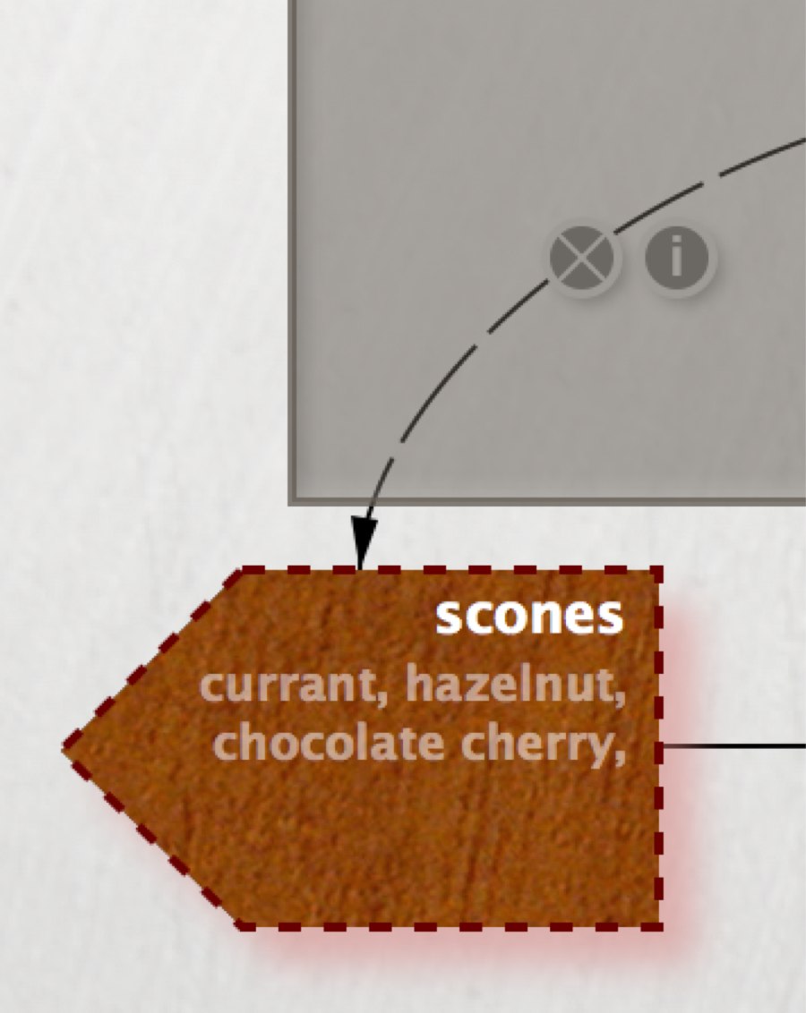
In the past, we’ve tried to make links selectable in the map. The would let you click on a link to select it, and press delete to delete it. But this turns out to be tricky; links are skinny creatures. They’re hard to click. In a tangled document, it’s easy to click on the wrong link.
Stacey Mason recently came up with a nice solution: add little widgets to the links that let you delete them.
To reduce visual clutter, we display only the widgets for links that begin at a selected note. The “x” widget deletes the link, and the “i” widget displays detailed information about the link. Nice, right?
Well, there’s one thing they had forgotten! Links are drawn behind notes and adornments, because in some documents you wouldn’t be able to see the notes if the links were drawn in front. But, if you click on the link widget in the figure above, you’re also clicking on a translucent adornment: which object did you intend to click? It gets worse, too, because some adornments are transparent. If you click on a clearly-visible link widget that happens to be lying underneath a transparent adornment, you probably meant to select that widget, not the adornment.
Welcome to my morning.