We draw a lot of boxes and arrows in computer science and information architecture. European computer science is especially fond of them. And of course they're central to the Tinderbox map view.
But should we rely on boxes? How about some curves?
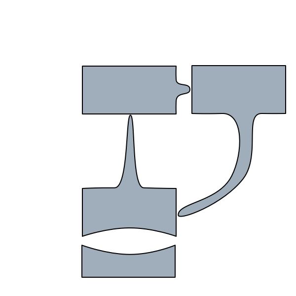
I tried to get some interest in foliated, art nouveau maps at IVICA a few years ago. I’ve not seen much uptake, but perhaps that was too much to expect; making this happen will take a lot of work and would probably be a risky platform for a doctoral dissertation. (It sure could put someone one the map, though!)
I’m not entirely happy with this sketch. In fact, I’m not happy at all. The curves aren’t right, and we need other ways to represent anti-links and contingent links. How do we represent typed links without too much clutter? And this does nothing to help matters when you have lots of tangled links, which I think is something we ought to encourage.
But there’s a lot of low-hanging fruit to be plucked around here.
I have a bunch of research topics gathering dust. Most would be suitable for a dissertation or thesis. All should be publishable.
When I was a graduate student, I used to spend hours looking for ideas that might generate a publishable scientific discovery. Everywhere one turned, either someone had been there before or you needed a ton of new equipment.
Now, I’ve got ideas lying all over the office. That was chemistry and this is the margins of computer science and the humanities. Perhaps I was completely clueless back then, perhaps everyone else has always seen these topics lying around.
Anyone interested? What’s the best things to do with them?