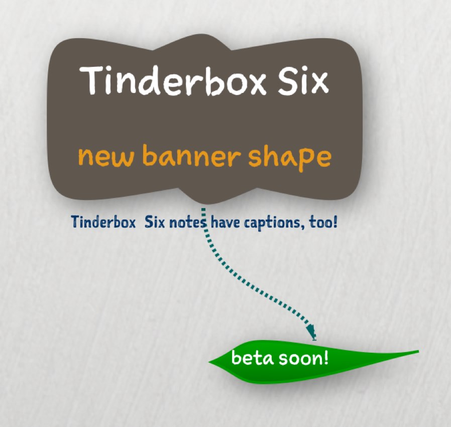

Too many diagrams rely on boxes and arrows. Tinderbox loves boxes and arrows too, but it’s easy to craft organic shapes as well. The Tinderbox leaf shape is very handy indeed, not least because you can use subtle changes of shape to alert you to unusual information.
I introduced a curved banner along with the leaf shape, but the banner never really worked well. In Tinderbox Six, we’ll revamp the banner shape. It’s based loosely on signs of Hector Guimard.
The font? That’s Mike Rohde’s Sketchnote
. And it’s also part of Tinderbox Six. It’s a terrific sketch font with tons of contextual alternates, meaning different words have subtly different letterforms.