Presentations
Guy Kawasaki, who invented software evangelism and played a crucial role in Apple's renaissance and who is now a VC, has a new weblog.
Recently, Kawasaki complained that most of the PowerPoint presentations he sees are bad. And since he's hearing polished and important presentations on which millions of dollars of investment depend, these are probably a lot better than the presentations at your average trade show or faculty meeting. His prescription:
- 10 slides
- 20 minutes
- 30 point type, and larger
The ten slide rule is wrong. No, you don't want to cram too much into a talk. No, you don't want to overwhelm the audience with detail. But two-minute slides are far from ideal.
- In two minutes, the audience has time to be bored by your slide. They can critique it. They can critique you. They can reflect on what you're not telling them. They can poke holes in your metaphors. They can look around the room to see who else is doing this.
- If you have only ten slides, each slide needs to cover a lot of ground. One slide for the problem your business addresses, one slide for the technology, one slide for sales and marketing.
- It's hard to design a visually compelling slide for broad, abstract topics like "our planned sales and marketing strategy".

All things being equal, take your 2-minute blue-gradient slide and break it up into five or six small slides -- none of which will be on screen for more than 20 seconds. Most slides need only a headline. A few can have a headline and two or three bullet points.
And that gives you space as well for visual information -- for emotionally rich but hard-to-discuss information about your company, your products, and your ideas. You don't have to talk about the visuals; they'll explain themselves.
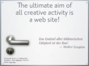
The 30pt text? Too small: 30pt is the fine print. Avoid small type on the screen; it's ugly and hard to read, and it tempts you to read your slides. 64pt headlines are fine, 96pt is better.
Better yet, when presenting to small groups who speak your language, consider dropping PowerPoint entirely and work from your Tinderbox map and notes. Crank up the magnification and the font sizes, dial back the colors, and you have an effective presentation tool that lets you adapt your presentation easily, right up to the last moment. PowerPoint and Keynotes are for keynotes -- fixed and formal presentations to a big audience.