An interesting research area for Tinderbox (which is now on sale, incidentally) is the discovery of emergent structure in Tinderbox maps. One aspect of this is simply discovering the geometries each user prefers for each problem.
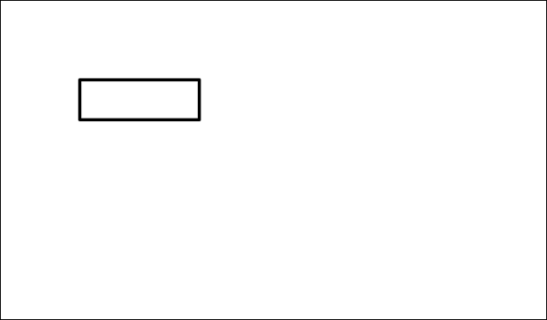
This structure emerges as soon as we begin to work. For example, when we place a single note in a map
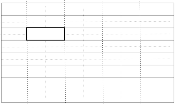
its mere presence might set up in our mind an implicit grid.
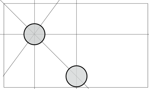
Your grid might vary. It probably will. For example, you might want to leave spaces or gutters between objects; some people will want larger gaps than others. Different shapes and different patterns of connection will also create distinct layout constraints.
An important stream of research on spatial hypertext involves spatial parsers – processes that recognize implicit structures and patterns. These can, for example, recognize that you’ve got a vertical list of notes and help you treat that list as a unit. Spatial parsers can also recognize and help correct small mistakes, such as unintentional misalignments.
Graphic design thinks a lot about grids, both how they can be respected and how they ought to be subverted. What is the latest design thinking about this? What’s happened since the Bauhaus? Email me.


