MarkBernstein.org
Jan 06 28 2006

InAudible

Yesterday, Ookles and Audible both had server problems.

I don't even know what Ookles is, except that it's Scott Johnson's new baby, and so it's bound to be cool when he gets around to telling us what it does. But Scott was quick to mention that they had a server failure, resulting in the new company's first full-scale fire drill. Good podcast topic.

Audible was down too, at least for me: downloading my new book took 6 hours yesterday, a retry overnight got only half-way, and now we're 90 minutes into the third attempt. Yesterday, I could get about 1K/sec; today it's up to 10K/sec; it's still pretty hopeless.

But there's no way to know whether Audible is aware they have a problem.

Linda noticed that my bill from T-Mobile -- the American repackaging of Deutsche Telecom -- had some curious charges. $7.96, to be exact, for downloading ring tones like "Fresh Azimiz by Bow Wow S". Now, I don't know much about Azimiz but I'm pretty sure that's not what I was doing at 4PM January 3. So I called to inquire.

They were happy to remove the charges this once as a courtesy, but insisted that the tones had been downloaded into my mobile phone. Or, not my mobile phone, a Treo which can't download these tones. Their theory is that someone took the SIM out of my phone, put it into a Motorola phone, spent 20 minutes downloading ring tones, and then surreptitiously returned the SIM to my phone. In any case, they were simply being nice -- and did not intend to extend this courtesy again.

My theory is that they made a billing error.

Unfortunately, three consecutive agents insisted that a billing error was inconceivable. Two implied I was lying.

Finally, "Kenneth" said the right and obvious things:

  • We accept responsibility
  • We've taken measures to see it won't happen again
  • If it does happen again, call me and we'll fix it

Do the math. If I'm a liar trying to beat T-Mobile out of some ring tones, or if my (non-existent) kids swiped the chip out of my phone, they're giving up the marginal profit on the ring tones and retaining a customer that will cost them ten or twenty times that cost to acquire. If I'm not a liar, they're not losing the marginal profit, they'll still need to acquire a new customer, and they risk blowback ranging from bad word-of-mouth to correspondence with regulatory agencies. There is no percentage in playing the cards as T-Mobile played them.

I'm a nifty wireless customer -- I pay for a bunch of minutes and seldom use them, I've had the same plan in place for three years, and I've encouraged a bunch of people to buy Treos. I'm expensive to replace.

And they were going to have to find a replacement because their call center people couldn't do the math.

The people who write Trojan-carrying email are getting clever. I just got one, disguised as an editorial query from Yale. The accompanying article and photos zip contained an EXE, which went straight to the trash.

Update: here's a second, very plausibly disguised as an editorial check from The Guardian.

Perhaps coincidentally, I've had an increasing number of my own editorial emails are being undelivered or ignored.

How about having a Tinderbox Weekend in Chicago?

I suggest April 22-23, 2006. Intertested? Please email me!

Last night, I took out those cookbooks that you, gentle reader, were kind enough to give me, and made dinner.

First off was a simple plate of roasted potatoes with some slices of saucisson. When Linda came into the kitchen, she looked at the plates and said, "Oh, bistro food tonight!" No peeking at the cookbook, which happened to be, well, "Bistro Food".

Then, we had a simple chicken broth, systematically prepared from a certified soup foul following detailed and lovingly photographed specs in The Professional Chef. The end product had terrific appearance, excellent body, and far too little flavor.

For desert, we had a little raspberry tart.

What I Cooked From Your Nice Present

Dance 10, Looks 3. Somehow, the custard makes the berriness much more pronounced; this tart tasted much more deeply of raspberries than the rustic tart which was almost completely fruit, or megnut's slump (which I really need to try again!) The frozen berry is remarkably tasty -- a very good thing to know about!

Someone -- I think at eNarrative 6 -- mentioned Peter Turchi's Maps of the Imaginations: The Writers as Cartographer . I made a note in my Projects file (in Tinderbox, naturally) to find it, with an eye to reviewing it for Tekka.

Yesterday, Linda saw it on a shelf at the Coop and thought, "Mark will want this!" So, here it is.

Only problem is, I can't remember who mentioned the book, or in exactly what context. Oy.

Know the answer? Email me. It was Ken Tompkins, from Stockton. Thanks.

Jan 06 25 2006

Team Of Rivals

by Doris Keans Goodwin

This group biography of Lincoln and his cabinet is, perhaps inevitably, dominated by Lincoln himself. The portrait of Lincoln that emerges here is strikingly close to David Herbert Donald's Lincoln) , or (for that matter)

Jan 06 24 2006

Sketchbooking

by Barbara M. Stecher

Subtitled "How to Create a Delightful Journal of Your Travels at Home and Abroad", this hard-to find book (now available at Eastgate) thinks clearly about the reasons people -- artists and non-artists alike -- should sketch in spare moments, and how they can do this effectively and without annoying their companions. Stecher advocates an interesting combination of tools: preliminary pencil sketches, followed immediately by direct drawing in ink once proportions are roughed in, and then followed up at leisure with watercolor washes.

Though Stecher thinks of sketchbooking as a travel activity, it might well apply with even more profit to work life. It might be fun, twenty years on, to have sketches from your college dorm. How about a quick drawing of the waiting room before your first big VC pitch, or the locker room of the rookie-league team that signed you after college? In any case, it might help calm the butterflies and give you some space to reflect on the moment. Tree at my window...

by Jasper Fforde

At eNarrative 6, George Landow brought down the house with a passage from The Eyre Affair, the first book in the series of which this forms the second. Fforde's heroine, Thursday Next, is an operative in a secret British agency that patrols reality (and happens to inhabit a reality where the dodo is a popular housepet and revived wooly mammoths are a protected species and a hazard to suburban gardeners). In this world, it is sometimes possible for people to jump into books and interact with their characters when off-duty. The books, it turns out, have their own police force which protects the integrity of literature from outside agents, form such vermin as the notorious adjectivore, as well as from bored characters who try to slip into adjacent novels. It's quite a romp, with abundant zaniness, some side-splitting moments, and some interestingly sideways views of text and textuality.

I caught a wretched cold at eN6, and I've had to spend most of the week on accounting and admin, and there's no time for food even if I were eating much. Which I'm not.

One thing I've been pondering, trudging between the accounting software and lying in bed dreaming of the accounting software, is the absurd attitudes people bring to software prices. Read the VersionTracker vitriol that's being heaped on Yojimbo, a cute little utility from BareBones for managing clippings: people denounce the company as greedy because they're charging $40 -- about the cost of a couple of entrees at the East Coast Grill, or (for that matter) a pair of nice racks of lamb from the Cambridge Museum of Fruits and Vegetables.

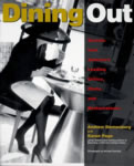
At the end of Dining Out, one of the restauranteurs points out that Americans are slowly becoming willing to pay for really good food. You can buy a chicken for $4, or a better chicken for $10: nowadays, stores can actually sell some of those $10 chickens. They taste better, they're better for you, they're probably better for the chickens and the environment. Life's too short.

And there's a place for the $4 chicken, too. Don't get me wrong: there are times when supermarket tomatoes and chicken and dried spices are just fine. It's good to have the choice.

First lesson: I bet a lot of the people who comment on VersionTracker don't do much grocery shopping. Not to put too fine a point on it, I wouldn't be surprised if most of them depend on Mom to buy the groceries.

Second lesson: In Gosford Park, there's a scene when a man whose life and marriage are falling apart sneaks belowstairs and is found by one of the servants in the pantry, seeking (and finding) consolation from a jar of the cook's wonderful, homemade preserves.

How could jam -- the stuff we buy at the supermarket -- be that good? One reason, of course, is that they didn't have fruit all the time: you got an orange for Christmas and strawberries were a couple of weeks in summer. And, probably, jam was better then -- maybe it still is, if you take the trouble and know how.

Anyway, I blew $8 (ouch!) on a small jar of blackberry jam from Stonewall Kitchens. It's pretty good.

New York Times restaurant critic Frank Bruni reports on a week as a waiter at Cambridge's East Coast Grill. It's hard work. Thanks, Megnut.

Even better on the subject is a brief chapter in Ruhlman's Making of a Chef. It's not because Ruhlman's experience differs, and it's not about the writing. Bruni's point is, essentially, "This is hard work!" Ruhlman goes further, exploring some ways an expert waiter can make the work easier by making the customer happier. A couple brings a toddler? Get the toddler a small basket of the restaurant's wonderful home-made bread right now, and ask the parent's permission; you'll please the parents and you've given the toddler something to do -- and toddlers can think of lots of other things to do that will give you a headache.

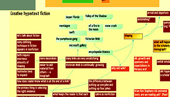
One of the first notes I derived from the prototype Themes last weekend was about the shaping of hypertexts, the way we think about carving the arc of the story from the mass of information we accumulate in research. This came up again and again -- perhaps most intriguingly on the second day in the form of a long discussion about nonfiction dialogue and its uses from Plato on down.

J. Nathan Matias pitches in, cleverly, in a dialogue with Claire Hooper on whether it's important for the author to understand the desired structure before embarking on a hypertext.

Tad Davis has a nice new Tinderbox weblog. Lots of literary goodness.

Jan 06 22 2006

Thank you!

Thanks to everyone who followed an amazon link from one of my booknotes last quarter. You just bought me these lovely books!

The etiquette of this sort of thank-you is tricky. On the one hand, you aren't supposed to talk about the dollar amounts -- in the case of Google ad words, you aren't permitted to do so. On the other hand, it seems wrong to simply say "thanks" and leave readers wondering whether they bought you a Porsche or a pastry.

A year ago, Matt Neuburg from O'Reilly took us backstage to explore how he built an award-winning help system: Creating Online Help With Tinderbox.

David Seah: Better Living Through Borscht (Thanks, Eric Scheid)

About halfway through burning my borscht, I was struck by how similar this was to creating an innovative software product. For the vast majority of development work, we can point to an existing product and say “it’s going to be like that.” Pre-existing patterns are a big time-saver. With the borscht, I only had a vague vision of a soup, but really no idea how it would come out.

On the second day of eNarrative 6 -- a symposium on creative hypertext nonfiction held at Eastgate last weekend -- Diane Greco led off with a nifty session on Craft. She gave us a nice reading list to prepare; I'll probably want it again someday.

  • Sigune Hamann, “Nothing But the Truth”
  • Sue Johnson & Thiago Demello Bueno, “My House, My Shack”
  • Michiko Kakutani, “Bending the Truth in a Million Little Ways”
  • Interview with Nicholas Christopher and Philip Gourevitch on the ethics of memoir writing 

Diane led us on a long look at Rod Coover's "Harvest" from Cultures In Webs. It's a really fine work; if you haven't read it and you're interested in hypertext, you've got a treat in store.

by Andrew Dornenburg, Karen Page

Following in the path of the pioneering and successful Becoming A Chef, Dornenburg and Page interview a broad cross-section of restaurant critics, mix them with a smattering of chefs and restauranteurs, and assemble the result into a breezy and readable exploration of food criticism.

The core argument, approached here from many directions, is that food is interesting and merits criticism, not just shopping. Food crit and lit crit have been jogging along converging paths over the past decade or so. Postmodernism argued that we were paying too much attention to whether writing and film were art and not enough attention to whether we were having fun. American food writing used to be entirely about whether we were having fun and getting value for money, and only recently and tentatively have we begun to explore the idea that dishes are constructed, that we can have ideas (and arguments) about food that are deeper than, "I don't like olives."

This volume might have been more convincing, in the long run, if it had simply assumed its conclusion and proceeded to explore the ideas. I'd like to know more about what critics would do if their editors and readers didn't get in the way. I'd like to know more precisely, too, whether restaurant critics are as influential as they believe: one critics laments that movies can survive bad reviews but restaurants can't, but nobody offers much evidence one way or another.

In The Soul of a Chef, Michael Ruhlman very gently suggests that food criticism might sometimes be corrupt; the intellectual integrity of book reviewing and literary awards is such a hot topic that it would be nice to explore the intricate issues food reviewing raises. After all, the point of the restaurant experience is to make the individual diner happy; in the theater, we can't change the script tonight even if we know there's a really sophisticated theater buff in D16, but a good restaurant is supposed to do exactly that.

What we need next, I think, is more close examination of exactly how the food business works, when it's working well. Michael Ruhlman and Anthony Bourdain are on the right track here, I think, in taking the space to show in great detail what actually happens in routine prep and service, and reminding us how hard it all is, and why.

Jan 06 19 2006

eN6 notes

What a day!

eN6 notes
eNarrative 6

Here's a picture of my raw Tinderbox notes. David Kolb's slides are here (ppt).

Update: The links were wrong. They're right, now. Sorry about the mess.

Jan 06 17 2006

eNarrative 6

Lots of great hypertext research people are converging at Eastgate this weekend for eNarrative 6: Creative Hypertext Nonfiction.

Diane Greco is in town:

It was very strange to walk into the coffeeshop where I had spent so much time complaining about writing, thinking about writing, and even sometimes actually writing, only to discover a piece of my very own writing right there on the shelf, exactly where I used to dream about finding it, someday.

I can't wait to see everyone!

by Jacques Pepin

A widely-read autobiography of a much-liked chef and teacher, this book often tells us the wrong things. Pepin is interesting because his food is interesting and because he taught us about La Technique. Here, he tells us more about being Jacques Pepin than we need to know, and writes too little about the food.

We're not here because Pepin is a wonderful fellow, though no doubt he is, nor because he's done interesting things. His wonderfulness is great, it's a bonus, but it's not the point: we're here for the food, and the food is usually squeezed between celebrity encounters, home renovations, memories of favorite teachers and students, and amusing but harmless disasters like the time the wild snails escaped.

Pepin writes a good deal about Craig Claiborne, who was the New York Times' pioneering restaurant critic and who was clearly an important and formative influence on Pepin. But the focus is not particularly on the idea of food, even with Claiborne; when we hear of the big meals they made together, the emphasis stays on what fun the meals were, not on the idea of the food. In fact, Pepin rarely discussed food with anyone in this book. Pepin's portrait of his last meeting with Claiborne is literally heartless, an unsympathetic surface impression of a dying man who had once been Pepin's friend. What really went wrong between Pepin and Claiborne would be interesting to know, but it's not here.

Pepin is at pains to remind us that the food business is a business, but he seldom follows the money in any but the most familiar ways. He opens, and then closes, a restaurant, recounting the anecdote as his wife's discovery that running a restaurant chains you to the work. This isn't news. Surely, they asked themselves whether they could hire people and free themselves sufficiently, rather than just abandoning a thriving business. The calculus that led the Pepins to reject the idea would be interesting to know, but it's not here.

Jan 06 16 2006

Hypertext 3.0

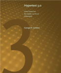
Eastgate just received its first shipment of Landow's brand-new Hypertext 3.0.

It's big, fresh, and full of changes since Hypertext 2.0 . Lots of new Web stuff, as you'd expect, but it looks like there's a lot of new discussion of electronic poetry, spatial hypertext, and new trends in hypertext education.

I'm looking forward to this one. Eastgate has some signed copies...

Kent Newsome speculates on why it's impossible to build a new blog in 2006.

The very large majority of the most successful blogs out there have one of three things working in their favor.

1. They got there first and filled an empty space...

2. They have a unique platform that almost guarantees them an audience. If you are the representative of a larger company, especially one that is a player in the blogosphere, your audience comes pre-packaged...

3. They get help from other established bloggers...

Tom Webster (VP of the polling organization, Edison Research) has a pair of fascinating notes:

  • Problem Solving With Tinderbox
  • More Problem Solving With Tinderbox
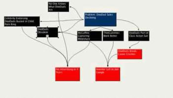
'I use Tinderbox for problem solving because it allows for divergent and convergent thinking on the same canvas. McKinsey alumni would call this making a "logic tree"--you start with one problem or concept, then break it down into all the possible reasons or issues that comprise the problem (that's the divergent part
, continuing to branch until each issue has been broken down to its core components.')
Problem-Solving With Tinderbox
Jan 06 14 2006

The 50msec Myth

A study by Gitte Lindgaard in Behavior and Information Technology found that a mere 50msec glimpse of a web page is sufficient for readers to form a judgment of whether the page is visually appealing. Writing in the pop section of Nature, Michael Hopkin asserts that this means that you'd better make a favorable impression right away if you want Web surfers to buy from you.

Of course, says Caudron, the other golden rule is to make sure that your web pages load quickly, otherwise your customers might not stick around long enough to make that coveted first impression. 'That can be the difference between big business and no business,' he says.

Well, no. The study described here does not demonstrate the claimed effect, and there's excellent reason to doubt the claimed effect exists.

First: there's no news here. We've known for a long time that people could perceive a single film or television frame well enough to gain an emotional impression: that's the point of subliminal advertising. If subliminals work, then surely people will notice blocks of color and composition in web screens.

Second, does visual appeal lead to lots of sales? Take eBay. The eBay home page is ugly -- everyone knows this. I guess that's because eBay is making so little money that they can't afford to hire a designer to improve their use of color? Conversely, do appealing sites lead to hot sales -- making Mark Boulton, say, a tycoon?

Visual appeal is nice. Findability is nice. Structure is nice. Clarity, brevity, and sincerity -- all nice. But they're all secondary.

You can compete on price, or service, or quality. If you're in a tie, the visual appeal of your web page (or of your salesperson) can make a difference. To argue that visual appeal is the dominant factor in web commerce is to assume that people are stupid, that they make snap judgments based on tiny glimpses of the page and act on those judgments against their best interest. It can happen: people make mistakes. In my experience, though, the audience is smarter than you.

The way to do a lot of business on the Web is to offer people things they very much want to buy, at a price they're thrilled to pay.

(Thanks, Peter Merholz, whose comments on the rapid appreciation of genre strike me as more interesting and useful than the study.)

Akscyn's Law, known since 1987, says that link traversal should take about 250msec. If link following is slower, people are distracted; if faster, people sometimes don't notice that the page has changed. Almost all web links break Akscyn's Law, because network latency and page rendering usually require more time. People don't like this: the popuarity of faster connections and faster browsers, and the use fetch-ahead tricks like tab browsing, are user efforts to get closer to Akscyn's Law. But it hasn't kept people from using the Web. Back in the dialup era, people were happy to wait ten or twenty seconds for dancing hamsters.

New on Notes About Notes: John Stephan writes about choosing a fountain pen.

Tony Maw, chef of Boston's ever-so-hot Craigie Street Bistro, has just started a "monthly blog".

A monthly blog is a bad idea. The point of a weblog is constant renewal, which attracts constant attention. In his first article, Maw lists nine or ten of his favorite cookbooks; instead of serving them all on a platter, Maw could have doled them out across nine posts. That would be just as interesting, and the email generated by early posts -- and remarks from diners -- could easily feed into subsequent writing. I'd also love to hear occasional news from the kitchen: the arrival of notable produce, or the way the crew handled an unexpected crisis.

This detail of execution aside, it's a promising start. Maw should meet Heidi Swamson from 101Cookbooks!

Heidi Swanson samples her new stovetop smoker. I've had a smoker on my list since Sydney, where I ate some wonderful smoked ocean trout.

Swanson's piece is especially interesting because she's a vegetarian. Smoked salmon, smoked turkey, smoked sausage -- they're all out of bounds. But these, surely, are the foods that people interested in smokers are most eager to read about! She compensates brilliantly with a catalog of things that would be great to smoke, and finds a way to smoke them all. Notice, too, how she casually explains why the recipe is the way it is:

Your vegetables and tofu are probably well cooked at this point but not really looking their best. Now it's time to give them some color and crust.

This sort of information is now ubiquitous in the best food writing, but it used to be quite rare. Just ten or fifteen years ago, you might have six or seven recipes, each proposing the same steps, but without motivating the sequence. Julia Child does this occasionally; I suspect that Cook's might be responsible for its current ubiquity, but I may well be wrong.

Eastgate's just received a batch of inspiring and intriguing objects from architect/designer Ted Naos.

Naos

These are decks of colored, die-cut cards with a plastic stand that doubles as a case. Here, you take a card from somewhere in the deck, drop it in front, and your whole perspective changes.

I think this could be an interesting approach to hypertext narrative. For example, attach an evocative passage to each frame. (For bonus points, use the Bob Coover's technique from McSweeeney's 16 and have each card end in mid-sentence, with the sentence continuing on the next card) Or, build silhouettes of your own fictive world. Or, contrive ways that interior cards disclose part of an incident that changes meaning with you see other parts, making an extremely interesting comic. (Flash is the obvious tool for this, though HTML/png/CSS could work nicely, too)

Eastgate's got a set of three decks. Street Architecture (above), Gateways (which looks at doors and entrance devices), and Color Game (which is completely abstract).

get it!
Ted Naos Collection. $27.95

You can always remove it later.

by Francis Davis

A sweet tribute and a pleasant interlude, this slender volume presents an extended interview with Pauline Kael. More accurately, it's the record of a conversation between Davis and Kael, old friends meeting and talking but always aware that Kael's illness meant this might well be their last good talk. Kael is lively and blunt as ever, and it's great to have even a sentence or two about the recent films she'd seen since Parkinson's forced her to give up reviewing.

Kael's influence on film criticism is obvious, but her influence on the broader culture needs, I think, a fresh and considered examination. On one hand, you could argue that she was a talented writer with a visible, influential job. But she may have been much more: in approaching all kinds of media, today, we're all either Paulettes or self-consciously reactionary essentialists. We start by asking, "Am I responding to this?", without regard to whether we're looking at pop or punk, whether we're reading a novel or witnessing performance art, and the canon is just a component of that response. Or, we force ourselves to start from the nature of the medium. But after Kael, we have to force ourselves; before, I think, it seemed natural. Determining whether Kael's role here is as central as now it seems will require some patient scholarship and some prudent judgment.

Jan 06 12 2006

Pen Passion

Data point: I've received a ton of mail about fountain pens. There's lots to know! I'm going to try to condense some of the information for Notes About Notes, rather than endlessly updating here.

The page is up.

It's interesting that so many computer folk are interested in fountain pens!

by Dan Simmons

This 700-page, Hugo-nominated adventure of the distant future is packed with incident and invention. We have old-style humans on earth, we have post-humans in the earth's rings, we have robotic cyborg intelligences called moravecs mining Jupiter and discussing Proust and Shakespeare among themselves. On Mars, we have little green men. Somewhere, we have a vast reenactment of The Iliad unfolding on the plain of Ilium, with real blood and real gods and with everything witnessed by a team of reincarnated classics professors.

At the end, the characters agree that they're eager to discover what happens next -- presumably, in the second volume.

Jan 06 11 2006

Duck Battle

On Tuesday, I bought a duck. It cost $15, because it came from the Cambridge Museum of Fruits and Vegetables. I got it home, unwrapped it and chopped it up. I seared one breast, let it finish in the hot oven, and served it with balsamic-cooked peppers.

On Thursday, I grabbed the other breast, sauteed it, and served it on top of leftover butternut squash risotto, fried up as a risotto cake and paired with some roasted carrots and string beans.

This weekend, I'll season the legs, wrap them tightly in foil, and cook them for several hours to make duck confit, finishing them before serving by crisping them in a dry nonstick pan over moderately high heat, seven minutes a side.

And, if I'm good, I'll also find time to use the carcass to make a batch of duck soup.

Bottom line: we got three dinners -- maybe five if I manage a big batch of soup -- from the duck. The duck is an indulgence, but then so were the meals; these weren't "oh, leftovers" days. It does make me feel a little like iron chef. Paper chef?

Proxima Nova

I like to try new fonts from time to time, and Typographica's annual Favorite Fonts essay is always a nice opportunity for a little font shopping.

A new font that works nicely in Tinderbox maps is Proxima Nova.

When I first posted this, I wrote Proxima Sans. Michael Newman swiftly caught the blunder. Yes, I mean Proxima Nova, SImonson's 2005 font, and not the older Proxima Sans. But, if you're on a budget, Proxima Sans might be a good substitute.

Kyle Hildebrant says, "It nestles neatly in a place between the geometric, grotesque, and gothic." It's clean, fresh, and legible.

Jan 06 9 2006

Fountain Pens

Who writes well about fountain pens?

I'd like to know more about pens -- what a good pen is like, and why I might want one. I'm not interested in nostalgia: I'm way to young to remember a world without ballpoints. And I'm not interested in pens as jewels or brands.

Email me?


Pens people mentioned:

  • Rotring
  • Waterman Phileas
  • Lamy Safari
  • Namiki Falcon

Resources

  • Pen Hero
  • Pens 101
  • Stylophiles Online
  • Richard Binder
  • Joon of New York
  • Ink Sampler
  • PenTrace
  • Rambling Snail
  • Penoply
  • MarcusLink
  • Pen Lovers 
  • Fountain Pen Network Forum

Thanks to Michael Sauer, Alwin Hawkins, Johndan johnson-Eilola, Fazal Majid, and Rob McNair-Huff.

Jan 06 8 2006

Stuff Happens

Stuff Happens

An interesting return request crossed my desk the other day. A young woman, it seems, had ordered a Florentine journal as a gift.

The journal had proved entirely satisfactory, but the boyfriend had not: could she return the journal?

The answer, of course, is yes. There are limits to what we can do, but it's nice to be able to make bad things a little less bad.

This morning, I stopped by my physician's office. They've relocated "visitor parking" to a more distant lot, so the employees in the medical office building have better parking spaces. The signage is rude, which did not improve my mood.

I was there to get bloodwork for my physical, which takes about five minutes, and since I was so cheerful (and so full of no breakfast) I thought I'd just park in the adjacent Brigham's, get my oil checked, and then treat myself to some nice french toast.

Nothing doing: Brigham's has hired a guy to stand in the parking lot and tell people they can't park there.

So I ended up spending my money at Carberry's, an upstart upscale coffee chain, instead of the traditional homegrown Brigham's, a franchise that's been gradually contracting for as long as I can remember.

What they should be doing, instead of hiring someone to chase away customers, is finding a way to exploit the bad parking situation to get more and happier customers. The real kicker is that this Brigham's is The Brigham's, the one located at the corporate office. So it's not the whim of some junior assistant manager; the whole company, apparently, has forgotten that they're in the hospitality business.

Jan 06 7 2006

Flint

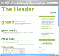
Flint is a new Tinderbox Assistant. It makes weblogs (and similar frequently-updated sites) in a variety of flavors, with lots of nice integration with Web services like flickr, Google, and del.icio.us.

Flint

Flint makes weblogs in a variety of flavors. The thumbnail to the right is the Green Theme.

The point of Flint is that it's a big box of cool tools, interchangeable parts ready to plug into your weblog. Take the green theme. Want something like it, but red? Just change the colors! Want a different layout? That's easy, too. Lots of pluggable parts.

It's not as easy as the free services -- we can't compete with free! But Flint is flexible and Flint is yours. Want to add a new kind of service to Flint? You can do it yourself. Want a new theme? Just do it.

(We're here, too, to help integrate the best ideas and newest technologies back into the Flint core. Yesterday, Alwin noted that Flint doesn't generate Atom feeds. Today, it does. Thanks!)

Alwin Hawkins pulls everyone up short in the discussion about links and hierarchy. Dave Rogers' underlying complaint, at least in part, was that Searls and Weinberger put to much faith in technological determinism, in the belief that technology can change things.

Technological determinism is wildly out of fashion in many circles, but Alwin reminds us that, in the end, it's self-evidently true:

Cancer isn’t the slayer of powerful young athletes anymore. Back when I was a kid we got Gale Sayers and Brian’s Song, now we have yellow bracelets and Lance Armstrong. My mom looks around the exercise pool and looks at all the folks exercising who have had cancer. Why aren’t they all dead? Why do they feel like they have time to hang out toning up and slimming down? Why aren’t they out enjoying that last meal, that last drink, that last smoke? Because they are all too busy living. Because of technology.

Ditto cardiac disease. Bypass surgery adds years to careers and vitality to lives. We operate on their hearts without placing them on bypass, without stopping the heart, sometimes - with robotic assistance - without cracking their chests. Or we just drop a little wire basket inside the vessel and stretch it open, crushing the debris along the sides of the walls. Heart attacks aren’t considered a show-stopper that forces retirement, just a warning shot to shape up your act so that you can see your new grandkids graduate from college.

Talk about show stoppers, you couldn't ask for a better argument in favor of technological determinism.

Cass McNutt has a weblog on Thought On Thinking; today, he's thinking about Douglas Johnston's DIY Planner, mind mapping, and visualization.

Last night, we started with mushroom soup. The Museum of Fruits and Vegetables had crimini's at $2.98/lb, so I grabbed a light pound of mushrooms and simmered them for 45 minutes with a diced onion (sauteed until soft) and a quart of veal stock. Into the food processor, reheat, salt and pepper, and finish with 2oz of sherry and a dollop of sour cream. (SUBTITLE: return to The Magic Pan)

For desert (wow! desert!) it was back to the incredibly simple, wintery fruit tarts. This time, I sliced 3 bananas and tossed them with 2T sugar, a splash of rum, and a splash of vanilla. 30 minutes in a 400°F oven, and we're all set. (Don't work to serve this hot from the oven, because I did and the tart was too hot. Let it rest 30 minutes.)

by Jonathan Harr

This novelistic account of the rediscovery of The Taking Of Christ clothes an unremarkable academic quest in the trappings of genre fiction. Harr's account is vivid, colorful, and full of character and incident. His care to avoid discussing anything his characters did not then know, while it lets us share the thrill of discovery, prevents him from explaining much about the work itself or about the course of its rediscovery.

Early on, for example, the point-of-view characters -- then Italian graduate students -- commit a breach of manners and (probably) of ethics, disclosing confidential information to their thesis advisor and then publishing that information, with their advisor, in a scholarly journal. This seems a remarkable breach, but because the students doubtless didn't immediately understand how serious it was, Harr can't really discuss the episode or its consequences beyond describing the immediate emotional impact.

The novelistic pleasures of description might justify passages that seem more likely to be imagined than remembered. Harr knows about the sunlight on the rooftops, the gestures of the expert academics, and the menu at dinner when it suits the needs of pacing and color. It makes a good story, but the details are often so convenient that they make us distrust the narrator. Does he really know this?

It's merely a matter of style. On the whole, I prefer to take my history straight.

Scott Price's mouse broke, so he tried using a Wacom pen he'd set aside. He found it worked better than he expected for Tinderbox and FileMaker:

But they've really improved the drivers, and this time I was forced to use it long enough to get used to it. And I won't go back soon because I'm really enjoying the physical sensation of using a pen for my text-work. It's thrilling to drag windows around with the pen like I'm drawing, and it feels so right to make a highlighter motion over text, then drag a link-arrow (in Tinderbox) from the text to another note to make a link. I made the main button on the pen into ctrl-click and it feels like I am really grabbing links and icons and pulling the contextual menu out of them.

A nice (temporarily?) free font that seems unusually well designed, and also seems useful in to Tinderbox (especially at a titling font): Yanone Kaffesatz.

Kaffeesatz Thin

Want to hire better technical workers? One key is to understand yourself what the job entails! A Test Guy describes how he used Tinderbox and Johanna Rothman's Hiring the Best Knowledge Workers, Techies & Nerds to help pin down exactly what he needed.

I used Tinderbox to compose the job analysis, so now I have a 2-dimensional color-coded map of the relationships between the various aspects. When Tim and I review the descriptions, we can go back to the Tinderbox document and see what other aspects are near the stuff we change, helping up propagate our changes fully and maybe pointing out other changes we might want to make.
Notes About Notes Updates

New in Notes About Notes: Information Triage and Commonplace Book.


Dave Rogers replies that, in a hierarchy, you might have many superiors. I meant, of course, that in a hierarchy you have exactly one immediate superior. Rogers then goes on to assume that the weblog ecology contains multiple interlinked hierarchies; this admits the point he is arguing against. Hierarchies have no cycles; hypertext links among weblogs demonstrably create cycles; therefore hypertext links among weblogs do break hierarchies. The Cluetrain assumes this matters a lot, Rogers assumes it doesn't matter much, and we're no further along than we were when we sat down at the table.

A sequence is not a hierarchy. Take a bundle of blogs: we can easily order them by traffic. We can order them by revenue. Does that mean it's a hierarchy? Nope. Does this mean weblogs have made traffic or revenue less relevant? No.

If we look at the blogosphere as it is, there's good reason to believe cycles matter. The power of the Fifth Rule -- Find Good Enemies -- is all about subverting hierarchies. Would Mark Pilgrim have nearly as much traffic without Dave Winer? Would Adam Curry? And don't Pilgrim and Curry send a lot of readers to Winer, directly and indirectly? I think it's likely that the friction among these weblogs generates traffic for all of them.

Same thing in the political blogosphere. Kos and Talking Points build attention together -- both when they agree and when they differ. Neither of these sites agrees often with, say, Andrew Sullivan, but when Sullivan does something dramatic, the commentary builds attention for everyone. Sure, they're competing, but their opponents make each of them more effective in the competition.

What would Buffy Say? "it's all about the power. Who's got it it, and who knows how to use it."

Update: Dave Weinberger.

Peter Hertzmann discusses good ways to plan meals for your guests that will amuse and entertain them, but won't leave you frantic in the weeds. Le Plan de repas also has a great Tinderbox idea:

I keep a simple list of everyone who comes to my house for a meal, when the meal was, and what was served. I feel that since I can prepare hundreds of different recipes, why should I serve the same dish twice to the same person? My guest list also provides a list a past meals served so I can easily serve the same menu to different guests, if that is what I wish to do.

Another great reason to write it down: you can keep track of what you've already cooked.

Doc Searls, in his New Years wish, asserts as fact that

Hyperlinks subvert hierarchy, Dr.Weinberger has been teaching us, since long before he installed that fact as a thesis in Cluetrain. I love that.

Dave Rogers responds, with some irritation, that Doc keeps asserting this fact even though it appears to be false.

Doc, for the umpteenth time, hyperlinks to do not subvert hierarchy. In fact, they help establish their own hierarchies. They may help overturn existing hierarchies, they may increase the rate of 'churn,' but as should be abundantly clear by now, human beings are all about competing for rank in a hierarchy and hyperlinks are merely another tool.

First, let's drop this term "hyperlink". It's not a hyperlink: it is a link. All hyperlinks are links, and all links are hyperlinks: the prefix is mere showing off.

Second, let's be precise. Do links subvert hierarchy? If we take "hierarchy" literally, links do subvert hierarchy. In a hierarchy, every member has one superior, any member may have multiple inferiors, and there can be no cycles: my superior is also superior to all my inferiors. That's what hierarchy means.

Now, links can and do break this structure. My master the Duchess is not subordinate to my footman, but her grace is free to link to my servants and my servants are free to link to her. Cycles happen all the time: they are the atoms of hypertext structure.

Does this mean we can't find power imbalances in link networks? No! Does this mean we can't find de facto hierarchies, or construct spanning tree, of hypertexts? Certainly not: you can always find a spanning tree in any connected graph. That's mathematics.

Dave Rogers concludes with an appeal to the better angels of our nature.

If we want a better world, a "cure" for high school, we don't require better technology, we need to work on being better people.

But he begins by denying the possibility, taking the side of inherent human nature:

Human beings are all about competing for rank in a hierarchy and hyperlinks are merely another tool. Technology changes how we do things, it doesn't change what we do.

Technology does change what we do. I drove to work; without a car, I couldn't do that. I flew, last year, to Sydney and Melbourne and Salzburg and Brussels; without planes, I couldn't do that. I'm writing this note, this morning, to a few thousand people who happen to enjoy reading about hypertext technology here on this page; without TCP/IP and HTTP and Tinderbox, I couldn't do that and you couldn't, either.

  1. Searls is right: links do break hierarchies.
  2. Searls is wrong: there's no evidence that these links don't simply form a new hierarchy -- or even recreate the old one -- although there's no particular evidence that they do.
  3. Rogers is right: people compete, nothing changes that. And he's right to point out that asserting a politically-desirable conclusion does not constitute evidence.
  4. Rogers is wrong: technology does change what we do. Moreover, appealing to people to work against their competitive nature to become better people is not, in the end, a better-established strategy for building a better world than creating better tools and better things. Food and shelter and art and science are good things, and we know we can make them; whether working "on being better people" will prove efficacious is open to doubt.
Dec 05 30 2005

TinderPod

Benoit Pointet offers a set of Tinderbox Templates for iPod Notes.

Guy Kawasaki, who invented software evangelism and played a crucial role in Apple's renaissance and who is now a VC, has a new weblog.

Recently, Kawasaki complained that most of the PowerPoint presentations he sees are bad. And since he's hearing polished and important presentations on which millions of dollars of investment depend, these are probably a lot better than the presentations at your average trade show or faculty meeting. His prescription:

  • 10 slides
  • 20 minutes
  • 30 point type, and larger
Presentations

The ten slide rule is wrong. No, you don't want to cram too much into a talk. No, you don't want to overwhelm the audience with detail. But two-minute slides are far from ideal.

  • In two minutes, the audience has time to be bored by your slide. They can critique it. They can critique you. They can reflect on what you're not telling them. They can poke holes in your metaphors. They can look around the room to see who else is doing this.
  • If you have only ten slides, each slide needs to cover a lot of ground. One slide for the problem your business addresses, one slide for the technology, one slide for sales and marketing.
  • It's hard to design a visually compelling slide for broad, abstract topics like "our planned sales and marketing strategy".
Presentations

All things being equal, take your 2-minute blue-gradient slide and break it up into five or six small slides -- none of which will be on screen for more than 20 seconds. Most slides need only a headline. A few can have a headline and two or three bullet points.

And that gives you space as well for visual information -- for emotionally rich but hard-to-discuss information about your company, your products, and your ideas. You don't have to talk about the visuals; they'll explain themselves.

The 30pt text? Too small: 30pt is the fine print. Avoid small type on the screen; it's ugly and hard to read, and it tempts you to read your slides. 64pt headlines are fine, 96pt is better.

Better yet, when presenting to small groups who speak your language, consider dropping PowerPoint entirely and work from your Tinderbox map and notes. Crank up the magnification and the font sizes, dial back the colors, and you have an effective presentation tool that lets you adapt your presentation easily, right up to the last moment. PowerPoint and Keynotes are for keynotes -- fixed and formal presentations to a big audience.

You've been cooking up a storm, right? It'll be February before the kitchen is really clean again. The last thing you want to think about is a tart.

Don't think! Act!

Get some dried apricots. That's right: dried. You need 20 or 30. Throw them in 2c water, and leave them overnight in the refrigerator. Then, preheat your oven to 400°F and grab one of those refrigerated pie crusts you can buy at the supermarket. Unroll it on a baking sheet. Having reserved some of the water in which they've been soaking, drain those nice, round little reconstituted apricots (who knew?) and put them in the middle of the crust. Sprinkle with lemon juice, 3T sugar, a little vanilla and cardamon. Or kirsch. Fold up the edges of the tart. Don't be too facile: this is a rustic winter tart, it's supposed to look that way.

Pop in a 400°F oven for 40 minutes. If the fruit looks a little dry, sprinkle some of that reserved apricot water. Service with a small dollop of sour cream.

While googling, I saw a reference to a coulis of salt-roasted apricots. Do you suppose you could do that with dried apricots?

It turns out that you can reconstitute apricots just like mushrooms, to surprisingly good effect. Sally Schneider says that California apricots are more consistent than Turkish; I had Turkish on hand, and three of the apricots did seem soggy. They made a nice afternoon snack.


Update: Fazal Majid writes,

In my parent's hometown of Hyderabad, India, they have a traditional dessert for Eid called "Khubani ka mittha". It's a compote of reconstituted dried apricots, preferrably from Afghanistan, topped with whole almonds and malai, a very thick top cream from buffalo's milk.

Today's instalment in Ebert's Great Movies is My Fair Lady, and he is in fine form.

It is unnecessary to summarize the plot or list the songs; if you are not familiar with both, you are culturally illiterate, although in six months I could pass you off as a critic at Cannes, or even a clerk in a good video store, which requires better taste.

And, deliciously,

That Hepburn did not do her own singing obscures her triumph, which is that she did her own acting.

This page is currently rendering poorly in MSIE/Mac and OmniWeb. It's one of those box model gotcha's.

I can't quite figure out where the problem is. Updating your browser will help, but you already knew that.

If you happen to enjoy CSS challenges and you can figure out the issue, I'll be happy to give you many huzzahs.

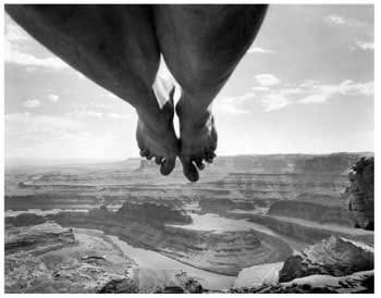
We spent the afternoon of New Years Eve at the Decordova, seeing a huge collection by Finnish photographer Arno Rafael Minkkinen. Minkkinen travels all over, and then takes pictures of himself nude against the landscape. The images are often elaborate visual puns -- feet over the abyss, or head underwater, or quotations from Adams or Stieglitz with a bit of the artist's anatomy thrown in for good measure. Others are experiences in themselves, like the series of the artist lying on snow and ice.

Minkkinen

Minkkinen, interestingly enough, keeps elaborate notebooks in which he sketches what he intended to do with each image. Often, the image won't actually do what he wants -- he concocts these spontaneously, he doesn't travel with a crew, and so things don't always turn out quite right -- so the sketchbook reminds him of things to try again, somewhere new.

Minkinnen is hard on himself -- he seldom shows a lot of the body, and when he does, it's often an uncomfortable body -- which may be one reason I found his occasional figures studies of women in the landscape made a pleasant change.