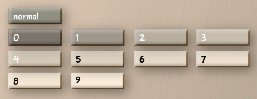
I am at Friday night dinner, and I am somewhat glum because on Thursday I spent too much money fixing my car and though they repaired brakes and locks and belts and bearings, they apparently overlooked the part of the exhaust that breaks on the way to dinner. And perhaps I am not holding up my end of the conversation because the Kitchen Therapist, our hostess, pointedly asks how Tinderbox Six is progressing and on what exactly I am working.
“I spent most of the afternoon choosing the right shade of gray to distinguish the selected tab, and arranging for the window to cast a subtle but evident shadow on all the tabs except the selected tab, and arranging for the selected tab itself to cast a shadow on its neighbor.”

“This is what you do?” asks the Business Professor. “The whole afternoon?” And I am hearing again my Uncle Fred, who said computers were a pursuit unworthy of anyone capable of being a surgeon. And I hear my own defensive crouch – that there were six or seven other bugs that got fixed, that one European scholar wanted me to make screen shots for her thesis and another student needed handholding to install a $25 hypertext and that nobody else is going to do this stuff if I don’t. And someone ought to, because learning to understand hypertext really matters. Besides, those shadows are tricky and require two completely different mechanisms because one is drawn and the other is part of the layer composition stack. So I say nothing.
“It’s the part he thinks will interest us,” my wife covers for me. “The part we’ll understand.” But it’s not that, or not just that. I’m sweating these tabs – again – because so many people insist on UI polish and hardly anyone seems very interested in underlying ideas. I’m sweating them because of what I overheard backstage:
It's very difficult to tell which tab is in focus, which makes it very difficult to switch from Outline, to Map, to Chart, to Attribute Browser.
I’m sweating it for the guy who just wrote to explain that he put off buying Tinderbox for six years because the default appearance had too many bevels and shadows. I am not picking on these folks. They are not wrong. The backstage crowd has found 157 issues, more than half of which have already been fixed, almost all of which got past the Eastgate insiders, and Tinderbox Six is already vastly better than it was a couple of weeks ago.
I’m sweating the tabs again because it seems these days that every new bit of user interface is reviled first by the pundits and then by the cool kids, and then by my old pal Jakob and the Wall Street Journal. After that, if the product makes a lot of money anyway, the design was always self-evident genius, and if it doesn’t, you’re an idiot engineer who doesn’t care about users and requires adult supervision. Engineers and scientists believe this, too: the president of RISD just tweeted approvingly that “as designers and engineers in general, we’re guilty of designing for ourselves too often.”
Meanwhile, the people at CHI and ACM Hypertext perform carefully controlled studies that sometimes influence other carefully controlled studies. I can’t remember that last time someone sent me a CHI paper and said, “try this!’ I can’t remember the last time I came home from Hypertext eager to build someone’s new idea into my system.
There’s a lot to think about when we think about our notes, which is to say when we think about how we think things through. Complex ideas lie behind Tinderbox and Vesper, Evernote, Scrivener, wikis, and VoodooPad. We don’t talk about the ideas, we talk about the tabs. There are new ideas to try. Just for Tinderbox, and just off the top of my head:
- richer reasoning about time and language
- representing change and behavior; understanding networks of agents
- separating representation of type from inheritance of behavior
- accurately reporting syntax errors
- integrating javascript behaviors
- revisiting adornments vs. containers
- designing documentary environments that last for years or decades
- balancing visual and symbolic media
- the consequences of Spuybroek’s “sympathy of things.”
But we don’t talk about those around the dinner table or across the conference table. We don’t talk about that stuff; we mostly talk about tabs and icons, bevels and borders, freemium schemes and iOS vs. Android and how about those Cubs.
There’s work to do. It’s not really so difficult to click that tab. There are people to feed, art to make, science to discover, sickness to cure, a climate to preserve, and winter is coming. But here we are again. talking about tabs and shadows.
Happy Birthday, Aaron.


