Tinderbox 4: Containers
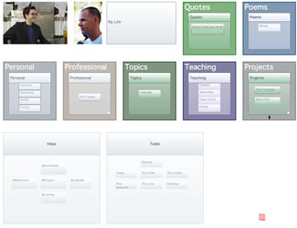
Here's a Tinderbox 4 container, seen in a Tinderbox map. The container has some subtle improvements, perhaps worth a brief comment.
- You can see more detail inside the container. Notes in the container are drawn larger, and with more information, than in previous versions. (The InteriorScale factor is an attribute, so you can adjust it for different kinds of containers to meet your needs)
- The prototype tab appears beneath the container, and tells you what kind of prototype the container uses. Right-click the prototype tab for a menu of alternative prototypes. No prototypes in your document? No prototype tab.
- The link widget (bottom center) is prettier, and easier to grab.
- The handling of gradient patterns is new, and (I think) nicer, than in previous versions.
All of this is UI detailing. I think we all tend to talk too much about details of fit and finish, because these are so easy to explain and everyone's an expert. In general, pixel tweaking doesn't get much work done.
The point here, really, is to find ways to help people make lighter, quieter maps that remain clear and meaningful. By encouraging gentle contrasts and mild gradients, Tinderbox 4 helps make maps more meaningful through small changes. And, when you really need to emphasize something, subtler maps make the occasional bright red alert really stand up and shout.
