Tinderbox 2.4 and colored outlines
One of the interesting changes in Tinderbox 2.4 is that the text of outlines is now drawn in color.
Previously, Tinderbox kept the text black, because black text is more legible. Tinderbox is a work tool -- we want to get things done -- and color here seemed likely to get in the way. This is especially true if you use maps a lot, and choose low-contrast color schemes for your map view; those creamy tans and grays that look great in your map will be hard to read in the outline!
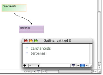
The compromise solution is to add color to outlines and to extend a preference that asks Tinderbox to darken all the outline colors. So, if you have a contrast-rich color scheme, everything is well. If your map is full of pastels, you can darken the outline, still have some color information to help you analyze your notes, and not lose legibility.
Color is much more useful in Tinderbox than I'd have expected when we originally designed it.