Color Scheme
Setting up my notes for Blogtalk Downunder, I made a fresh Tinderbox document with a few handy prototypes. Because I might want to show this to people, I wanted the document to look nice -- and to be easy to read. So, I set the map font to Copperplate Gothic, and I modified the color scheme with a few samples from yesterday's snapshot of the opera house.
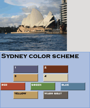
Recently, I read a color theory article in the graphic design space that proposed, when you're stuck, just grab some colors from a photograph.
One fun thing about Tinderbox: you can redefine what sort of red that "Red" is.