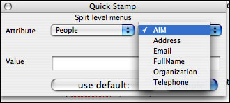
Split level menus
Each Tinderbox note has a big bundle of information -- metadata -- that keeps track of the note, its source, and its presentation. The information is organized as a simple list of attributes and values.
Title:Grocery List
Text:skim coffee, lamb for stew, wild mushrooms...
Color: light gray
BorderColor: red
Height: 2
....
The list of attributes tends to grow, and right now it's growing quickly. For example, Tinderbox now understands the standard vCard format for personal information, and that leads to new attributes like Email, FullName , and Telephone.
In fact, the list has become so long that it's unreasonable to ask people to find and select an attribute from a menu. But sometimes you need something like a menu; you certainly can't ask people to remember the names of all those of attributes!

Right now, we're experimenting with a two-level popup menu. The first menu offers a selection of kinds of attributes -- Map, HTML, People, TextFormat -- and the second menu lists the attributes in the chosen category. I don't like the design much, but it does seem much nicer than the long, long menu we've used in the past. Do you know of good, compact alternatives.