Maps
The new Tinderbox maps have some interesting new features. These may seem to be prettification (or chart junk), but I think you'll find they make hard-nosed sense.
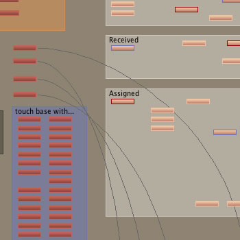
Here's a working document I'm using for medium-term TEKKA planning, using the new Tinderbox 2.3 features.

- This is a custom color scheme; I like to use different color schemes in each Tinderbox task, so I can more easily remember what I'm doing if I'm interrupted.
- I don't have much color sense, so I enjoy books that suggest nice color schemes. Tinderbox 2.3 lets me enter colors as RGB codes right out of the books, and also gives me better access to the color pickers.
- Most of the notes have borders. Border style, thickness, and color are now attributes. Here, borders tend to represent subtypes. Light-colored notes are articles and article ideas. Blue borders distinguish reviews, red borders distinguish fiction. These get inherited by prototypes (or assigned by agents), so they're no extra work.
- The notes have gentle gradients. Again, this gives agents and prototypes additional degrees of freedom. Secondary color and gradient style are attributes, too, and so they're easy to manage.