Designing A Conference With Tinderbox
At the close of Web Science 13, conference chair Prof. Hugh Davis said some very kind things about the construction of the program. During the final deliberations, he was in Southampton and I was in San Francisco. When we made the final decisions late in the Southampton evening. it seemed we had a big bundle of ill-assorted papers. When Hugh awoke the next morning, all the papers were neatly sorted into sessions and assembled into a draft program.
Though Tinderbox isn’t designed for this task, it turns out that Tinderbox does it quite well. I’d like to walk through it in some detail — perhaps too much detail — because the task is itself not uncommon or unimportant, and because lots of other scheduling have similar properties.
The Nature Of The Problem
You never have enough time to plan the program for a peer-reviewed conference.
On the one hand, the deadlines for submitting papers and for submitting peer reviews need to be as late as they possibly can be. You want the latest results at the conference and the best results of the moment – not the best of last year. These days, researchers tend to submit late, and reviewers are even less punctual. While it’s possible to take a firm line with authors, reviewers have the upper hand and they know it; they’re important and busy people and you need their reviews more than they need you.
But once the reviews are in, there’s lots of pressure from the other end to have a final program. The Proceedings Chair wants the list of papers, yesterday. The Publicity Chair needs a program to publicize. The Powers That Be are always very edgy at this moment; they’ve committed to almost all the conference expenditures at this point and they’re terrified that no one will come. It never fails: the grizzled and ultra-competent Professor who has done this dozens of times before will, inevitably, wake up at this point in a cold sweat and email everyone to demand a finished program right away.
What You Can Do In Advance
In the nature of things, the Venue and the Powers That Be will dictate the shape and duration of your conference. For this conference, these constraints included:
- A tradition of a single track, without parallel sessions
- Three days (plus workshops, which Claudia Roda handled so adeptly)
- Two fixed keynotes, shared with other conferences, that cannot be moved
- Our own keynote and a plenary panel, also fixed by the speakers’ other commitments
- We’re not buying lunch, and this is France; we need to allow plenty of time for a lunch break.
- The opening and closing times of the auditorium (typically constrained by local regulations or work rules)
Now, other conferences have different constraints, and some of these constraints might be finessed. Computer Science conferences, for example, never have evening sessions. Biochemistry conferences do, and that’s an arrow for our quiver if we need one.
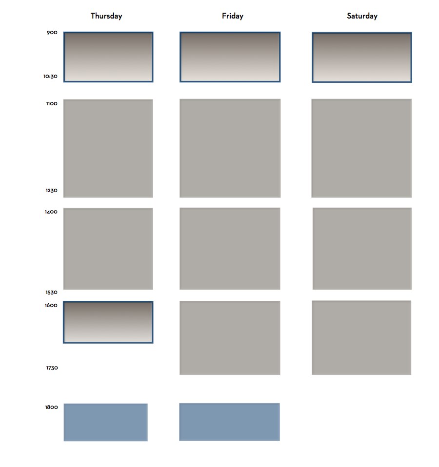
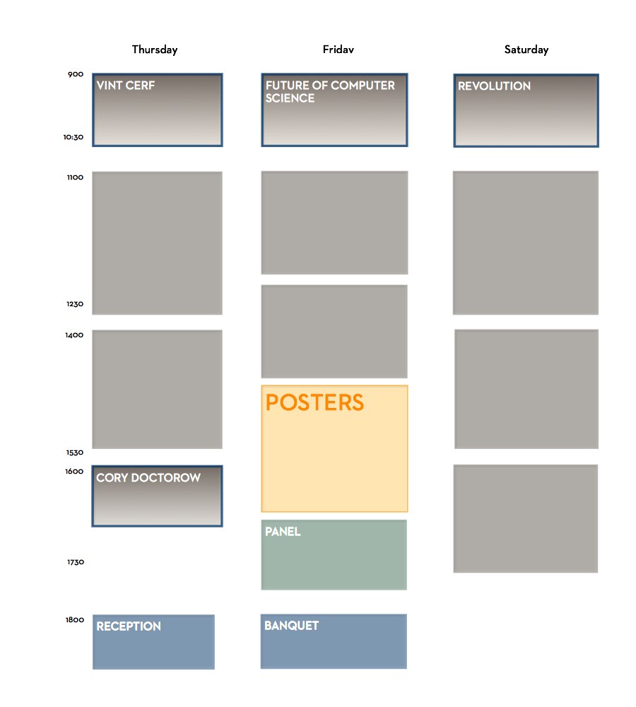
All these constraints can be hard to keep in mind, but it’s easy to write them down in the form of a quickly sketched schedule.
Each box is a Tinderbox adornment. Each label is an adornment, too. This doesn’t need to be precise or drawn to scale: it’s just a sketch. (Of course, it’s much larger and easier to read on your screen).
Looking at this, we can see that we have eight sessions to plan. Each session runs 90 minutes and so can accommodate 3 long papers, 6 short papers, or some combination of long and short papers. So, we could possibly accept as many as 48 short papers.
Special Events
Web Science always has a poster session as part of the main program. It’s unusually strong, featuring good work from senior researchers. It’s tough to get experienced people to do posters, which in other conferences are dominated by student work, so we need to give posters a large and prominent slot. But we already have two keynotes on day 1! We’ll put the posters on Day 2, and give them 2 hours. But then the coffee break — which is again fixed by the venue contract — falls at the end of the posters. So, we’ll move lunch a little earlier, split the morning session in half, and now the coffee break falls conveniently at the midpoint of the poster session. We’ve got an odd space at the end of the day, but I’ve got some ideas for a setting up an invited panel anyway in the name of program balance.
So now we have six sessions of research papers. I’m not happy that three of them fall on Day 3, but decide that can’t be helped.
Pecha Kucha
We’re still well in advance of making program decisions at this point. Reviewers are reading and pondering their assignments. We’ve got a lot of submissions — 198 — and lots of interesting topics. My own impression, though, is that we don’t have many papers that stand head and shoulders above the rest. Making decisions will be difficult.
In addition, I’ve been worried for years about the quality of presentations at research conferences.
Cons, or Why We Are Unhappy At Conferences
I work at my talks, but I have to: I have the legacy of a speech impediment and the handicap of choosing topics that are usually unfamiliar. Lots of researchers are not especially talented presenters, but there’s no reason to expect they would be. You wouldn’t expect researchers to be especially good singers or right fielders, either.
Pecha kucha talks (about which I’ll write more later) are usually considered a risk-averse programming technique, a way of minimizing the damage one lousy presentation can do. That’s not my concern here; we’ve got the whole arsenal of peer review to cover that. But the discipline of 20 slides, changing every 20 seconds, helps bring out the strengths and hide the weaknesses of academic presenters. No one uses enough slides: here, the format insists on it. Too many presenters forget to speak up; here, they’ve got the adrenaline rush of summing up years of research in 400 seconds. Students, especially, tend to get lost in a forest of detail, but with only 20 seconds per slide, they’re constantly reminded of the need to explain the big picture.
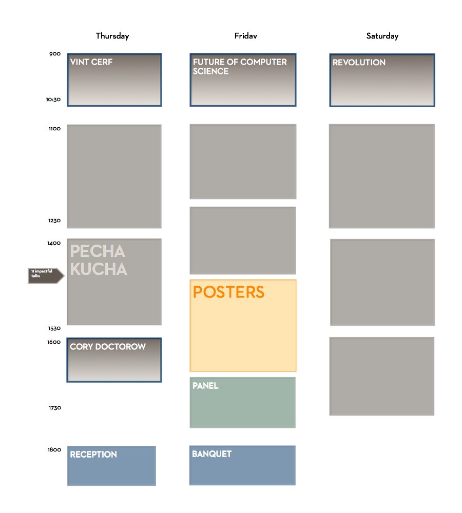
I want to try this. I sense that other people on the committee aren’t exactly enthusiastic about the idea, but sitting in the chair has some perks. We drop that into Day 1, session 2. That gives us 11 pecha kucha talks, and I make a mental note to ensure that some really good papers and reliable presenters are among them
When discussing which papers to accept, I make a point of asking whether an accepted paper might be suitable for the pecha kucha session. By the time we’re done, we’ve filled the pecha kucha roster. (In the end, one of the best-paper winners and two runners up came from the pecha kucha session.)
The Talks
The peer review process identifies acceptable talks. Every paper is read by at least three reviewers. I try to mix expertise and disciplines in assigning reviews, so we often have very different people discussing the same paper. Difficult or contentious papers get additional reviewers. Some have five or six. The goal is to accept every paper that is acceptable, but none that are not.
In addition, we have some tight constraints. Wall space limits us to 45 posters. Our five sessions can fit 15 long papers or 30 short papers. We’ve already lined up the 11 pecha kucha papers.
Posters and Presentations
Lots of conferences use posters as a training ground, but at Web Science we want them to be a first rate venue. Some papers lend themselves to posters.
- One strong message
- Topics with clear appeal to everyone
- Topics with specialized appeal and clear importance
- Implemented systems
- Controversial methodology
The last point bears some elaboration. Occasionally, conferences receive papers that are difficult to evaluate because they are methodologically unorthodox. Reviewers are not confident that the results are wrong, but strong doubts are expressed. Discussion will improve the underlying work, but how can you arrange for that discussion? Referee reports may not be enough, especially not if the author simple assumes the the reviewer is hostile or has failed to understand their work. A paper presentation might not work, either, because even a carefully prepared question might get bogged down in details in which most of the audience isn’t interested. Posters are perfect for this; you can meet with people and establish that (a) you’re a reasonable fellow, (b) you understand their work, but (c) they could be more convincing if only they addressed some objections.
Conversely, some topics lend themselves to presentations.
- Lots of messages, each requiring separate discussion
- Epistemology, ethics, literature, and other fields without strong visual language
- Arguments that require tearing down common assumptions
- Arguments that confirm or extend received wisdom
Lots of people will bypass a poster titled “Dogs bite!” assuming that it is student work, confirming what everyone already knows. Sometimes, this sort of research cleverly demonstrates what everyone knew but nobody could actually prove. Sometimes, we demonstrate what everyone thought they knew, but could not really have known before our new experiment. This rhetoric is more effective in a dramatic presentation than in a poster; the poster has to disclose the punchline at the outset where the presentation can build up to it properly.
So, at the end of the day we have about 30 papers destined to be posters. Now we start to build up some sessions.
Building Sessions
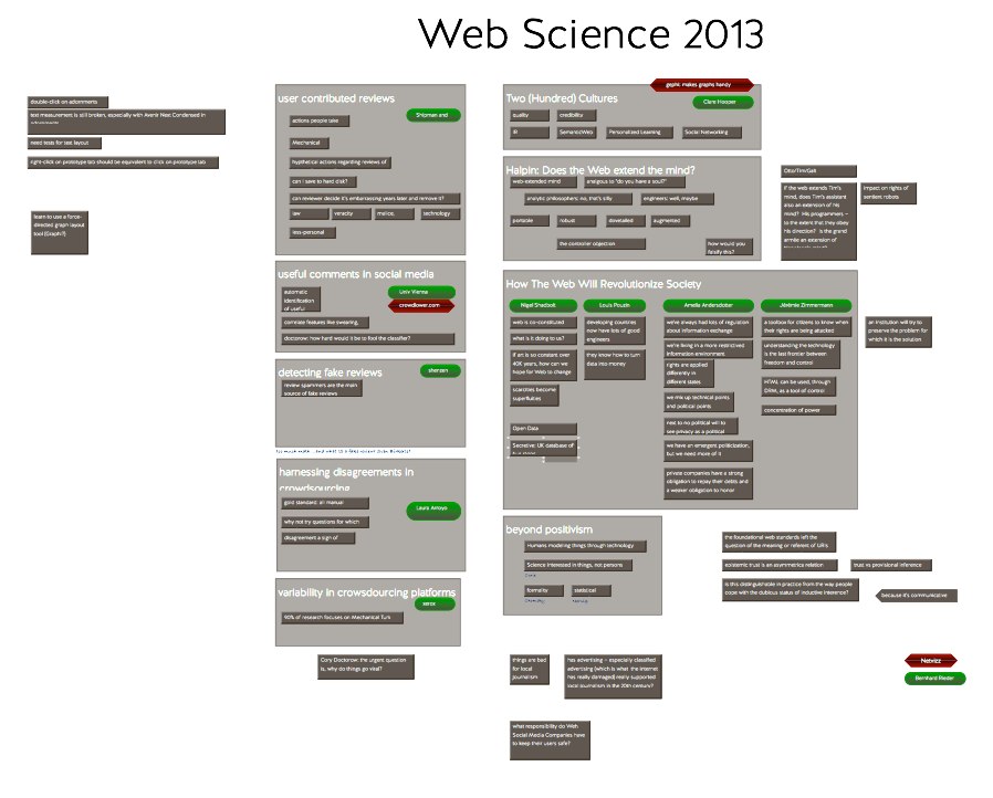
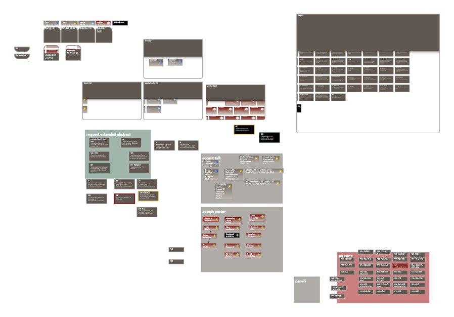
The hard work of pulling together 700 reviews of nearly 200 papers led to a very complicated workspace that I used during program committee meetings. Every review was read, every paper examined, and most papers were discussed in some detail. In the end, we had a list of papers that were clearly acceptable, papers that clearly needed more work or that would find a better audience at a different conference, and perhaps a dozen papers on the bubble. It was time too build some sessions.
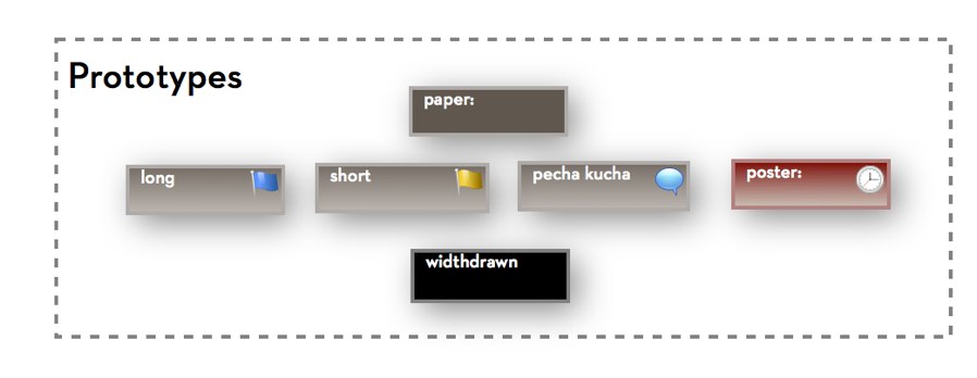
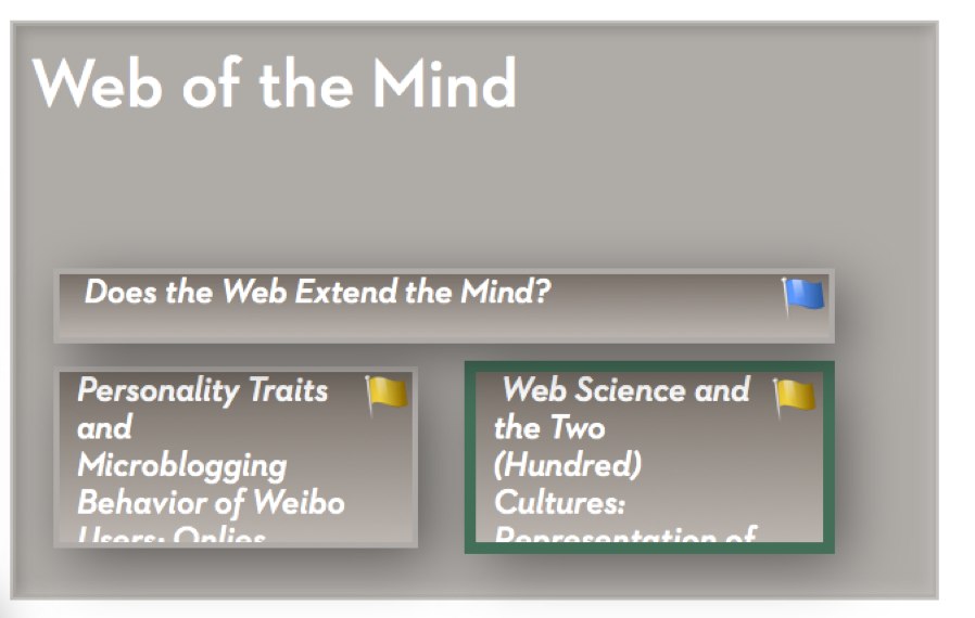
I had to start somewhere. I picked up Harry Halpin’s “Does The Web Extend The Mind?” It’s got to be a presentation — it’s a philosophy paper, it’s dense, there’s no obvious visual hook. Halpin’s got a panel on Day 3, and I’m not sure this paper is ideal in the leadoff spot on Day 1. So it’s the opening act on Day 2. We don’t have any other papers on the same topic, but we’ve got two papers that harmonize nicely with its psychological concerns.
The mechanics of this are really easy. I make an alias of the paper’s note from the program committee workspace and then paste the alias onto the program adornment. The original note carries metadata like paper number and author email addresses, so those are carried along with the alias. We’ve only got an hour in this split session, so we pencil in one long and two short paper sessions, and we give the session a title.
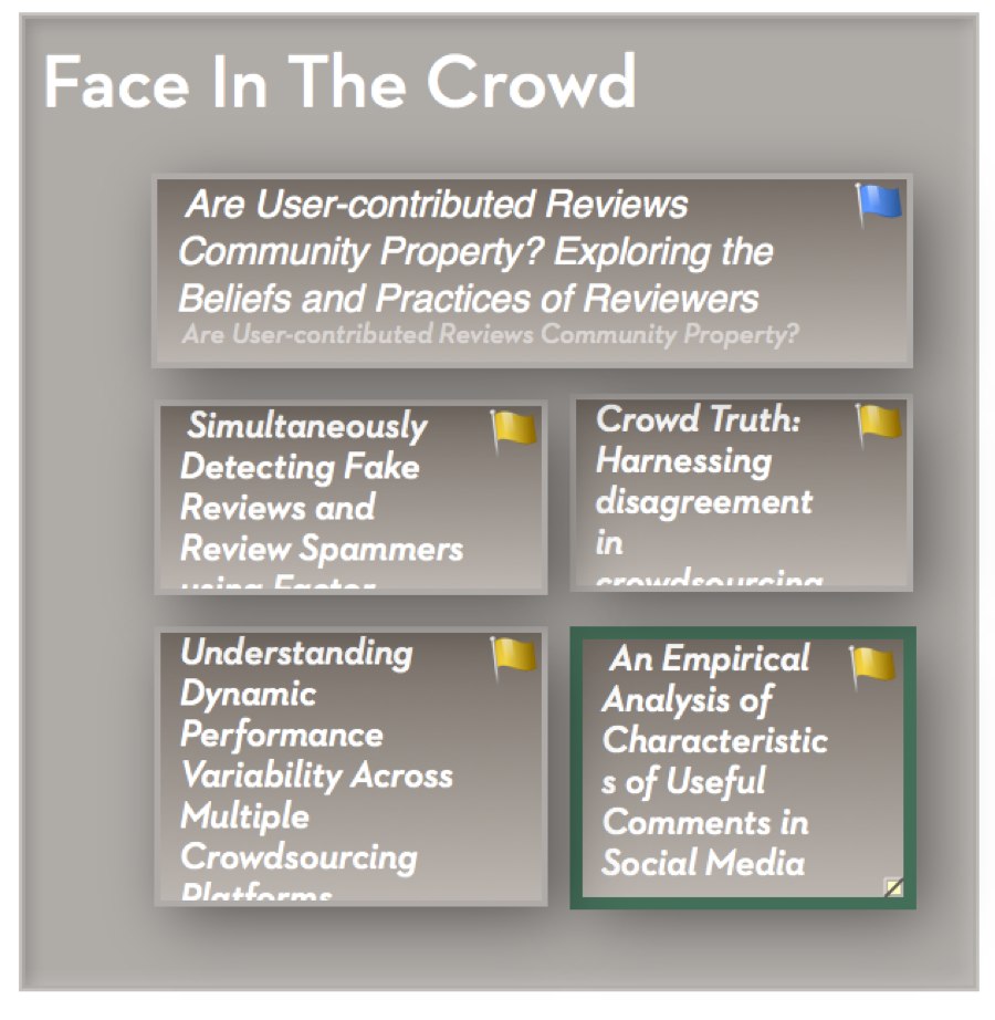
Going back to the pool of accepted papers, I notice a study about people’s attitudes toward user-contributed reviews. This concerns ownership of crowd-sourced material, and Cory Doctorow, slated to close Day 1, is a renowned intellectual property activist. So, it would be nice if this paper were on Day 1, but not so close to the keynote that it steps on its toes. But this one can bat leadoff – it’s classic Web Science material. Again, there’s nothing else much like it but we have lots of papers about user-contributed material and also lots of papers about crowdsourcing. It’s easy to imagine a session.

Most of the other sessions are equally easy to assemble. The session on Journalism and the News assembles itself. Another collects interesting papers about affinity, ranging from financial sentiment on Twitter and general concepts of privacy to gender in Facebook profiles. The remaining papers break down fairly neatly into those chiefly interested in networks and those concerned with representing data (or people). Suddenly, we’re done.
Cleaning Up
Much of this could be done in a graphics package like Visio, or OmniGraffle. But in Tinderbox, because each of those notes already has the title, author list, and lots more metadata, it was easy to write a quick export template to format the draft program, including the pecha kucha session and the list of accepted posters. All this went straight into Pages (I might easily have used Scrivener) where I fixed the formatting and made sure everything was right.
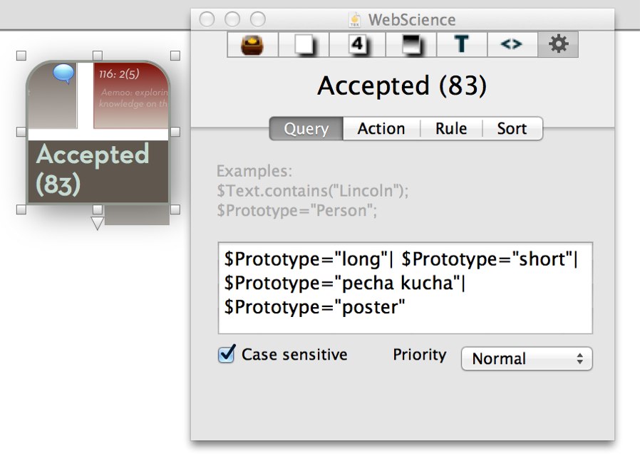
It was also easy to write agents to do simple checks. How many papers and posters were in the program? How did they compare to the number of acceptance emails we had sent? At this point, I noticed that the program showed we had accepted one poster too many. Were we listing as accepted a poster we had actually rejected? It turned out to be a clerical blunder — I’d made two aliases of one poster and hadn’t noticed the spare. But Tinderbox made it easy to check the number of papers and posters in the program against the number of acceptances we had sent out. It would be awkward to have rejected a paper and then have the researcher show up at the conference empty-handed, only to be asked to do a presentation. Double-entry accounting is your friend.
So, a few hours after the final decisions were made, we had a nice draft program ready for discussion. Additional changes would be made, but the bones of the program were all in place. When changes were needed, moreover, it was easy to move papers in the Tinderbox map and see the impact on the program.
