Looks Right. Isn't.
Khoi Vinh and Liz Danico have a lovely new Web design magazine, A Brief Message. It looks terrific. It's got style to spare.
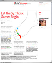
It's going to feature brief messages about design. Today, Rob Giampietro talks about Olympic identities. (Designers seem to hate London 2012's "jagged neon" logo, and there's a foulup in the proposal for Chicago 2016.) Giampetro argues that this is all premature, that we will feel differently about the design after we've experienced the event.
OK, fine. But we're talking about design, which means talking about the design of these symbols absent the event. Sure, history will load our design with lots of new layers of meaning; that's the difference between graphic design and, well, life.
But we're here to talk about design. If design doesn't matter at all, well, why bother writing about it? Why bother doing it? And if the design does matter, we want to talk about it now, when London 2012 is just an abstraction and a big pile of steel outside of the city. Sure, the logo for Munich in 1972 meant something different after Olga Korbut, and something else different after the massacre. But logo designers can't do anything about that.
If you want to talk logos, then talk about them.
Speaking of which, I've got a project. If you're a hypertext fan and you happen to be a designer, you might Email me..
- Get Well, Mark Anderson
- Storyspace Stories
- Tweet Music To My Ears
- Hypertext courses
- Tinderbox and 90% of Success
- Context Persistance
- Growing A Language
- Hypertext courses
- Duck, no Play
- Duck, no Play
- Context Persistance
- The Jewish King Lear
- Tinderbox and 90% of Success
- 8 Random Facts
- Stock Memo
- Tinderbox 4: Email from Tinderbox
- Tasting Notes
- Tinderbox 4: Shapes
- Tasting Notes
- Monarchy
- TinderWest
- Emanuel Goldberg
- Print is Dead
- The Jewish King Lear
- The End Of The Last Best Hope
- Reconciling the forces
