MarkBernstein.org

TechnoCrit

Writing about literary machines and the people who make them. For software development and its discontents, see NeoVictorian Computing, too. (Older TechnoCrit is here)

Sep 15 18 2015

Why We Link

It is Friday night dinner again, and the Business Professor asks straight out why anyone would want to bother with hypertext narrative. I handle this question badly in social settings. I understand the underlying family traumas; sorry, Freud, but knowing doesn’t help that much.

It’s time for a fresh tilt at that windmill; here are some thoughts for an introduction to Getting Started With Hypertext Narrative.

Comments and improvements welcome: Email me.


The future of serious writing lies on the computer screen. That future, indeed, is already upon us. We compose on the computers, we read our mail on computers, and increasingly we read our novels and textbooks on computers.

Today, most of what we read is written as if it would be read on paper. We no longer write on paper and we no longer read on paper, yet our computers, our tablets, and our ebook readers simulate paper. Indeed, they go to great lengths to copy the inconveniences of paper, the awkwardness of turning the page, or the arbitrary limits it imposes on our margin notes. Most significantly, we still write books as if they were to be mass-produced by factories, one page forever following another in a fixed and inalterable sequence, one size fits all. We don’t use links much, and we don’t use them wisely.

Hypertext is, simply, writing that uses links; hypertext narrative is telling stories (and histories) that use links. Links let us write in new ways for new audiences. Links should let us tell stories that were once difficult to tell. Though links can sometimes let us alter the story, changing “what happens” in different readings, we more frequently will use links to change the plot, changing “how we explain what happened.”

Why does this matter?

  • The audience is ever more diverse, and the fragility of our planet makes reaching our audience ever more critical. We cannot assume that every reader has attended the same schools, read the same books, or will ask the same questions. The work must be ready to provide answers to each reader.
  • The importance of writing truly for a diverse audience is clear and pressing in nonfiction, especially when writing to influence public policy for an audience of legislators that ranges from experts to cultivators of ignorance. Fiction, which addresses emotional truth, is not less important.
  • Each reader brings to their reading distinct constraints and attitudes. Today, your audience is calm, attentive, and critical. Tomorrow, your audience is agitated, anxious, and eager for distraction. The work must be prepared to satisfy both audiences – especially as they might be the same person. Homer understood this.
  • A central lesson of modernism was that artists should exercise tight control in matters that matter, but may relax their grip elsewhere and let the material or the brushstroke show. Links explore a looser approach to narrative.
  • Serious reading has always encompassed rereading. Hypertext requires rereading, and makes manifest the way changes in the reader change the work.

These notes explore some lessons we have learned from the first twenty-five years of hypertext narrative.

Aug 15 15 2015

Pry

Danny Cannizzaro and Samantha Gorman

Winner of the 2015 Coover Award, this iPad app is an art installation that invites the viewer to “pry open a troubled mind and hold its thoughts in your hands.” It’s thoughtful and serious and certainly worth $2.99. What it’s not is precisely what it claims to be: a novella.

Pry is the story of a demolitions expert, returned from the war in Iraq. The work invites you to either pry open the space between lines, which often reveals hazy video clips, memories of past traumas and their banal surroundings, or to squeeze them shut to reveal impressionistic word animations that (sketchily) represent unconscious or subconscious thought. The interstitial videos — or is this really video with interstitial texts? — are intriguing, but Pry really gets going in the most textual episode, Chapter 6, where prying lines apart leads to more lines and still more lines. This works – at times spectacularly – for the iPad, and it’s the most convincing use of stretchtext I’ve seen. The animation of the revealed text is superb; Polle Zellweger’s research in the late 90s argued that this sort of polished animation would in fact reward the effort, and Pry make that case nicely.

There might be some sophisticated commentary on hyperfiction here, too, though I can’t quite see where it’s going. The work’s site is “PryNovella.com”; is that an allusion to afternoon, a story, or just a way to find a vacant domain? There’s a girl and a scud and broken glasses: is that a nod to Victory Garden or is it just that the broken soldier always has a girl and a scud somewhere? I think there’s a nod to Garp, too, but I’m not sure it goes anywhere. And of course, once again, we have a hypertext of ruptured bodies and crashed vehicles; that could be homage, or it could be showing us all How To Do It, but it could simply be walking into the same tropes again. It’s hard to be sure.

This is the latest in a line of electronic artist books, starting with Myst and Inigo Gets Out, in which we dimly perceive a depopulated world and in which the poverty of our perception and our lack of agency or reflected in the protagonist’s current paralysis and past impotence. The writing is sometimes fine and sometimes not.

From a chinese restaurant six blocks away, the sound of frying echoes.

Are the fried echoes served with rice? Six blocks is nearly a kilometer, and blocks are found in cities: who can hear the echoes(!) of the sound of frying over the song of the city? Writing about his fraught relationship with Jessie, The Girl, we are told that

Relations between two NCOs were prohibited based on rank, class, and subordination.

I’m not sure what sort of “class” we’re talking about here, and it looks to me like Section 92 of the Uniform Code of Military Justice could prohibit relations between non-commissioned officers of identical rank. “Relations” is a tricky word here: it suggests specificity but withholds it, it gestures at clarity but remains ambiguous. Why dance around it? This is Forbidden Love – maybe twice forbidden because I think The Girl is already My Brother’s Girl.

Once again, we apparently have a story about a fellow who goes to war, is changed forever by the war, and who doesn’t do very much or think very much about the war and his place in it. Here, too, we have the conveniently impersonal SCUD missile stand in for the improvised explosive device, perhaps planted in the road by three kids whose sister was hurt in a raid last month, or whose aunt was the collateral damage of a drone attack, or whose grandfather went to Abu Ghraib. No one mentions Bush and Cheney; we play with those silly cards with the drawings of Famous Iraqi Bad Guys but we don’t spend any time on the fact that the whole thing was ginned up, a war in pursuit of a lie, itself in pursuit of a permanent Republican majority.

Is Pry a novella? Things have happened, yes, but most of those things have already happened. That’s not a merely a framing story: our interest is so often focused on our current helplessness and its contrast to our past as a running kid, a thoughtful soldier, the man in charge of the explosive charges. There are words, sure, and lots of those words are good, but I’m inclined to think Pry a personal video installation which happens to employ a lot of text.

Despite its awards, this is apparently a work in progress. That, too, seems odd; once you have let your work out into the world, it’s out; you can extend it, you can write a new work that envelops it, but the work is the work. If it was good enough to show without chapters 4 and 5; perhaps there are no such chapters.


Jhave Johnston has a long and thoughtful review in the LA Review Of Books. It’s among the most intelligent reviews of a new media work I’ve seen in a nonspecialist publication.

Let Go Of The Line

You are writing a short hypertext.

Your hypertext will be clear, coherent, and concise. You have something to say: stand up, speak up.

Tell everyone that you are busy. Find a comfortable place to write. Close the door if you think that will help. Be sure you have a good chair.

There was a link in the previous note. Perhaps you did not see it. You cannot see it. Only Italo Calvino and his readers can see it, but there it is. In hypertexts, there may be many kinds of links.

Each of these notes may contain an instruction worth hearing and weighing. Obedience is not required or expected. Rules about writing are made to be broken.

We are accustomed to writing a fixed line, one that we imagine will be read from its start to its end. Let go of old habits.

The reader is always thinking about what has been read, and about their reaction to it. The eye jumps ahead, the mind falls behind.

Some readers have always started in the middle, because this week’s assignment covers pages 113-184. Some start in the middle because they like it like that.

Coffee may help you focus. More coffee may help you focus more intensely. You may consider decaf. Consider scotch, but not too closely.

Multivalence is not a vice. One word may mean many things. Won’t you stay just a little bit longer?

Calligraphic hypertext uses links to connect notes together. Sculptural hypertext assumes that everything might be linked together; the writer adds constraints to remove connections.

You are a writer. You are writing a short hypertext. You write. You do not author. No man but a blockhead ever authored.

Links come in many varieties. The slow, static, blue and underlined links of the Web were a mistake. They are neither typical nor ideal. Respect them, but do not venerate them.

Storyspace introduced the valuable concept of the default link – the link the reader will follow if they have no immediate preference. The default link from a given place may change, depending on what you have read.

Do not think about the babysitter.

In Storyspace 3, if a note has no default link, the system looks for sculptural connections. Sculptural connections augment calligraphic link, offering a set of destinations, all connected to each other except where the author has removed the connection.

A set of sculptural links is like a shuffled deck of cards. The destination is the first playable card.

From time to time, we might tell the reader to swap the deck she’s reading (or that she’s exhausted) for a new deck. The young Aristotle exchanged the scroll he was reading for a new scroll.

In sculptural hypertext, a fresh deck signals a new chapter. Time has shifted, or circumstance. Everything has changed. You cannot go home again, not yet.

The link is the most important new punctuation since the invention of the comma in the late middle ages. There may have been a time, long ago, when you did not know enough about the comma.

You are not required to tell the reader when their deck has been swapped. If you wish, you may signal the shift by writing a transition that establishes a new place, a new topic, a new time, or a new voice.

If things don’t make sense, take care. Readers may suspend disbelief, but they always form theories. One theory holds that you are an incompetent bore.

Would you like another cup of coffee? You might consider the scotch. Or, you could bake some scones: they’ll be out of the oven in 17 minutes. Sometimes, when you are writing and young and merry, the dawn comes soon.

The link’s guard field is time’s winged chariot, always urging us to move along. Without guard fields, large hypertexts may feel encyclopedic, and large narratives may have trouble getting anywhere.

In the midst of sculptural hypertext, we find calligraphic links. A sculptural link takes us to the start of a calligraphic sequence – a dramatic dialogue, perhaps, that needs to be performed in a specific order.

In the midst of calligraphic links, we find sculptural interludes, tangles and split/joins where the writer can ease up and let the reader improvise and chance intervene. Eventually, a new calligraphic link restates the theme and returns us to the tonic key.

Cause and effect, call and response, point and counterpoint: constraints and calligraphy protect coherence.

See whether new sequences will work for your hypertext. You may find many paths through your thicket.

Four tourists are walking down a busy summer street in Ogunquit, Maine, past the boutiques and the bars and the organic bakeries. One of them asks another, “Say, is your husband out of jail yet?”

Closure is a suspect property.

“Stand up; speak up.” I said that before. I also told you to focus, to get comfortable, to close the door if you think that will help. Have you done as I asked? Don’t keep the door closed, and don’t keep your work in a drawer. The grave is another fine and private place.

Comic theorist Scott McCloud describes “closure” as the theory that viewers develop to explain a cinematic cut, to piece together two shots – shots that might have been performed months apart – into a continuous scene. The reader will create a theory; you cannot stop her.

The patience of the audience can be exhausted. It is greatest at the outset: they have come here for a story and they are inclined to let you tell it.

While you were trying to get through your college’s legendary reading load, a girl across the dorm hall used to shout, to no one in particular, that she really, really wanted to fuck but how would she ever find the time?

The patience of the audience may increase when the end is in sight. Even when it is not the end, a glimpse of the goal, the object of desire, can renew their patience.

Your readers may form theories to explain what you meant, even if what you said cannot be true. You may tell them what they once heard: they know they did not hear that, but they may nod, anyway.

You may fear that, if you let go of that line, you will fall, lose coherence, be lost to meaning. Your fear may be correct, but until you let go of that line, you will not know what lies beyond.

Aug 15 13 2015

How To

How To

Designing Storyspace Three has required some fresh thinking about writing hypertext, especially the craft of hypertext narrative. Where do you put the links? How do you know whether the links are too plentiful or too sparse? Sure, we can point to some lousy examples – most Web writing today either ignores links or uses them to lie – but cataloging sins and exhorting the audience to sin no more is not entirely convincing. We have examples of good writing with links, too, but talking too much of that makes people envious and tetchy.


I’ve been inventing writing exercises and making an effort to actually write them out, using both familiar Storyspace features and the new sculptural techniques. One issue here is simply time: I’m finding it quite difficult to sustain more than 3,000 words/day of first draft material, even if the nonfiction is familiar ground. The fiction, well, I’m making that stuff up, so what takes so long? Damn.


A friend who is a Friend writes on Facebook: “I have enough, I do enough, I am enough.” You’ve got to envy that. I can’t imagine what #2 would feel like.


There’s a lot of literature that tells people How To Write. There are MFA programs and workshops and English departments and Comp Lit. There are plenty of books about books, many of them good. There are shelves upon shelves of How To Get Published and Write Best Sellers, and some of those stink of the confidence game but not all of them do.

There’s not a lot of literature about writing with links.


For example: imagine a long dialogue. The scene is dramatic and consequential: revelations will be made, minds will be changed.

Now, divide the dialog into many shorter exchanges, as you might present them for reading on a small screen. Link them in sequence. This is easy enough, though someone might ask “How long should the passages be? How do I tell if this one is too long, or that one is too short?” and, if they do ask, I can’t recall a single paper in the twenty-seven year history of hypertext that will help them.

But maybe no one will ask.

Now, let’s change that sequence. Specifically: assume that if you were there, holding a microphone behind the arras, you would have heard the first sequence. But that’s not the way we’re going to tell it. Instead, we’re going to start with the first big revelation – lead with the news – and then circle back to explain how we got there, and then talk about what came later. If you like, you can add a framing story: we’re telling the grandchildren what was said, or we’re telling the jury, or we’re telling our friends as we sit around on the deck of our yacht, becalmed in the Thames. You can rewrite transitions, but if you change dialogue you probably want to change it in both places. (Or, perhaps someone misspoke or someone else misheard? Perhaps our narrator is not to be trusted? Hello, Mr. Rashomon -- grab a seat and what’re you drinking?)

Now you think you’ve done the assignment, but you’re just getting started. Figure out ways to cross from one telling of the story to the other, and figure out ways to get back. Do not step outside the boundaries of the fields we know: magic and lyric, fugue and insanity, noise and nonsense and contradiction are all very nice and I’m sure you do them very well, but let’s keep this simple. Just make it possible to start either sequence and to wind up in the other.

Finally, figure out how the initial split occurs in the story, and also write a passage – not necessarily the conclusion – which naturally follows either sequence.

It seems to me this is the sort of thing hypertext writers ought to know how to do. It’s the sort of thing writers, period, ought to do in their sleep. Do we have good models? Where?


How To

I can’t draw, but it’s fun to try – in part because I’m not good at it, and because drawing and painting require thinking about the thing rather than the symbol of the thing, and software design is always about those symbols.

There’s an iOS called Sktchy where people upload selfies and draw each others’. It’s an interesting mix: some school children, some art school students, some pro illustrators who are doing finger exercises or want to pin down some practical details. (If you want to draw ten Thai faces, or twenty colors of blonde, this is the place.) A lot of the discussion is formulaic or sentimental, but sometimes it's unexpectedly good.

How To

So, Leigh V’s photo and my sketch. There’s stuff we can talk about. Some of it’s just ineptitude – bad draftsmanship, eyes that are pretty much symbolic, a lack of conviction about the neck, all stuff that deserves a red pencil but that’s pretty much only interesting in terms of “don’t do that if you can help it.” But there are other things, too. The color choices are not harmonized but I think some of them work. The warm shadows aren’t there in the world but they’re interesting, and the cerulean on Leigh’s neck isn’t there either but it looks right in the image. The exaggerated shadows work, too, more or less; some of the drafting errors might actually help, and if they're errors and not intentionally painterly touches, well, that’s why it’s called the intentional fallacy.

Leigh’s comment was “This remind me of Francis Bacon. But, you know, without the tortured screaming and slabs of meat.” And that’s generally where I meant to go, though maybe more Pearlstein or Freud than Bacon. But that’s an interesting conversation, too.

But we seldom have these conversations about hypertext writing.


The 2015 Coover Prize for Electronic Writing went to Samantha Gorman and Danny Cannizzaro for PRY. Sandy Baldwin won the Hayles prize for criticism for “The Internet Unconscious: On the Subject of Electronic Literature”.

Brian Crane’s intriguing hypertext on William Faulkner, Faulkner At MGM, is now online. It’s made with Tinderbox. Fascinating notes about the project as well.

Crane has been anxious that he’d never master Tinderbox export, which is flexible but has a reputation for complexity. In fact, he’d been putting off even attempting to begin.

So I bit the bullet, cut materials, linked back from dead ends where I found them, left quite a few long notes I’d planned to break up whole, and then last night (less than 24 hours ago!) sat down to see what I could get out of my Tinderbox file.

It was a revelation.

Tinderbox’s export is jaw-droopingly, amazing.

Tales Of Storyspace

I’ve just spent the better part of a day in Storyspace. Not in Xcode building Storyspace, but actually writing new stuff in Storyspace 3. (I did need to bail and do a fresh build to address a bug, but I got all the way to 4PM before that happened. A landmark.)

Right now, I'm working on a way to integrate Storyspace and Card Shark, one of my exotic hypertext systems. The two are very different in form and rhetoric, but I expect they’ll work well together; in particular, Card Shark lets you construct tangles with more easily and more thoughtfully than pure Storyspace allowed, while focusing your concentration (and the map view) on links that participate in more interesting patterns.

For example, a chase lends itself beautifully to the tangle. Lots of stuff happens in the course of a chase. Some of it is indispensable. Some might work tonight but be better left out tomorrow; that’s what hypertext is for. Sometimes, we might keep the point of view in one place, tracking our protagonist. Sometimes, we might intercut the hero’s point of view with the enemy’s. Hypertext can do that, too.

Exploring fringes of software aesthetics, I’ve been reading up on things that are not quite beautiful. I came across this in a book review by Adam Kirsch in next month’s Atlantic:

Niceness without goodness is cuteness.

This makes a certain sense; it explains, for example, why a toddler can easily be cute but is seldom beautiful. “Goodness” here is not a moral judgment, or not just a moral judgment: an horse with a hat might be cute, but a beautiful horse is a horse doing what horses do – running gracefully through a meadow, say.

How would this work with software?

We look at a clever Perl one-liner, decipher it’s meaning, and exclaim “Nice!” But one-liners seldom do much good: even when they do something useful, it’s probably better to use a few lines to explain what you intend. Perl one-liners are cute.

Gratuitous user interface polish does little or no actual good; it’s an expense, and it seldom produces much benefit. Often, this year’s marvel may be actively pernicious in a minute or two: remember Cordovan leather backgrounds? Gratuitous polish is cute.

Under the hood, it’s entirely possible to use language features in strange and esoteric ways. You can be make C++ feel like a functional language. You can make C++ feel like Smalltalk. You can write little interpreters in C++ and do the real work in your own variant of LISP. Sometimes, this is elegant; often, it’s merely playing cute.

Games and fictions sometimes drop the mask (or the fourth wall) to attempt an arch and knowing address to the player. We’re in the middle of a complex and challenging city simulation, and suddenly notice that the factories all have silly names and make silly products, or have in-joke references to industry insiders. Archness in games and fiction is cute.

Almost all codewerk is cute.

Brent Simmons hit this nail on the head when he wrote about the problems of splitting classes that are too large and do too much into smaller, more focused objects. If you do this intelligently, you get better code. If you get carried away, you get a basket of bunny classes. Bunny classes are cute.

Marcus Zarra laments the Dangers Of Misinformation, specifically when software developers share specific experiences that are later generalized so broadly that the overall impression is false.

For example, years ago Brent Simmons pointed out problems that were leading him to leave Core Data behind. Looking back, he says

The response to that post continues to amaze me. I come right out and say, multiple times, that you should use Core Data. And yet it’s used as a thing about how Core Data sucks.

Caves and Enclaves

Lots of software developers work in caves, using the tools and techniques they already know and adding whatever they’re required by circumstance to acquire. When they are at work they’re not at home, and when they’re at home they’re not reading journals or immersing themselves in books about software. So, when it comes to new technology, they rely on occasional hints they see or hear.

Other software developers work in enclaves – companies and clusters of companies that share a technical base and a technical attitude. Again, the common wisdom in an enclave gets formed by the bellwethers, and often that process of wisdom-formation is erratic.

Our problem is simply that lots of new ideas are actually bad ideas; things that ComputerWorld and TechCrunch tell you are the Big New Thing are sometimes yesterday’s thing and often nothing at all. Sometimes, a new system rolled out at WWDC will make your life better if you adopt it right away; sometimes, it’s going to make everyone miserable unless you wait a year or two for the dust to settle. (Years ago, Apple had a lovely technology called OpenDoc to which we made a big commitment. It was The Future. Then, one day, it was Cancelled. No more. Nice product you had there…)

Right now, Joel Spolsky’s Stack Exchange plays a crucial role in linking up caves and enclaves. It’s a technical forum, and it’s often astonishingly good: you search on the ridiculous error message that makes no sense that that you’ve certainly never seen before, and voila there’s someone else who reported exactly the same message last week, and explains who sent it and why. But lots of people on Stack Exchange don’t know what they’re talking about, and lots of them don’t have a very solid grasp of English, and so there’s also a fair amount of noise.

The Way Out

One good way out of this bind is simply to have better contacts.

Planning Tinderbox Six, I was guided by a number of warnings that Objective C++ was slow, poorly supported, doomed, or otherwise a Bad Idea. The problem was, Objective-C simply doesn't support a number of idioms on which Tinderbox relies. So I started to ask around: could we use a little Objective C++? Could we use it briefly as a transitional mechanism?

I asked lots of people who have solid Mac products and lots of experience, and the answer came back: “people say it’s a bad idea, but it’s not.”

“Are you sure?” I asked them. “Everyone says…”

“Everyone is an idiot. We’ve done everything that way for a couple of years.”

The Better Way Out

Make mistakes. Accept that code will be thrown away. Wrong turns aren’t a waste: they tell you where you didn’t want to go, and give you an idea of where you might head another time.

Find a way to be more at home with your work, and to work when you’re at home because it’s natural to do what you do. You can live with alienation, but you don’t want to.

Don’t trust the common wisdom of your technical enclave too far. Stand up, speak out, judge for yourself, and be ready to change your mind.

Jan 15 21 2015

Reckless

Supplemental to: InfamousThoughtlessCareless

I’ve been blocked at Wikipedia — ostensibly for posting the following comment, but obviously for writing Infamous, Thoughtless, and Careless – and for the further offense of having these become so widely read. (The GuardianGawkerPandoDailyThe Mary SueWil WheatonDer Standardde VolkskrantDr. Clare HooperP. Z. MyersFayerWayerThink ProgressStacey MasonThe Verge)

Thank you to the tens of thousands of new visitors here; your interest is very welcome. If you're interested in software, I hope you'll visit often.

Here’s the passage that drove Wikipedia nuts. It’s in a thread titled with my name and discussing my work on Jimmy Wales’ page, which had apparently been designated by ArbCom as the place to discuss the Proceedings – provided, I guess, that the discussion heaped praise on the arbitrators.

Mark Bernstein’s weblog post

… (many comments from various people)…

That the proposed decision of which I wrote is infamous, is an opinion widely shared. Yes, some of its most extreme measures might not pass and some additional, disposable accounts may be sanctioned to give the impression of balance. Whether or not widespread public indignation at its measures has played some role in that, I cannot say....

Wikipedia has been and continues to be used as a weapon against women in computing; I see little in either the proposed decision or the current revision that recognizes, much less remedies, this, and much that lends assistance to those who would like nothing better than the opportunity to intimidate women with the threat that their own sex lives might be the next topic for Arbcom publicly to scrutinize. — Mark Bernstein


Yesterday on Wikipedia, a new Arbcom case was filed. The complainant observed that Wikipedia now mentions the “false accusations” that a particular software developer prostituted herself, following the example of the New York Times and the New Yorker. Would it not be more neutral, he proposed, to say, “unproven accusations”? And why did people unfairly insist on “false”? (“Greedo8” surely knows more about journalism than the legendary fact-checking department of the New Yorker, right?)

Of course, the point was simply to call this developer a prostitute somewhere on Wikipedia. Every time this is done, people can send anonymous emails to the developer’s aged mother, or to classmates of the developer’s school-age children, or to the developer’s managers, pointing to the discussion.

Editors, administrators and arbitrators sedately discussed the question: should Arbcom start a formal case on the question of this developer’s putative prostitution? I accidentally discovered the filing, contacted Wikipedia’s emergency channels, and began to scream bloody murder on Twitter. A few minutes later, an arbitrator finally blanked the page, No sanction has been taken against the perpetrator, and the old version is still online.


Yesterday on Wikipedia, a Men’s Rights advocate edit-warred the page of an artist who is the husband of another software developer. He said that the artist’s wife "was raped by her family and gave HIV to her husband". Again, this remained as part of the encyclopedia for quite some time. The perpetrator used a disposable account which was blocked for one week; this will not even inconvenience his next effort to harass software developers who happen to be women.


Two days ago on Wikipedia, an edit was made to suggest that one software developer, having been threatened with rape and murder, had not in fact been “forced to flee her home” (as reported by the Boston Globe, among others) but rather had merely “chosen to leave her home.” This remained in the article for quite some time; it is now being discussed at length (again) on the talk page.


Today at Wikipedia – almost a week after the publication of the proposed decision – a clause was finally added concerning “Harassment”. It is good that ArbCom recognizes (at last) that harassment is wrong. Unfortunately, this clause only condemns harassment aimed at Wikipedia editors.

There is still no mention of care for innocent people against whom Wikipedia is wielded like a sword, including the software developers mentioned above. The harassment continues today.

That clause — innocuous and toothless as it is — has thus far mustered only six of fourteen votes.


Arbcom today is busy trying to negotiate clauses that protect itself from inconvenience but that fail to acknowledge, deplore, or take even the feeblest steps to discourage harassment of other people – harassment that Arbcom knows has been and continues to be specifically coordinated to drive women out of computing.

After all, why do these people accuse a software developer over and over again of prostituting herself? Sure, it's to punish her and to discourage female students who might want to pursue a career in computer science. But it also makes an argument: women should stay out of computing because their presence could tempt men to give them preferential treatment in exchange for sex.

Wikipedia is instrumental to a campaign to drive women out of computing.

Wikipedia administrators are too busy to enforce obvious policy violations that do real harm to people who have done no wrong, but they find plenty of time for retribution against their critics.


In the last few days, I’ve seen hundreds, probably thousands of emails and tweets and Facebook posts, asking what can be done. I don’t think Wikipedia can be saved at this point, but I might be wrong.

  • Arbitrators: those responsible for drafting the infamous proposed decision on Gamergate should resign all Wikipedia privileges, offices and honors, immediately.
  • Editors: join me in exile. No one can honorably assist an enterprise that condones these reprehensible actions.
  • Donations to Wikipedia are counter-productive. Donate instead to a charity that assists women in computing, or victims of online harassment. Highly recommended: App Camp For Girls. (Tell them why, ok?)
  • Tell the Wikimedia Foundation that you’re doing this.
  • Tweet that you're not donating to @wikipedia.
  • Teachers: warn students stringently against relying on Wikipedia, especially in contentious areas, and most especially in issues related to feminism and gender, broadly construed.
  • Researchers: document this disaster – there are good doctorates in Web Science, Computer Science, and History for the taking in this mess – and find a path to a replacement. Making anonymity safe, legal, and rare is clearly essential to wikis, as is intelligent and responsible oversight. Wikipedia lacked either. It’s unlikely that it can be salvaged, but a better encyclopedia can be built from the ruins.
Jan 15 19 2015

Careless

Part 3 of a series: InfamousThoughtless ❧ Careless ❧ Reckless

The real crime and most serious mistake in Wikipedia’s infamous draft decision on GamerGate was not that it sanctions every GamerGate target, nor that it gave no thought to the consequences that may have been suffered by the handful of editors who sought to preserve Wikipedia from the coordinated and systematic attack.

Worse than this, the draft decision shows no care for the victims of GamerGate harassment and no concern for the use of Wikipedia as a weapons platform against them.

How It’s Done

GamerGate seeks to drive women out of computing by choosing some targets, harassing them until they go into hiding, and warning the remaining women (and the declining number of women pursuing computer science degrees) that they might be next. Methods for achieving this include:

  • anonymous threats of assault, rape, and murder.
  • anonymous messages to employers seeking to have the victim demoted or dismissed.
  • publicizing the target’s sexual history, both as an end in itself and as a way to make the target less attractive to prospective employers.

At an early date, GamerGate identified Wikipedia, “the encyclopedia anyone can edit,” as ideal for their purposes. It’s conspicuous. Google loves it: for most everyday people, Google will make Wikipedia its first or second hit. No one admits it, but reporters use Wikipedia as a crib all the time. It’s anonymous, and it’s rich enough to make that anonymity stick.

Note to Google folk: it’s time to think seriously about turning Wikipedia’s page rank down, at least until it finds a way to prevent this stuff. That might help Wikipedia too, by making it less attractive for use as a weapons platform.

The problem for GamerGate is that Wikipedia has rules against inserting libels into people’s pages. When GamerGate started to add stuff about female developers’ sex lives to various Wikipedia pages, experienced editors removed it. That led in turn to plan B:

  1. Try to put the sexy story into the article.
  2. After it's removed, argue on the talk page – repeating the sexy stories there.
  3. When people object, argue that some weblog or student newspaper or political columnist somewhere alluded to that sexy story, so it's got to be there.
  4. When people object, argue about the wording. Can we say “they fucked?” How about “blow job?” How about “exchanged sexual favors?”
  5. When people object to that, try it again on against a different woman
  6. A couple of weeks later, repeat step 1 again.

Tactics

To make this stick, you need three separate editors working together.

  • the PROVOCATEUR inserts the sexy information and argues for it. Often, this account appears to be new and claims to be a naif, an innocent who simply wants to expand the encyclopedia and happens to be well-versed in WikiLaw.
  • the PALS cheer on the provocateur, repeating and ringing changes on the provocateur’s arguments. If someone reverts the Provocateur, the Pal reinstates the change. Absent an edit war, you only need one Pal, though it helps to have at least two. In an edit war, it’s important to have plenty of Pals, and to coordinate offsite to make sure there's always a couple of Pals on call.
  • the BOSS rarely or never edits articles, but is extremely active on the talk page, citing policy to support the Provocateur and encourage the Pals. It helps a lot if the Boss is an administrator. It is useful for the Boss to know when and where the Provocateur will be launching a weapon, but it is essential to hide this: the Provocateur and the Pals can write openly on 8chan if they like, but the Boss must never appear. The Boss dominates the talk page and the complaints (see below) but, not editing the article and always citing policy to the same end, protects the team.
  • the whole team launches constant COMPLAINTS against their opponents in order to remove opposition. Here’s where the Boss is most critical. Pals are expendable, and the Provocateur can be sacrificed at need – even if he’s banned, he can start a new account and become a Pal, or borrow someone else’s disused account and return as a new Provocateur. From the beginning, a major GamerGate goal was to get rid of five specific editors — a goal which the draft decision granted them wholesale.

You need this complexity to evade Wikipedia rules developed to protect against cultists and cranks. These rules work adequately against casual vandals and isolated zealots; GamerGate turned into a debacle because here the cultists and cranks were just sophisticated enough to work the levers, though too short of resources (and seeking too awful a result) to escape detection.

What Wikipedia Should Have Done

The key issue here has always been clear: Wikipedia systematically is being used to publicize the sexual history of women in computing in order to drive them out of the field. This is central: whether or not someone said something intemperate on December 13 is not.

  • First, the draft decision ought to have acknowledged this fact and deplored it. It did not.
  • Second, the draft decision should have resolved to redress the damage already done and to prevent further damage. This may be difficult. It may take time. Steps are needed to begin to address the damage; the draft decision proposed none.
  • Third, those composing the draft decision ought to have read the entire record — all the talk pages, all the procedural arguments — and should have consulted experts. They should know everything there is to know about the affair, and they should demonstrate that knowledge. Doing less opens the door to infamy and ridicule. (Infamy and Ridicule have now walked through the door and are enjoying a nice gin and tonic in the living room; I don’t really know how Wikipedia can get them to leave at this point.)
  • Fourth, consulting experts would have been prudent. If you don’t want to be accused of banning all the feminists, for example, I know at least a dozen professors who would have been happy to point out that banning all the feminists en bloc might not be the best idea.
  • Fifth, a formal and thorough apology could have worked wonders. Clearly Wikipedia failed here: it should not have been used for months as a weapon against women in computing. This should have been stopped, and stopped quickly. Even if we don’t know how to stop it, apologizing for what has been done and expressing determination to fix it would reassure everyone that Wikipedia is not actually supporting the effort to drive women out of computing by publicizing their purported sexual histories.

Caring

It now looks like some of the worst elements of the infamous draft proposal won’t pass. It’s possible that almost nothing of consequence will pass.

That doesn’t matter. If you start with an infamous document and delete some paragraphs, are you likely to end up with a good result? Is doing nothing of consequence a good response?

Wikipedia should have cared for and about its victims, about people who did nothing worse than gain employment in the computer industry.

Wikipedia should have shown its care. Having been used shamefully, and not having a clear and immediate path toward a remedy, Wikipedia should be filled with care and contrition.

Wikipedia has lost an opportunity, our respect, and our trust. It may have permanently damaged the open Web because it just didn’t seem to care.

Instead, Wikipedia’s ArbCom took a superficial look at the evidence, found a few largely-technical rule infractions, and carelessly tried to give GamerGate the keys by banning all their targeted critics. Now, they propose to merely sanction some of the defenders (as well as one GamerGate Provocateur and maybe a Pal) and they want everyone to cheer.

Doing less harm isn’t good enough; it’s time for Wikipedia to care, to show its care, and to take care of its victims and of the volunteers who have worked to save it.

Jan 15 18 2015

Thoughtless

Part 2 of a series: Infamous ❧ Thoughtless ❧ Careless

Some cooler heads at Wikipedia's Arbcom seem prepared to demur from some of the most egregious sanctions in the infamous original draft decision on Gamergate. Two apparent outcomes hang in the balance. The original plan would ban all the major feminists and GamerGate critics involved in the area from mentioning anything pertaining to games, gender, or sexuality anywhere in Wikipedia. The compromise, apparently, is to sanction one second-tier Gamergate ringleader as well, and perhaps to deadlock on sanctioning some of Gamergate’s targets.

What is conspicuously absent from the discussion is any trace of explicit concern for the way Wikipedia has been exploited as a platform for spreading baseless speculation and innuendo about the sex lives of women who have been targeted – targeted either because GamerGaters want to drive them out of the industry, or because some GamerGaters think this is fun.

A prominent journalist took me to task because, in “Infamous,” I assert the first motivation, while the second is equally consistent with the known facts. I grant that they might be doing it for kicks, but I assume that most people would have some rationale for doing such awful things.

Nor is there any hint of recognition in the draft decision of the harassment endured by Wikipedia editors through offsite channels. This evidence may only be supplied to the committee in private. They say the received a lot. I sent some myself, and offered to send more. The committee failed to acknowledge receipt, to thank me, or to request more evidence.

Things we know include:

  • We know about massive efforts to recruit Gamergate editors and to revive zombie Wikipedia accounts.
  • We know about persistent, mind-numbing, round-the-clock argument to add more sexual innuendo to pages of Gamergate victims, to insinuate that their harassment is faked or self-inflicted, and to suggest that Gamergate has nothing to do with the harassment.
  • We know that no argument is ever settled; after a few days, the same rumor or innuendo gets reposted by some new account and – thanks to the cover afforded by Gamergate’s own admin – everything starts again from ground zero.
  • We know that some Wikipedia targets have been publicly humiliated, their sexual orientation publicized, and their Jewishness ridiculed.

What we don’t know, however, is how many Gamergate critics have had their boss receive anonymous email accusing them of sexual improprieties or God knows what. We do know that the women whom Gamergate targets have been exposed to a deluge of such stuff.

We don’t know how many of their spouses have received mysterious messages about infidelity.

We don’t know how many have seen creepy pictures of strangers standing in front of their workplace, just to remind them that their anonymous opponents know exactly where to find them.

We don’t know how many have been the subject of police investigations and SWAT raids triggered by spurious Gamergate “tips.”

We don’t know. If you’re a Wikipedia contributor and you have a boss, you might not know whether it happened or not. Your boss might not tell you. – and if she did, you might not be eager to tell Arbcom all about it and maybe see the accusation show up on the lunch room bulletin board or in your next employer’s Google search.

If you’re a Wikipedia contributor and you have a spouse, your spouse might not tell you about that weird email about what someone says you did at the conference in Orlando.

Because we don’t know, we can’t pass judgment on the suspects. But we can certainly express sympathy and support to the victims – even if we can’t know all the details. And we can look for places where such harassment may have occurred and take steps to fix whatever damage was done.

Thoughtful organizations come to the aid of their staff when aid is needed, even if the problem is not the institution’s fault. Thoughtless organizations say, “there isn’t enough clear evidence.” Thoughtless organizations say, “there’s nothing we can do – call the police if you want.” Thoughtless organizations say, “she’s just a volunteer.” Thoughtless organizations say, “we can only look at the evidence, even if it’s mostly supplied by an army recruited to manufacture it. We don’t have time to look into this, or even to read the talk pages ourselves.”

If we gave the matter some thought, we could see where help might be needed, where harm may have been done, and supply help and assistance. This is what ArbCom should have done.

But that’s too much trouble. It requires too much thought.

It’s much easier to pick out isolated misjudgments culled from hundreds of thousands of words of discussion by an army of anonymous trolls, recruited to provoke intemperate outbursts using disposable account names and carefully coordinating their campaign.

Jan 15 17 2015

Infamous

Part 1 of a series: Infamous ❧ ThoughtlessCareless . Supplemental update: Reckless

The infamous draft decision of Wikipedia’s Arbitration Committee (ArbCom) on Gamergate is worse than a crime. It’s a blunder that threatens to disgrace the internet. (I refer here to the original draft; the current revision is here. )

Background

Late last year, a group of computer game enthusiasts and journalists apparently decided to strike out against what they considered unfair feminist critique of violence and sex in their favorite games. They called themselves “#GamerGate.” In principle, their grievance should not be dismissed: we don’t need Miss Grundy to turn games into pabulum. But it’s not clear that they really had a grievance, that the purported fears were anything more than a rationalization for anonymous persecution.

The #GamerGate crowd decided that their ideal tactics were to identify women in the game industry who were “social justice warriors,” and to drive them out of the field. Through Twitter and unsavory chat boards, these women were subjected to intense harassment. Their sexual histories were dissected. They were repeatedly threatened with assault, rape, and murder. Their employers were sent anonymous email, both embarrassing and threatening. Some of the women had to cancel speaking engagements. Some have been forced from their homes.

An Encyclopedia Anyone Can Edit

The reaction of newspapers and magazines to these threats was not favorable to the criminals. But Wikipedia is an encyclopedia anyone can edit – and game fans with lots of computer savvy and plenty of time on their hands should be singularly effective Wikipedians. GamerGate set out to writes its own story in Wikipedia – and to spread the dirt about the women who were its targets.

These efforts were blocked by established editors under established Wikipedia policy. In retaliation, GamerGate planned an operation to get rid of its opponents – the “Five Horsemen” active in preserving objectivity and in keeping scurrilous sexual innuendo out of the encyclopedia. As a side-game, GamerGate also launched efforts to promote the idea that “Cultural Marxism” is a conspiracy of some Jewish academics to control the media.

The original GamerGate operation targeted the "five horsemen:" Ryulong, NorthBySouthBaranof, Tarc, TheRedPenOfDoom, and TaraInDC. All were sanctioned in the draft decision.

For months, these Wikipedia pages have been an escalating scene of daily – indeed hourly – conflict.

The Purge

Yesterday, ArbCom announced its preliminary decision. A panel of fourteen arbitrators – at least 11 of whom are men* – decided to give GamerGate everything they’d wished for. All of the Five Horsemen are sanctioned; most will be excluded not only from “Gamergate broadly construed” but from anything in Wikipedia touching on “gender or sexuality, broadly construed.”

By my informal count, every feminist active in the area is to be sanctioned. This takes care of social justice warriors with a vengeance — not only do the GamerGaters get to rewrite their own page (and Zoe Quinn’s, Brianna Wu’s, Anita Sarkeesian’s, etc.); feminists are to be purged en bloc from the encyclopedia. Liberals are the new Scientologists as far as Arbcom is concerned.

No sanctions at all were proposed against any of GamerGate’s warriors, save for a few disposable accounts created specifically for the purpose of being sanctioned. The administrator who wrote, regarding Zoe Quinn’s sexual history, that

I know other other allegations exist but will not state what those on WP are because that would be a BLP violation at the current time.

was not even mentioned. The many brand-new accounts who arrived in December with no Wiki experience, but possessing a curiously detailed knowledge of Wikipedia policy jargon, are unmentioned, save for the fact that the decision rests almost entirely on their proposals.

The extensive evidence of off-site collusion, which Wikipedia considers so improper that evidence must not be discussed on wiki but rather submitted in confidence, appears to have been entirely ignored. (I submitted such evidence myself, but received no acknowledgment or thanks; I have been told that much additional evidence was submitted.)

Status

Overnight, the one member of ArbCom who is known to be a woman voted against some of the worst measures, and there are some signs that the final decision might be slightly less bad than the initial proposal. At this hour, they remain a disaster.

Why It Matters

First, this is the end of the Wiki Way. We have a blueprint now that shows how any decently-funded group with a modicum of access to the media – which is to say any group (unlike GamerGate) not patently criminal – can take control of any part of Wikipedia it pleases. You need a PR agency with a few offices in different cities and a phone – resources whose lack complicated GamerGate’s position.

Worse, the decision is so egregiously bad that it may well permanently discredit not only Wikipedia but the entire open Web. If a mature and well-funded site like Wikipedia can’t distinguish between reason and perfidious slander, if it punishes volunteers who enforce its own policies against libel, then who will trust any publication that doesn’t bear the brand of ABC/Disney, Reuters, or Al-Jazeera?

If there’s anything left of the European Pirat Partiet, incidentally, this is your last best chance to show that you can do some good.


Update: * A journalist suggested clarification here. Of the fourteen arbitrators, eleven are believed to be men, one is a woman. The gender of the two remaining arbitrators is not known to the public.

Update 2: A member of the Arbitration Committee has now confirmed (on February 4) that the committee had 13 men and one woman.

Nov 13 10 2013

Ridicule

A frequent trope of user interface discussion, one often picked up by journalists, is to hold up a bit of bad design to show how cravenly ridiculous it is. This has been going on for a long time – Louis Sullivan’s Kindergarten Chats sometimes border on this – but in tech criticism I associate the style’s roots most closely with the enormously influential Don Norman, the father of information appliances.

Ridicule is closely coupled in practice with a deeply anti-intellectual strain that wants to remove effort, learning, and expression from computing and that valorizes the new user to the exclusion of everything else. Today’s software marketplace exaggerates this: what demos well sells, and once you’ve made the sale, it’s time to move on to the next mark sales lead user. App stores make this worse because they eliminate update revenue and mostly eliminate the demo phase: show the user a pretty screen shot and maybe a two-minute video ad, take their 99¢, and move on.

Artisanal software can resist this, but there remains the insidious call to do stuff right – to polish those tabs some more, to speed stuff up, to make things work. Even things that, maybe, don’t need to work.

Yesterday, I spent most of the day on a problem report.

159: Dragging more than one file at a time sometimes fails to create notes.

To the connoisseur of bug reports, the key word here appears to be sometimes. Either some files never create notes (and we discover this most easily when importing a bunch of them), or some files will fail to get imported the first time because some concurrent process is getting in the way. Both are plausible.

I set out to instrument things to monitor the import process. An hour later, I found that all this analysis was wrong: dragging more than one importable file at a time always created one note. The code was written to ignore the extra files; all the instrumentation was looking at the wrong place.

So: why was the code written to import only one file? Because that was easy and got the most common case out of the way. But it’s obviously nicer to accept a bunch of files at a time, and the generalization shouldn’t be difficult – not if the code is any good, not if you understand Composites. So, I added some more tests and refactored and a few hours later, the tests said we could import a bunch of files.

And a few hours after that, Tinderbox actually would import a bunch of files: the Undo system (of all things) was undoing all our new work and saving only the one file we formerly imported. No one expects the Spanish Inquisition, and what idiot designed that?

So: it works now. It’ll take another day to polish and test and to get all the instrumentation cleaned up and put away. And, sure, it would be pretty ridiculous to require someone to drag a bunch of individual files one by one, rather than selecting them all and dragging. That’s making people work for the machine! What ridiculous design!

But: how often do we do this? I use Tinderbox a lot, and I might import a collection of files once or twice a year. Even then, six or seven files is probably par for the course. How many files could you drag, one by one, if you had all day? And, of the people who need to do that, how many have an assistant or an expendable grad student to do it for them?

I may have spent the whole day chasing style points or hiding from ridicule. Damn.

I am at Friday night dinner, and I am somewhat glum because on Thursday I spent too much money fixing my car and though they repaired brakes and locks and belts and bearings, they apparently overlooked the part of the exhaust that breaks on the way to dinner. And perhaps I am not holding up my end of the conversation because the Kitchen Therapist, our hostess, pointedly asks how Tinderbox Six is progressing and on what exactly I am working.

“I spent most of the afternoon choosing the right shade of gray to distinguish the selected tab, and arranging for the window to cast a subtle but evident shadow on all the tabs except the selected tab, and arranging for the selected tab itself to cast a shadow on its neighbor.”

Shadows: a software allegory

“This is what you do?” asks the Business Professor. “The whole afternoon?” And I am hearing again my Uncle Fred, who said computers were a pursuit unworthy of anyone capable of being a surgeon. And I hear my own defensive crouch – that there were six or seven other bugs that got fixed, that one European scholar wanted me to make screen shots for her thesis and another student needed handholding to install a $25 hypertext and that nobody else is going to do this stuff if I don’t. And someone ought to, because learning to understand hypertext really matters. Besides, those shadows are tricky and require two completely different mechanisms because one is drawn and the other is part of the layer composition stack. So I say nothing.

“It’s the part he thinks will interest us,” my wife covers for me. “The part we’ll understand.” But it’s not that, or not just that. I’m sweating these tabs – again – because so many people insist on UI polish and hardly anyone seems very interested in underlying ideas. I’m sweating them because of what I overheard backstage:

It's very difficult to tell which tab is in focus, which makes it very difficult to switch from Outline, to Map, to Chart, to Attribute Browser.

I’m sweating it for the guy who just wrote to explain that he put off buying Tinderbox for six years because the default appearance had too many bevels and shadows. I am not picking on these folks. They are not wrong. The backstage crowd has found 157 issues, more than half of which have already been fixed, almost all of which got past the Eastgate insiders, and Tinderbox Six is already vastly better than it was a couple of weeks ago.

I’m sweating the tabs again because it seems these days that every new bit of user interface is reviled first by the pundits and then by the cool kids, and then by my old pal Jakob and the Wall Street Journal. After that, if the product makes a lot of money anyway, the design was always self-evident genius, and if it doesn’t, you’re an idiot engineer who doesn’t care about users and requires adult supervision. Engineers and scientists believe this, too: the president of RISD just tweeted approvingly that “as designers and engineers in general, we’re guilty of designing for ourselves too often.”

Meanwhile, the people at CHI and ACM Hypertext perform carefully controlled studies that sometimes influence other carefully controlled studies. I can’t remember that last time someone sent me a CHI paper and said, “try this!’ I can’t remember the last time I came home from Hypertext eager to build someone’s new idea into my system.

There’s a lot to think about when we think about our notes, which is to say when we think about how we think things through. Complex ideas lie behind Tinderbox and Vesper, Evernote, Scrivener, wikis, and VoodooPad. We don’t talk about the ideas, we talk about the tabs. There are new ideas to try. Just for Tinderbox, and just off the top of my head:

  • richer reasoning about time and language
  • representing change and behavior; understanding networks of agents
  • separating representation of type from inheritance of behavior
  • accurately reporting syntax errors
  • integrating javascript behaviors
  • revisiting adornments vs. containers
  • designing documentary environments that last for years or decades
  • balancing visual and symbolic media
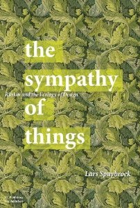
  • the consequences of Spuybroek’s “sympathy of things.”

But we don’t talk about those around the dinner table or across the conference table. We don’t talk about that stuff; we mostly talk about tabs and icons, bevels and borders, freemium schemes and iOS vs. Android and how about those Cubs.

There’s work to do. It’s not really so difficult to click that tab. There are people to feed, art to make, science to discover, sickness to cure, a climate to preserve, and winter is coming. But here we are again. talking about tabs and shadows.


Happy Birthday, Aaron.

Mar 13 14 2013

Newer Media

Nate Thayer, a reporter, took grave offense when The Atlantic asked him to adapt a basketball story for one of The Atlantic’s weblogs but didn’t want to pay him. He lost his temper colorfully, and also published the editor’s email address, which wasn’t terribly nice.

Alex Madrigal replies at length in A Day in the Life of a Digital Editor, 2013. It’s a shaggy post and gets off to a slow start, but it’s also one of the all-time best pieces of new media on the Web.

I'll be damned if The Atlantic dies with my generation, if all that is left of it when I leave is some moldering books and cold servers. Quite possibly, I would get to the gates of heaven and Ida Tarbell would be sitting there like, “Wait, wait, you’re one of those guys who let The Atlantic die?” And poof: trapdoor in the clouds, burning in hell for all eternity. Actually, strike that, I'd probably get stuck in purgatory rewriting press releases about corporate sustainability, forced to eat tuna sandwiches every day for lunch.

I spent about a day this week polishing a detail of Tinderbox Six. I’d like to walk you through some of the design because it’s interesting and accessible, and because I think it demonstrates why our expectations of software are leading us into such a terrible mess.

Under the hood, this feature is called Tansey Tabs, named for the distinguished university administrator who first suggested it. Tinderbox encourages you to open lots of windows on different facets of your document. You might have a map of the section you’re working on, an outline of references and sources, another outline of tasks remaining to be done, perhaps a treemap overview of everything. This gives you lots of flexibility and lets you tailor your workspace. But using lots of windows can sometimes be tricky, and increasingly it’s not something people discover for themselves; why not use tabs within one window to provide quick and easy access to as many views as you need?

How Software Is Built Today

This isn’t off the shelf, but that’s OK — we’ll just build it, it’s not rocket science. And it’s a feature that’s nice, not one that’s essential. Lot’s of people won’t use these tabs.

So, what do we need to think about when adding a bar of tabs like this?

  • The whole point is to have a view state that summarizes what you’re looking at and how it’s presented. You want to switch between view states. So we need a new object that encapsulates the View State, methods for updating the view state when the view changes or you switch tabs, methods for allocating memory for the view state and cleaning up afterward.
  • You need a bar in which the tabs live. That bar needs to have something drawn on it, which means choosing a suitable gradient or texture.
  • The tab needs a suitable shape. That shape is tricky enough to draw that we define an auxiliary object to frame and draw it.
  • Whoops! It gets drawn upside down! Slap head, fix that.
  • We need a way to add new tabs. Make a subtle button, attached to the right edge of the tab bar. Make sure that the tabs are arranged so the button won’t be covered by tabs, even if there are a ridiculous number of tabs.
  • The tab needs a label. That also means choosing a font, color, and type size.
  • When a tab is clicked, we need some feedback. So, while the mouse is down, we’ll change its color slightly and change the label color as well.
  • The currently-selected tab needs to be distinguished. It has a lighter color. And, because it’s notionally in front of the other tabs, perhaps it needs a slightly more pronounced shadow.
  • We need a way to delete tabs we no longer want. It’s easy enough to add a close button to each tab, but that adds a lot of visual noise. So, we’ll only show the close button when the mouse is over the tab.
  • There’s always a current tab, the place where the view you’re looking at puts its view state. So you can only delete other tabs, not the current tab. This requires a little extra logic.
  • Tabs needs to be saved with the document. That means we need to be able to encode a ViewState as XML, and we need to be able to read that XML and create a ViewState from it next year. And this needs to be done right, because if you make a mistake in the XML, you’re going to be writing code to work around it next month — and you’ll still be working around that mistake in ten years.
How Software Is Built Today
  • As soon as you save a file and start to actually use the tabs, you realize that you want to reorganize them. Everyone will want to reorganize them. So, allow the user to drag a tab inside the tab bar to change the order of tabs.
  • If the user drags tab A over tab B, the tabs swap places in the bar. This might look nicer with an animation, so try one. It does look nicer. Now, when tab B moves to its new place, does it slow down when it gets close, like a car applying the brakes? Or does it speed up, like a magnetic clasp? How fast should it move?
  • If the user drags tab A all the way to the right, it’s over the place tab 7 would be if there were a tab 7. But there isn’t a tab 7, so we crash. There’s no tab −1 either. Fix those.
  • If the user clicks too forcefully, the tab thinks it’s being dragged, not clicked. So, treat tiny drags as if they were clicks.
  • That’s functionally good, but now clicking the tab makes the tab jiggle a little bit. It doesn’t feel solid. At this point, I’m getting to hate tabs. But let’s add logic so the tab doesn’t move until you’ve clearly started to drag it, and then “tears off” to catch up.
  • Writing “Outline” or “Map” on each tab makes the kind of view clear, but it takes up a lot of space. Let’s add an icon or thumbnail that shows a little bit of what the view looks like. The obvious approach is to draw a tiny picture of the view. Getting this to look good seems to require more vertical space than I’m willing to spend on this feature.
  • It turns out that the thumbnails look pretty terrible. Instead, we’ll hand-draw the icon. We use the color scheme from the selected view as a hint. We could go further and draw a highly abstract picture of the view, optimized for a tiny space. Put that on the ToDo list.
  • Today’s computers have several processors, so we can ask another processor to help out when we need to set up a new view. And when the view changes, we can animate the transition. But with lots of tabs, we might click tabs so quickly that we start setting up a new view, begin a lot of animations, and then switch tabs again before those animations are done. Yikes! And what if you asked for a wakeup call when the animation was finished? And then the user closed that tab? Now, you’re gone and there’s no one to answer the call. Crash!
  • And we need some additional unit tests to ensure that all of this continues to work as the ViewState object and the views that use it change.

This is a hell of a lot of design and implementation for a small feature. The old answer was “reusability,” but that’s no good; we need more than NSSegmentedControl can give us.

This kind of detailing gets lots of attention in the tech press, because it’s thought to be a secret of Apple’s success and talking about (or against) Apple is always good for circulation.

This is a hell of a lot of design and implementation for $0.99. But that’s increasingly what people expect to pay for software. OK: maybe $19.95 for something really terrific. But can you sell an extra 100 copies of the program because it’s got draggable tabs? If you can’t, don’t you have better things to do with your time?

This is a hell of a lot of design and implementation for an auxiliary feature. Tinderbox isn’t about tabs. Tinderbox is a tool for notes, for visualizing, analyzing, and sharing. Tabs are just a nice things that some people will use and others won’t. And some people will give you 1-star reviews because they don’t like the shadows, or the typography looks bad in Sanskrit. There’s always something you forget.

But it can be done. One day to implement the tab bar. One day for dragging and saving tabs. OK: a pretty good day both times, but just a day. And if I can just string about 270 of those days together, we’ll be ready for beta.

Digital Humanities Manifesto (Version 2.0) is unsigned, but its author seems to be Todd Presner (UCLA).

Digital Humanities is not a unified field but an array of convergent practices that explore a universe in which: a) print is no longer the exclusive or the normative medium in which knowledge is produced and/or disseminated; instead, print finds itself absorbed into new, multimedia configurations; and b) digital tools, techniques, and media have altered the production and dissemination of knowledge in the arts, human and social sciences.

I think this characterization of the universe that the humanities study is a bit thin – there are many interesting things to know about the universe and not all of them concern the status of print – but it’s natural to focus on one’s own specialty.

This an interesting document, although its open source enthusiasm sometimes seems tinged with hostility (or contempt?) for working folk who might want to be paid for their labor. In calling for professors to "circumvent or subvert all ‘claims’ that branch out from the rights of creators to those of owners“, the manifesto apparently overlooks the empirically-verifiable fact that most of us are living in a capitalist society. Are digital humanists expected to move to Oneida or Brook Farm? If owners have no rights, then creators cannot realize the value of their work because they cannot exchange it. That might not matter immediately if you’re paid to teach and you create as a hobby, but what happens to those without a sinecure bestowed by the state or by a friendly billionaire?

The manifesto adopts a very pessimistic view of the value of knowledge:

Scholarship and art practice: a) are not‐for‐profit endeavors whose actual costs far exceed real or potential returns; and b) are endeavors that, rather than diminishing the value of IP or copyright, enhance their value.

This strikes me as a classic conflation of price and value. Surely, whether we paint a canvas or examine the economics of the late Roman Empire, we set out in the expectation that the work we create will be more valuable than our time and effort. We might be mistaken, the result might disappoint us, and accidents happen; still, no sensible scholar sets out to waste their time. Inefficient markets, ignorant patrons, and the caprice of consumers may impede the work’s value from being readily converted to cash, but its value is no illusion. Skill and knowledge are worth a lot; unique skill and knowledge are worth more. The humanities used to know this.

May 12 31 2012

RPG?

One of this week’s top iPad games is something called Defender Chronicles II. Supposedly, it welds tower defense and role playing games (RPGs).

This is bullshit.

Every abstract game can become an RPG overnight by gluing some stereotyped bits of stock narrative between episodes. There was a queen. She was besieged. There were monsters. And more monsters. And even more monsters!

You can do this in your sleep. And, apparently, they do.

It’s not an isolated case, either, and it’s not limited to translated titles or the clueless productions of precocious kids. What confuses me is whether these game peddlers know they’re lying, or really think that gluing a name and character sheet onto some parametric game mechanics makes something “role playing.” Yes, eurogames glue nearly-irrelevant metaphors to abstract game mechanics and nobody minds, but nobody buys a eurogame because they want to learn to build pyramids or buy art or settle Catan.


On a slightly more cheerful note, here’s a talk by Martin Jonasson and Petri Purho about “juiciness’ in games. “Juiciness” is an interesting term that stands, in essence, dor “nearly-gratuitous animation.”

The critical word here is “nearly”.

We draw a lot of boxes and arrows in computer science and information architecture. European computer science is especially fond of them. And of course they're central to the Tinderbox map view.

But should we rely on boxes? How about some curves?

Boxes and Arrows

I tried to get some interest in foliated, art nouveau maps at IVICA a few years ago. I’ve not seen much uptake, but perhaps that was too much to expect; making this happen will take a lot of work and would probably be a risky platform for a doctoral dissertation. (It sure could put someone one the map, though!)

I’m not entirely happy with this sketch. In fact, I’m not happy at all. The curves aren’t right, and we need other ways to represent anti-links and contingent links. How do we represent typed links without too much clutter? And this does nothing to help matters when you have lots of tangled links, which I think is something we ought to encourage.

But there’s a lot of low-hanging fruit to be plucked around here.


I have a bunch of research topics gathering dust. Most would be suitable for a dissertation or thesis. All should be publishable.

When I was a graduate student, I used to spend hours looking for ideas that might generate a publishable scientific discovery. Everywhere one turned, either someone had been there before or you needed a ton of new equipment.

Now, I’ve got ideas lying all over the office. That was chemistry and this is the margins of computer science and the humanities. Perhaps I was completely clueless back then, perhaps everyone else has always seen these topics lying around.

Anyone interested? What’s the best things to do with them?

Apr 12 16 2012

Gothic

I’m finding the first chapter of Spuybroek’s The Sympathy Of Things absolutely fascinating. It explores “The Digital Nature of the Gothic,” connecting the artistic impulse behind fan vaults and foliated stonework to the craft of new media. Ruskin’s characteristics of the Gothic – savageness, changefulness, naturalism, grotesqueness, rigidity, and redundance — apply with great force to the nature of the digital.

It’s tons of fun, believe it or not. It’s not easy to follow Spuybroek’s argument, which twists through spandrels and ogees and technical issues of vaulting long before we get to technical issues of the digital. I think I see how the gothic nature illuminates Storyspace-style hypertext in new and powerful ways. It’s worth a little architectural research to find out.

It will be interesting to see how NeoVictorian artisanal programming looks in the light of Gothic Revival architecture. There’s certainly an interesting point to be made about the use of new tools and finishes to achieve things to which (we think) ancient artists aspired. To accompany this, we might want to set up an iPod playlist with Respighi’s Ancient Airs, Vaughan Williams’ fantasias on Greensleeves and Thomas Tallis, a Mendelssohn oratorio, and Ormandy’s orchestral transcriptions of Bach.

Apr 12 5 2012

Day 6

Day 6

Revamped the text-handling routines and added support for text styles. This is trickier than it sounds because style information in Storyspace, naturally enough, coincides with the sorts of styles that QuickDraw used. The style information is stored in a hand-built heap flattened in the binary disk file, and reading it is tricky because, if you don’t get it exactly right, you have garbage and no hint of what went wrong. I remember that this drove me up a wall for the original Storyspace for Windows. Good times.

To make things worse, I lost a perfectly good hour debugging this because unit tests were asking for one file and SSPFile was opening another file just like it, but with different style information. Storyspace was doing it right but the results were wrong.

Another long session began a cleanup of the guard field parser. This is very old code, largely untouched since I added some features to support my IWHD paper in 1995. It’s so old that it doesn’t use std::string, since the standard template library wasn’t even a standard until 1994. So everything is built around old-fashioned C strings. Worse, everything depended on buffers of fixed size, because Jay Bolter, who did the coding for Storyspace 1, had a signature avoidance of variable-length strings. So not only do I have the ghost of my own old style, filled with fstrcpy and strchr, I’ve also got this palimpsest of Bolter’s style. It still needs more work, but all the antique machinery has now been replaced and those ugly buffers are all gone.

Other bits and pieces for Sunday afternoon included fast enumeration support for Nodes, Links, and Styles, and adding a pane splitter to support an optional map view. The latter was especially nasty because XCode started to crash when resizing Interface Builder elements. Something is not right.

Is there a secret trick to tell XCode to heal an ailing project? Email me.

Apr 12 4 2012

Day 5

Day 5

Settled yesterday’s “where do we put the controls” question for now by opting for a top bar and sticking with painfully standard controls.

A lot of logic had wandered into the AppDelegate for lack of a good home. Most of this was refactored to a new SSPTextViewController, which also now manages the Browse Links popover. Some new classes might help encapsulate some of the uglier Cocoa objects, things like moving between C strings, C++ std::string, CFStringRef and NSString.

Mac OS X Lion replaces Cocoa memory management, which was a bear, with automatic reference counting (ARC), which is a big win. But ARC is no panacea. In principle, most of the time it “just works” and programmers can pretend that all objects will get magically collected. In practice, the exceptions are close enough to the surface that it seems like you really need to know what you’re doing, and what ARC is doing, to get things right. As with the old memory management style, I can’t imagine how casual or novice programmers cope with this. Hell: I’m having quite a time with _bridge_retained and its friends myself!

Day 5

Good and long day of programming, punctuated by Storyspace authors who are already urging ever-earlier deadlines and some conference-review headaches. Full-screen works, controls work, menus work.

Status:25 classes, 17 tests.

To reward myself for hard work, knocked off early for 10PM showing of The Hunger Games.

Mar 12 31 2012

Day 2

Day 2

About twelve hours of head-down, straight-ahead coding. Classes include Hypertext, Node, StoryspaceLink, and the beginnings of a text window.

Day 2

I’m still undecided about using much Objective C++. Advice welcome. Automatic reference counting is delightful, though I’m still waiting for it to bite me when I’m not looking.

Status: 8 classes, 7 tests. (Four more classes were added and then removed, as the text formatting has involved a degree of design thrashing. As usual, the user interface-heavy classes lack good tests.)

Mar 12 30 2012

Day 1

Day 1

A grueling day of sprint-coding, starting from the rarely-seen XCode stationery. The blank canvas is always formidable, and it’s worse here because intensive Tinderbox work for the 5.10 updates has played havoc with my Objective-C reflexes.

Ten hours later and we’re just about reading legacy Storyspace files.

Day 1

Much of the code is quite ugly, thanks to tons of arcane bit-twiddling. Remember, this file format was originally designed to lift things efficiently off floppy disks, because a big hypertext like Victory Garden could take five minutes to load on those old machines. To minimize processing, large parts of the file format exactly matched the data structures, so you could slam the bits right into memory. Unfortunately, this means that details of the 68000 compiler’s memory layout persist even in this new code, three processors on.

It’s not all awful. Test-driven design will help a lot. It hadn’t been invented the last time I went through this. It’s already helping, although I did lose 20 minutes trying to track down the lost 141-st link in Mary-Kim Arnold’s “Lust”, when it turned out the lost link was never lost at all.

Status: 5 classes, 4 tests.

Tim Parks suggests that there’s no point in finishing a book that’s not delighting us.

It seems obvious that any serious reader will have learned long ago how much time to give a book before choosing to shut it. It’s only the young, still attached to that sense of achievement inculcated by anxious parents, who hang on doggedly when there is no enjoyment. “I’m a teenager,” remarks one sad contributor to a book review website. “I read this whole book [it would be unfair to say which] from first page to last hoping it would be as good as the reviews said. It wasn’t. I enjoy reading and finish nearly all the novels I start and it was my determination never to give up that made me finish this one, but I really wish I hadn’t.” One can only encourage a reader like this to learn not to attach self esteem to the mere finishing of a book, if only because the more bad books you finish, the fewer good ones you’ll have time to start.

I confess: I tend to plough right through to the end unless the book is clearly awful.

I start a book. I’m enjoying it thoroughly, and then the moment comes when I just know I’ve had enough. It’s not that I’ve stopped enjoying it. I’m not bored, I don’t even think it’s too long. I just have no desire to go on enjoying it. Can I say then that I’ve read it? Can I recommend it to others and speak of it as a fine book?

First, my stack is huge, but it’s not so filled with surefire delights that I can afford to drop a book I’m enjoying thoroughly. “I just have no desire to go on enjoying it” are not words you’ll hear from me. The same applied, incidentally, to food and wine; I might stop because I’ve had enough, I might stop because more than enough is too much, but I’m not going to leave the rest of the delicious cheesecake just because I’ve had a bite already.

Interestingly, though Parks is not thinking here about hypertext, his conclusion is that closure is indeed a suspect quality:

And finally I wonder if it isn’t perhaps time that I learned, in my own novels, to drop readers a hint or two that, from this or that moment on, they have my permission to let the book go just as and when they choose.
Sep 07 16 2007

Edale to Hope

On Sunday, I took a little stroll in the Peaks District, planning to follow the conference chair's advice and walk from Edale to Hope. Walking to Hope sounded nice.

It was a good deal more exciting than I'd planned.

Edale to Hope

I'd expected a gentle stroll amongst country lanes, with views of gardens and summits and declivities. A walk suitable for the Miss Bennets, or Mary Russell at the outermost. I was equipped with sturdy shoes, a bottle of water, a tomato and Taw Valley Cheddar sandwich, and an Ordnance Map of the district. I was fit. I was prepared. I was feeling salty as hell.

Edale to Hope

There were a good many sheep along my walk. They come in many varieties. Most were a bit reserved, but some were very curious about hypertext.

The very helpful gentleman at the visitor's center gave me printed directions to the most suitable trailhead, explaining that perhaps the signposting might be less prominent than I was accustomed to in the States.

It appears that, when a trail crosses a pasture, there is no perceived need to indicate the trail at all. Having entered, you must exit; you're simply expected to find the other exit and proceed. Or, perhaps there's another secret.

Edale to Hope

And so I arrived at the trailhead and set out, and here things began to go badly wrong, for the simple reason that I set out on the wrong trail. Or, I think, on no trail at all. I have read about following a sheep path on the moor. I know about this. Didn't stop me. So I following this nice little footpath, clinging to the side of a steep and increasingly narrow little valley, climbing a tall ridge.

It was the wrong ridge. But, far above, I could see lots of people on the trail. I pushed on and up. I discovered an interesting fact at this point.

In Colorado, say, you get boggy swamps in lowlands. In Derbyshire, you can be at the bottom, the top, or in between, standing on a steep, steep slope, and you carefully set you foot to keep your balance in a patch of dirt that looks a little muddy, and glop! you're up to your calves in glutinous brown mud.

There are lots of sheep. There have been lots of sheep here for a long time. In consequence, approximately every plant has thorns, or little prickles on its leaves, or burrs. Which means I soon had legs covered in mud, hands covered in bleeding scratches, with a cloud of midges in pursuit who had discovered true love.

Edale to Hope

So, at this point I'm getting quite high up the slope, which is getting much less passable, and the trail has given out entirely. But, at the ridge, there's a steady stream of hikers: that's were I ought to be. There were still occasional sheep about. I did reflect, frequently, that "if Linda were here, she would have said, 'This is not a trail!' several miles back." And she would have been right.

It was tiring. I made it. Eventually. Hooray.

Lunch. Another tomato baguette, or six, would have been welcome. And then, confidently, I set out, smiling and nodding at each encounter with a fellow rambler, restored to society once more. Good times, good road. Everyone was cheerful. A group of fresh young fellows, led by a wiry older man who looked like he knew just where he was and where he was going, walked past.

"Is this the road to Hope?" I asked.

"Hope?"

"I've been waiting to ask this question for many years."

"Hope. No, I don't think so!" He looked concerned and pulled out his map. Much study ensued. "I think you have gone wrong. Down here," he said, pointing to an indistinct spot on the map, "you would have lots of choices. There's a very nice pub in Hope, as well." A pub sounded very nice to me, right then, since pubs tend not to have gelatinous brown mud, thorns, or pecipitous rises. "But you're up here. If you want Hope, today, I think you really need to go down this clough."

And so I set off down the clough. It was a nice clough. A stream runs through it, as streams do.

Edale to Hope

And here, again, we find ourselves in a muddle. There was no trail to be found. Much of the descent was steep, and much of it was wet, and lots of bad things can happen when clambering over wet rocks in a stream in a hidden and obscure defile in which one was not expecting to be. I observed to myself that, if someone at Hypertext '07 was wondering where they had mislaid Bernstein, this particular clough would not be the first place they would look.

I was sure there must be a trail. Somewhere. Unfortunately, I was at the bottom of the clough, so any attempt to find the trail involved struggling up its steep and thorny sides. My ordnance map made an excellent sail, but did not offer any clear advice. The clearest thing it told me was that no feature in sight conformed to the place my advisor had told me this was.

I decided the trail couldn't possibly lead down the wet boulders, so I climbed the ridge to what looked to be a trail. It was a disused pasture wall. I climbed some more; but this was getting serious. As the view improved, I realized that my revised itinerary had almost certainly been proposed by a fellow who, like me, did not know where he stood: the clough I was clambering was distinctly curving, which the Ordnance map clough had no curve.

Edale to Hope
I did not fall off cliff, or down either clough. I did not spend night on moor, though was thinking very seriously of making provisions.

And so, eventually, I got back down, and now I was again on real footpaths. I was also far from Hope, and night was not that far off. But there were sure to be some hours of daylight left, and on I went. And then, the map said that if I were only to follow a spur and climb this little ridge, there'd be a Roman road.

Edale to Hope

By this time, I really must have been tired, as I did notice how the trail up the ridge crossed quite a few of those little brown lines on the Ordnance map but somehow failed to understand exactly what this meant. I am still sore.

This must be Tolkein's Eriador: barren hillsides with lovely views, crossed by The Road and The Greenway and dotted with ruined walls and strange, deep holes. Somehow, I managed to notice the cairn that marks the path that winds slowly down the ridge and into the lovely hamlet of Hope, Derbs.

Edale to Hope

Bly on Of Day Of Night
 

Bill Bly, musician and author of We Descend, writes about Megan Heyward's of day, of night :

I really enjoyed my first reading of "of day, of night." It's certainly immersive: it took me a little over an hour to read, and I only got up once to refill my coffee cup.

I was captivated by the overall visual appeal of the piece, and found the reading apparatus welcoming and engaging. I always like to see if I can figure out how to move around inside a hypertext without resorting to the directions, and here that was easy as well as rewarding. Thoughtful wandering seemed to work best, and it was gratifying to find, when I finally did read the directions, that wandering was what the author recommended. The interface itself encouraged the best way to read.

The music is dreamy, all bottleneck & pedal steel guitar. The rest of the soundtrack consists of the natural sounds of objects and critters -- matches rattling inside a paper box, a rusty tin opening, pages being turned, a pencil scribbling in a notebook, treefrogs, birds, insects. Human sounds (except for the narration and a single line of dialogue in what may be Chinese) are of the same order: atural sound, like footsteps on different surfaces and in different (or no) shoes, breathing, laughter, sighing. To me, this was the most enchanting dimension of the piece.

I was especially delighted by Sophie's gambit, once traditional therapies had failed to "wake up" her ability to dream, of wandering around town picking up objects and imagining their stories. The sketchy fragment she writes to accompany -- not explain -- each artifact invites the reader to come up with more details, fill the fragment out.

Hepworth on Of Day, Of Night
 

Rose Hepworth writes from Goldsmith's College, University of London:

Re-reading [Of Day, of Night], it struck me again how 'I lost the ability to dream' is such a beautifully simple premise for a fragmented narrative. It just dovetails so perfectly, for me, with the experience of reconstructing the text, which is dream-like in itself.

Fragmented narrative is one of the hallmarks of much electronic writing. It's not just an artistic challenge: weblogs are fragmented narratives. Memorable weblog arcs unfold over days and weeks -- whether we're talking about Drudge's pursuit of sex scandals or Kaycee's fight against leukemia or Badger's struggle to put her life back together.

Pieters on Of Day, Of Night
 

Brendan Pieters has been teaching English and new media at Santa Fe Community College for more than a decade. Reading of day, of night prompted him to look back:

Of Day, Of Night combines oral narrative, words onscreen, music, and video to create a rather sensuous détournement through a person's life. Amazing how hypertext has evolved since Patchwork Girl, or afternoon -- they were more like traditional stories with the capacity for the reader/user to interact. Of Day, Of Night is very accomplished.

When I read this, my initial reaction was that Professor Pieters was wrong -- that Heyward's of day, of night is indeed unlike Patchwork Girl and afternoon, but that the effort to measure them in this competitive way is wrong-headed. The critical corridor, I think, always has a cluster of sourpusses eager to complain that last year's new media is too old and too full of words, that they want the shiniest new thing.

But I think there's something else here, something deeper than "Heyward has more pictures". Heyward is sitting right at the border of artifactual hypertext; she gives the reader a range of objects, links the objects to moments, and knits this together in a young woman's quest. It's not just the intrusion of film into text, it's the singular appropriateness of these dreamy images in a struggle to dream again.

Or maybe not. My point is that we should be talking about hypertexts, new and old. What's fun? What isn't fun, but turns out to repay the effort? What bits of craft can we note down to use in tomorrow's weblog, or next year's electronic fiction?

Atchley on Of Day, Of Night
 

Denise Atchley is a multimedia producer who has convened a long and important series of Digital Storytelling Festivals. Recalling Megan Heyward's reading of of day of night in Sedona, she recalls:

The sumptuous quality of the artwork and the story line behind the piece. Also, the hidden little surprises that made the whole piece feel a bit like a treasure hunt, but because it was personal, that we were being also being voyeuristic.
Fleming on Of Day, Of Night

One of the nice parts of my job is that I have the pleasure of reading notes that people send us about new hypertexts. Professor Dan Fleming writes from Waikato about Megan Heyward's new of day, of night:

The more time I spend with it, the more I think it's one of the best pieces of new media narrative I've encountered.

At times, on a formal level, it recalls Peter Gabriel's Eve, but where the latter invites the reader/viewer to reconstruct a lost paradise by puzzle-solving, of day, of night doesn't so much offer puzzles as narrative 'knots' that loosen and reconnect themselves just by having time spent over them. There's a delicious sense of reconstructed memories that gently exert pressure from underneath somewhere until you can't stop them from flowing back together in unexpected but wholly satisfying ways.

That rising flow of connectedness is very rare in hypertext where connection often doesn't shake off the arbitrariness of user interaction. Here the interaction shifts gradually away from the physical encounter with the interface and onto a conceptual and emotional plane where I found myself, in the end, in a state of stillness and apparent non-interaction with the computer - but very much engaged by the dreamlike flow of interconnecting memories. Powerful stuff.

As I was saying, even the proverbially boring blog post

I ate a cheese sandwich.

is not really boring if you do it well. And there are lots of ways to do it well: so many, indeed, that I left out some important ones.

  1. How I made a cheese sandwich is always interesting. While I was in LA, Linda did some experimenting and found that lightly toasting the bread before grilling the cheese sandwich made a huge difference -- the bread stayed crisp, it got nicely buttered, and the Vermont cheddar melted just enough.
  2. The cheese sandwich may focus a larger issue or resentment. Every Tuesday and Thursday, they serve the same cheese sandwich to the inmates -- a repulsive and unhealthy sandwich which, thanks to graft and profiteering, costs the taxpayers more than steak. This is the dominant discourse of political weblogs. The sandwich isn't merely an emblem, but it's part of the picture.
  3. The cheese sandwich may be introduced for pacing. I am in the midst of a dramatic, unfolding story -- struggling with a dreadful disease, perhaps, or running for Congress, or selling my startup to Google -- and you're visiting my weblog every day to see what happened, and today I'm going to tell you a long and interesting story about this cheese sandwich because I want to remind you that life continues to unfold while we're waiting for the test results or due diligence.

Just to review the bidding, our earlier cheese sandwiches included:

  • the excellent sandwich
  • the notable accomplishment
  • the conventional occasion for an extraordinary event
  • the symbol or emblem
  • the sandwich that identifies a place or time

It's not just cheese sandwiches, of course.

Cheese Sandwiches Again

Exercise: the LiveJournal equivalent of the cheese sandwich might be something like this:

Last night I went to the party at Foo and saw this really cute guy and we danced all night and then I brought him back here and it was really great, except...

Compose blog posts that use this story for each cheese sandwich variant.

People who want to disparage weblogs like to say that they're full of dull trivia. "I ate a cheese sandwich."

Let's take a look at the craft of the weblog, by looking at the craft of that cheese sandwich. How can the cheese sandwich matter? How can it be interesting?

First, it might be an excellent cheese sandwich. I had a very fine bleu cheese the other night at AOC, a mild and creamy bleu from a small farmhouse cheese maker in Minnesota, served with a nicely fresh and crusty baguette. Food blogging has been immensely successful and influential. We're in the midst of a food writing revolution, a new way of thinking about food, and blogs and other forums are leading the way.

Second, eating a cheese sandwich might be a notable accomplishment. After a long convalescence from surgery, I actually ate a cheese sandwich. Or, the cheese sandwich might affirm or reject a longstanding habit or prejudice: though you all know that on moral grounds I have always despised all meat and dairy products, yesterday -- defying my physician, my ancestors, and sneering at hell's bells -- I ate a cheese sandwich.

The cheese sandwich may be the conventional occasion for an extraordinary event. Yesterday, I was eating my usual cheese sandwich and Roger Ebert came into the sandwich shop and sat across from me and we had a long talk about Pauline Kael.

The cheese sandwich may be a symbol or emblem, standing concretely for an abstraction. This need not be a grand or remote literary effect; indeed, much food writing is not precisely about food at all, but rather uses the food and our feelings about it to approach even deeper subjects in ways that, if addressed directly, might seem merely sentimental.

sad thoughts on the love that got away on the plate that time forgot -- Adam Gopnik

The cheese sandwich might identify a place and time, situating a story specifically in order to help us believe. The Sunday bagel and cream cheese in the Bronx, or the elaborately-garnished, thin slices of seven-grain organic bread and imported low-fat Havarti wolfed down at a desk in Hollywood, can matter beyond the bread and cheese.

Here's an interesting discussion in a church blog on the subject of allowing comments.

Comments give us flames, trolls, comment spam. Imagine: if the left took some of the hours and hours of work they spent last October fighting comment spam and trolls on Atrios and DailyKos, and spent maybe a tenth of those hours canvassing Ohio and Florida.

Moral of the Great Weblog Comment Experiment: comments build traffic, but not traffic you want or you can use. Link liberally to other weblogs -- including those that disagree with you -- but let your opponents publish in their own space.

In a brand-new paper for the upcoming Blogtalk, Trevor Cook suggests that bloggers won't be able to make much money from their weblogs.

Only a few bloggers seem to have any serious prospect of generating enough revenue to be able to provide journalism outside the constraints of corporate media.

This seems plausible. Is it true?

  • Industry analysts and specialist correspondents can clearly generate enough income to sustain a business. Writers who provide critical business intelligence can easily justify subscription fees of $500-$2000 per reader per year from the circle of insiders who absolutely need that information. This has been true for decades, and won't change; private weblogs simply provide a better and more timely vehicle than mimeographed newsletters. These businesses don't need a mass audience; they need a writer, an office, a lot of plane tickets and hotel rooms, and perhaps an assistant. Do the numbers; you can make money way out in the tail. Needed: 100-1000 readers who really want the information you can get for them.
  • Political columnists who can command even a modest following should be able to generate enough income to stay in the field. If you're a political reporter in the US and it's an election year, you want to go cover the New Hampshire Primary. Several weeks of motels, a rental car, lots of meals in diners and lots of drinks for your sources. A plane ticket. Two, three thousand bucks. You won't get rich. Neither did Ida Tarbell or Sinclair Lewis. Get some readers, get $25 donations from them and $100 from your fans, and you'll be working, you'll be writing, you'll be heard -- and you won't have to haggle over your expense reports. Needed: 1K-10K fellow travelers.
  • Sports writers, food writers, and travel writers might be able to break into the field through weblog writing. It's not a sure thing, but it might work. The challenges here differ. Sportswriting is a shrinking field: there aren't many jobs, and there are plenty of gatekeepers. There are also plenty of readers: the decline in jobs stems from the decline of newspapers and the consolidation of publishing, not from anything intrinsic. Travel writing is dominated by publisher-owned brands, and so getting beyond Barely Scraping By is a challenge. Food writing is in transition from "women's page" to something else. A combination of subscription, tie-in merchandising, and membership/affinity programs should be able to generate $5 or $10/year from each reader. Needed: 20K readers, a garret, and a calling.
  • Viable, small businesses can (and often should) support a blogger, especially in a field where everyone needs to be able to write. One fundamental difficulty managing a small firm is that people are quantized and expensive. If you want to add staff, you usually have to add a whole person -- and commit to that person for months or years. This means that small companies are either understaffed (and nobody has time to do anything) or overstaffed (and that usually means there's no money for equipment that everyone needs). A weblog can convert a a fraction of a person to cash, simply by attracting visitors and making them interested in your products. (If you don't need more visitors and more prospects, you don't need more money. Please send it to me, ok?) Every bit helps. Plus, it's great training, it helps build contacts in the industry, it's got upside. Needed: For a retail business, 10K visits/month ought to translate to about $15-30K/year gross margin, which can make that extra staff position a bit more palatable.

Notice, too, that this is a revenue stream that clusters of small firms can mine much more efficiently than large firms. A small operation can pick up $10K lying on the table, but the overhead burden on a large company makes this a much more marginal proposition.

  • Artists need a blog. If you are (or want to be) a professional artist, you need a channel -- a path that leads from you to your patrons. Galleries used to be the channel for painters and sculptors, publishers and agents were the channel for novelists. Just about every artist has some unsold stuff, so you can always use a better channel. At minimum, it's a place where your collectors and fans can see what you're doing now and dream about acquiring a new piece or perhaps giving one to their cousin or their alma mater. You never know. Needed: a vocation, a style, and a short list of people who want to know what you're making.

This isn't a comprehensive list. These are some models that can clearly generate enough revenue to sustain themselves, given the appropriate underlying capabilities.

If you want to be a business pundit, you've got to write well and schmooze well and travel lots.

Notice that I haven't even mentioned advertising revenue (which is, in my experience, overrated by people who write about blogs and underrated by bloggers themselves) or sponsorships or donations. And none of these models require lots of traffic.

They key isn't to get a lot of readers. They key is to get the right readers.

Adrian Miles says that we are written by our blogs. Lilia Efimova responds, suspecting that Adrian overestimates the importance of incoming links for shaping weblogs.

I'm not sure that the way others could construct my identity from links to me is the same as my identity... From my perspective 'incoming links' matter, but it's me who decides what role they play...

In a (formerly) separate conversation, Blogtalk Downunder speaker Chris Chesher argues the opposing view:

In the speculative era of cyberculture criticism in the early 1990s, many authors claimed electronic text would destabilise the institution of authorship (Poster 2001; Landow 1994; Bolter 2001). They argued changes of material form of writing would decrease the power of the author. They connected this claim with critics such as Roland Barthes, Jacques Derrida and Michel Foucault who had questioned conventional assumptions about authorship, and speculated on the possibilities of texts without authors. While the claims of these electronic writing advocates were contested theoretically (Grusin 1994), the popularity of blogs empirically demonstrates the persistence of authorship, and how progress often works backwards.

This is problematic on a few fronts -- surely the place to reach for Bolter's view is his 1991 Writing Space? Later, Chesher say that authorship emerged "alongside a range of economic, technological, social, political and legal changes associated with the rise of individualism, capitalism, rationalism, democracy and rule of law." This might surprise Archilochus, the 7th century poet whose authorship is sufficiently recognizable that we can find 30 new lines of his work in a scrap pile, some 2,600 years after he died, and say "By George, this is Archilochus!" (Democracy isn't on Archilochus's radar -- Pericles was born about 150 years after Archilocus died -- capitalism is a problematic term two millenia before the Medicis, and as far as rule of law goes, the handy Oxford Classical Dictionary reports that Archilochus's most-remembered poems were biting satires of the sexual habits of his former fiancée and her younger sister, written by Archilochus as a form of revenge after their dad broke a marriage contract and reneged on the wedding.)

But Chesher assumes that the natural boundary of the blog excludes the pages linked to the blog, and the pages to which it links. The critics he denounces -- especially Landow -- assumed the opposite, and so reach a different conclusion. Miles assumes that the linked pages are the essence of the blogosphere, that they flavor the blog so intensely that they set its key, its tonality. Lilia demurs; I fancy, though, that if Lilia were slashdotted more frequently, the slashdotting would change things. If your blog inscribes your calendar -- adding speaking engagements and consulting trips -- does it inscribe you? If it inscribes your bank account, does it change who you are?

For example, I have just posited a debate between Miles, Efimova, and Chesher, outlined their positions, and demonstrated some weaknesses each writer exposes. Who made this debate? Adrian, who wrote the first post? Chesher, who began it? Perhaps I am the author of the entire affair.

Peter Wasilko integrates iCal and Tinderbox.

Aug 04 21 2004

Code Smells

There are at least 38 different kinds of windows in Tinderbox. I know this, because there are exactly 38 classes that compute a WindowTitle. (Some windows, of course, have no title, or don't need to computer a title). Indulge me while I adduce some consequences:

Incidentally, the development peekhole is back.

Apr 04 20 2004

Osborne

After dinner last night, I was talking with open source software engineering guru Walt Scacchi, and with Doug Engelbart, the guy who invented outliners, the mouse, and lots of other things you use all the time.

It was a Memory Lane kind of evening -- Frank Halasz was there, too, a guy who had a huge influence on my career though I'm sure this would surprise him.

Someone recalled the early personal computer flea markets. "I was there," said Doug. "I saw Bill, in a little flea market booth, selling software off his tailgate," Scacchi recalled. "I saw Adam Osborne on his soapbox, telling us to give away the computers, to give away the software. 'How can we do that?', people asked him. 'We'll all make money selling them the manuals!'"

"Well," I said, "it turned out that it was Bill who got to buy the big house." That might have been the real start of open software, right then and there. Scacchi's almost convinced me that the open software economy might work, even without the cost-shifting arbitrage that currently seems to supply so much of its fuel.

And that's still, in a way, the core of the problem. 'Indirect economies suck,' said Diane Greco, and she is not wrong. Computing may have become a service industry, but the needs of a service industry are not the needs of research and innovation and progress. It's a puzzle and a problem.

Osborne

Adam Osborne was a wonderful tech writer. He built a terrific business on his model, writing a wonderful series of books on microprocessors back when microprocessors were new. I still own mine. It was brilliant: from sentence structure to production, everything was right. Osborne, and Brian Kernighan, and maybe Bob Horn (who was at Hypertext '87, though not at dinner) pretty much defined modern tech writing. Or so it seems to me.

They weren't all fools
Among the worst, and most popular, historical myths is the belief that people used to be idiots. It's always tempting for historians to fall into this because the historian knows how things turned out, and because our inner adolescents perpetually remind us of what fools are parents were.

One symptom of this mistake is sudden descent from something very interesting into unreadable politics:

Orientalism serves as a safety valve for gender friction by providing imagery for male wish fulfillment and idealization. This function was signaled early on by Hiram Power's The Greek Slave, which depicts a nude woman chained and sold into harem slavery by the Turks during the Greek War of Independence. This unprecedented sculpture came to epitomize the nineteenth century cult of pure womanhood, with its ideals of chastity, piety, and quietude.

This is Holly Edwards channeling Edward Said, and though her catalog of Noble Dreams, Wicked Pleasures: Orientalism in America 1870-1930 is full of delightful work, the text is often marred by this sort of carping. The artist's politics were not ours -- or at least not Said's -- and so we have to hold the artist (and the buyers, viewers, and critics who were all fellow travelers) in a certain contempt. (Edwards does do an important service in explaining why France's imperial issues were not America's, and that Orientalism in American painting does not have to mean the same thing that it meant in Paris)

They weren't all fools
Mark Bernstein,
Guantanamo Study,
Poser sketch after
The Greek Slave

But if of politics we now would speak, what were the artist's and the viewer's politics, anyway? No, the Greek Slave isn't the girl next door. If she were, this would be unbearable. Terrible things happen; art gives you some distance. Sooner or later, it is going to happen here , and it's easier to plan and to prepare if you begin by thinking about what's happening over there.

And somehow, speaking of politics, we've managed to forget that we're in New England in 1843 and we're talking about people who knew slaves, people who could (and did) say that some of their best friends had been slaves, people who were 17 years away from busting up the last, best hope of mankind and walking out of their New England parlors all the way to Georgia, in order to destroy slavery at any cost.

If you convince yourself that those old folks were fools and louts who just wanted to do the male gaze thing to the Orient, you're fooling yourself. They may have been wrong, there were lots of things they didn't know, but they weren't merely greedy simpletons and perverts.

They weren't all fools
In Carpeaux's Les Quarte Parties Du Monde (Luxembourg Gardens, maquette in the Orsay), we have four women -- Europe, Africa, Asia, and America, supporting the globe. Africa's leg is shackled, and America just happens to be stepping on her chain.

I spent a couple of hours this afternoon, sketching The Greek Slave in Poser, to sort out two different ways we're distanced from this girl. One is intentional -- she's a hunk of silicon dioxide. The other, though, is partly an accident of time. Her hair is antique, and that's a powerful source of distance. (Anne Hollander points out that, in historical movies, the stars almost always have modern hair.) And her body is antique, too; nude statues, from the Greeks on, are almost always distorted by the forces of the underwear that the subject is not wearing . (Poser has the same problem -- and it gives her the abs of a kouros -- but because it's modern we don't see it so prominently)

The unexpectedly interesting parts of this exercise in new media remediation were the hands. I wanted to change the right arm just a little, moving the girl a little away from the column and letting her put more weight on it. Hiram Powers probably couldn't do this because the marble wouldn't withstand the shear force, but we can benefit from the magic of virtuality. The Poser 5 slave isn't conscious of the corset she's not wearing, she's accustomed to jeans or skirts or to the little black dresses that Coco Chanel will invent for her granddaughter, and I wanted some muscle tension somewhere.

The left hand, I thought, was a bit of silly 19th-century nonsense. It turned out to be a headache, because small changes in gesture end up reading very differently, and I didn't want to wind up in Fleshbot. It was murder to get anything close to acceptable, and to do that I pretty much abandoned the attempt to mimic the original angles. (There's a reason you never see hands in user interface icons: nearly every gesture is obscene, somewhere)

It's a hell of a note that we're now more puritanical than the 19th century Boston Brahmins. But, let's face it, we are. Gender friction? Male wish fulfillment? The viewers were often women, the tastemakers were even more often women. Those women didn't have much political power, but they had some -- and they could easily have preferred something else. And the whole point of the sculpture is that you're obviously supposed to identify with the slave girl.

And this is becoming the sort of thing of which plain folks, in 21st century America, dare not speak.

As I'm walking home, a fellow pulls over and asked me for the best way to drive to Paddington. I'm from Boston, I have no idea where Paddington is, and I'm striding confidently down Gower Street because I narrowly escaped from being enmazed in Russell Square. I'm not that confident anyway: I've been up for 40 hours, I just walked about 15 miles or so through Bloomsbury and Notting Hill (see below), before that I flew across the ocean, and I have just enjoyed two of those excellent (but preternaturally large) pints of real ale.

Someone always asks me for directions. Lately, someone always asks on my first day. Often, in a language I don't speak, in a place I've never been.

Why, exactly, did we think hypertext navigation was a problem?

I had those two pints (memo: special is worth the 15p premium) at a very pleasant, unremarkable pub just down the street from where Foundling's Hospital used to be. It's a park now, for children -- Foundling's is. Not the pub. The pub has always been there, and it's always been a pub.

I did have some trouble, ordering a pint. even though I read an entire thesis on how to act in a pub. Spending more time in Britain and among Britons abroad has left me nearly deaf to accents. I forget that, where I hear a charming trace of an accent I can't place, the other person hears me speaking broad and incomprehensible Chicago with overlays of something nobody can identify anymore as a speech problem (thank you Mrs. Horowitz). Like the Minbari, Britons may sometimes sound like us....

The pub seems unremarkable, but Robert Elms did remark (in London Walks v2) that it's not much changed since his schooldays -- or since the 18th century -- "complete with snugs and engraved screens." So, back in 1775 or so, a couple of medical workers probably sat in the nook where I was reading Hiromi Goto and complained about their caseload and worried together about the troubles over in Boston.

Everything in this post is about hypertext. It has no links.

In the past months, many weblogs have pondered Iraqi blogger Salam Pax. Is he real? A fiction? Paul Boutin summed up the evidence  last month:

Speculation continues that Dear Raed , the weblog of a young man in Baghdad who posts under the name Salam Pax, is a hoax, perhaps even a disinformation campaign by the CIA or Mossad. A month after Computerworld published a story quoting a "terrorist" who turned out to be one of their former writers pranking them, it would be foolish not to wonder.

An interview with Salam Pax by Mark Stephen Meadows, to appear in Tekka this week, appears to close the book on the question. Salam Pax is real.

  • Meadows met Salam in Baghdad, at the Baghdad Sheraton. They spoke at length, on the record. Meadows also met Salam's father. Salam asked not to be photographed.
  • Salam blogged the meeting in some detail, on May 22.

So, we know that Meadows met someone in Baghdad who said he was Salam, and who has access to Salam's weblog. This doesn't completely preclude some off-the-wall scenarios -- perhaps Salam flew to Baghdad for this interview, having posted his weblog from Wisconsin through an Iraqi intermediary? But what would be the point?

As I've written previously, we worry about the authenticity of weblogs more than we ought. Kaycee Nicole was true, although she was a fiction. Isabella (new URL) revealed an important lesson about thrillers that the interactive fiction community had overlooked. Salam reminds us that people can be who they say they are -- that, sometimes, things are pretty much what they seem.

Of course, we still have all the questions about reality that face any reader. When Salam offers an opinion, or I do, is this precisely what he believes? Of course not. We write things we believe, we write things we want to believe, we write things we ought to believe even though we cannot believe them. We write about who we were, not who we are; we write about who we wish he had been and what we wish we'd thought to say. Isn't that more true, in the end, than a recording?

The wonder of designing software tools is the chance to take ideas (the gossamer of dreams) and commodity hardware (rust) and create something completely new that helps people do wonderful things. If you're lucky and skillful, you can sometimes make this happen. Sometimes, you might be well paid for doing it.

Sometimes, things don't work. Maarten Hekkelman wrote a text editor called Pepper, meant to be better than BBEdit. He gives a long, detailed, and frank interview to John Gruber, who used to work for BBEdit. Together, they explore what went wrong, and why in this case rust and dreams remained rust, and dreams. (Thanks, Aaron Swartz!)

Apple has just shipped iCal, its new calendar program. A free download, for MacOS X 10.2 (Jaguar).

iCal and .Mac may be more important to technoculture than you'd think. Apple's plan seeks to lower the barrier between the net and the local system by building network awareness into lots of local applications. You've already got built-in photo downloads -- and easy snapshot sharing over .Mac. Easy sharing: WebDAV as a hotkey, ftp and windows servers on the desktop, Rendezvous discovering your LAN on its own. iChat transfers files to your buddies by drag and drop. Next, calendars. Many-to-many sharing.

It's brilliant marketing. Microsoft's message, right now, is all about security and copy protection, patches and Palladium. Apple's message is about sharing. Dell and IBM ship Windows in black boxes. Apple wears white. Don't you just love it when a plan comes together?