Operating Room Schedules
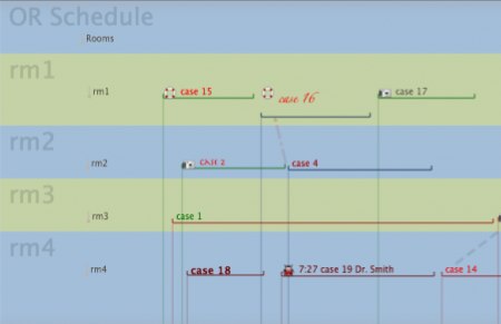
Brian Gregory studies ways to utilize operating rooms (and their personnel) more efficiently. In a recent weblog post, he shows how the new timeline view in Tinderbox can represent a wealth of information about facility usage.
Each font represents a distinct OR room setup. The color of the horizontal line for each case represents a category of procedure, the vertical line represents the ASA of the patient and the potential difficulty and slowness of anesthesia in starting the case. However, the representation of every attribute can be changed. Make the bottom colors maroon and gold if those were your school colors, or make them represent who was in charge of the OR that day. The vertical lines also give you a good idea of ‘crunch time’ –lots of cases starting at once– and the difficulty in starting them (the color of line).
When we designed the timeline view, we were thinking chiefly of retrospective tasks: teaching history, disentangling evidence in court, explaining political crises. But the same view lends itself in interesting ways to planning.