I’ve been working on responsive styles for this page, in order to adapt nicely to small windows and mobile devices. Some breakage is likely inevitable in old browsers. Trouble? Let me know.
The front page of today’s Boston Globe offers two or three stories of local interest, an advertisement, and a below-the-fold piece about how Barney Frank (D-MA) and Scott Brown (R-MA) have become great buddies while negotiating over the fiscal reform bill.
In other words, the paper has become a local or provincial paper which assumes its readers understand that it cannot compete for news coverage with real papers. Since the Globe is owned by the New York Times, one presumes they expect you to subscribe to both.
We’re thinking seriously about canceling our subscription. My mom was a newspaper woman. I’ve never been without a daily paper. (Growing up, we got a morning paper and an evening paper as a matter of course.) But even I am ready to jump ship.
How to report a bug: Simon Tatham ☙ Dave Winer
I have a sermon on this topic that I need to finish and publish one day.
I've been toying with The War Of Eustrath HD, a clever little game for the iPad. It’s a plot-heavy tactical role-playing game, complete with manga characters and romantic subplots. The subplots are fairly good, and since the translator’s grasp of English is tenuous, it would be churlish to make fun of the many missteps in the writing.
The writers have an odd sense of grittiness; one manga girl scores points in a debate with another by calling her small-breasted. Is this precisely the insult a Japanese warrior might select before heading out to meet the invader in a nearly-hopeless battle?
I wonder if the original has a different insult? Perhaps this was an interpolation to appeal to gaijin tastes?
This lies, I think, at the heart of Ebert’s now-famous claim that games can’t be art. As Ebert now acknowledges, that was a silly way to pose the question. And let’s not roust up the whole game studies controversy about games and narrative, at least not today.
But, on the whole, if narrative — or character — were really central to games like these, I bet the writers would take more care.
Update: Mike Auxhiller explains that calling a rival “small-breasted!” is actually a common insult in Japanese entertainment. He thinks the issue arises from the developer’s workflow. My guess is that’s part of the story, but if the writing mattered to the developers as much as the nifty fashions the characters wear, they’d have arranged the workflow otherwise..
Gene Golovchinsky writes a terrific response to my Hypertext 2010 paper, “Criticism.”
Golovchinsky and I are in fairly close agreement here. He reads that paper as being more concerned with “good writing” than I do.
The sharing of the Hypertext term (and the conference) by these two different camps is a good thing, in my opinion, but it is also useful to remind ourselves periodically that sometimes we are talking about completely different things. When Mark starts his paper with a question “How do we know that a hypertext is a good hypertext?” he is already referring to a form of writing. To talk about interaction, he would also have had to answer (or at least ask) the utilitarian question “Good for what?”
That utilitarian question is key. If we are realistic in our view of reading, it is hard to answer; only if we imagine that we’re studying hypothetical low-level “knowledge workers” whose work is to look stuff up does it become straightforward. If we’re studying a hypertextual biology book, we need to think about whether the students learn biology – whether they learn to think as biologists do – and not simply whether they remember ten minutes later which one is the impala and which the ocelot.
The new entry in the ELO’s “Electronic Literature Directory” for Shelley Jackson’s “My Body & a Wunderkammer” has a curious beginning:
While Shelley Jackson’s Patchwork Girl (1995) must be purchased on CD and downloaded onto one’s computer before one can read it, her shorter hypertext narrative, “My Body & a Wunderkammer” (1997), is freely available online, both on the ELO’s Collection of Electronic Literature Collection, Volume 1, and the ALTX Online Network.
So, the most important thing to say about this work is that you don’t need to read Patchwork Girl? Strange. (Personally, I’m not so sure that My Body & Wunderkammer is a narrative at all. What happens? And I believe the entry gets the title wrong. The Web site gives the title as “my body — a Wunderkammer." I believe the ampersand is meant to serve at the author’s chop. Embedding the ampersand in the title suggests the the body and the wunderkammer are two different things, while I think the work itself argues that the narrator’s body is a cabinet of curiosities. Maybe I’m wrong. In any case, Jackson does have a prominent ampersand tattoo and did compose a short story in tattoos, one word per volunteer.)
The directory currently appears to list 159 works. Some hypertexts that aren’t listed include Greco’s Cyborg, Kolb’s Socrates in the Labyrinth and “Twin Media: Hypertext Under Pressure”, Falco’s Dream with Demons and “Charmin’ Cleary”, Mary-kim Arnold’s “Lust” and “kokura”, Michael Joyce’s Twilight, a symphony and “Twelve Blue” and “WOE”, Brian Thomas’s If Monks Had Macs, Richard Holeton’s Figurski at Findhorn on Acid, William Gibson’s Agrippa: The Book of the Dead, Adrienne Eisen’s Six Sex Scenes, Carolyn Guyer’s Quibbling and “Izme Pass” (with Martha Petry), Judy Malloy’s Uncle Roger and its name was Penelope and Forward Anywhere (with Cathy Marshall), Rick Pryll’s Lies, Nitin Sawhney’s HyperCafe, Deena Larsen’s Samplers, Jean-Pierre Balpe’s oeuvre, Loss Glazier’s oeuvre, and George P. Landow’s Victorian Web.
At least I don't think they’re there: I searched on "These Waves of Girls", which is in the directory, and the search tool can’t find it.
That’s 25 additional hypertexts, just off the top of my head. That’s about 15% of the size of the entire directory. You can play too; I bet many of you you can come up with twenty or thirty additional missing titles off the cuff.
The directory also has a listing of “Works of criticism, collections, and general resources on electronic literature.” I’m not sure it’s actually fleshed out yet. Some missing monographs include the well—known volumes of Landow, Joyce, Douglas, Ensslin, Bell, Gaggi, Ciccorico, Bolter, Lanham, Johnson-Eilola Funkhauser, and Ryan. There’s a paper in Hypertext 2010 on “Criticism” with 90-odd references; someone might mine that.
The Electronic Literature Directory was made possible by a $47,870 grant from the National Endowment for the Humanities.
It’s a nice start. I think everyone familiar with the wiki literature knows how important it is to populate a new wiki with stubs, and filling out the bibliographic information – if nothing else – for the obvious works would have been a logical start. I seldom found the old directory terribly useful, but could it not have been mined for stubs? How about taking some books off the shelf and looking stuff up?
The creators place a lot of faith in tags and folksonomy for this application, of which I am skeptical. What literary categories would have been created, for example, in an open folksonomy in 1930’s Germany? We’ve already seen how seemingly-progressive celebrations of Women In Hypertext from the 1990’s have already become a bit embarrassing; folksonomic literary criticism seems bound to enshrine all sorts of categories and classes at which we’ll soon cringe.
But every compendium needs to start somewhere.
by Nick Hornby
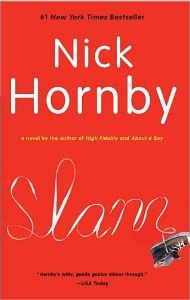
Hornby has a wonderful knack of making everything funny without being silly. Here, he’s being funny about teen pregnancy while, like his protagonist, taking it very seriously indeed. Fifteen-year-old skateboarder Sam Jones gets lucky with his new girlfriend, and then gets very unlucky. He takes everything very, very seriously. Naturally, hilarity ensues.
We’ve been having a bit of a discussion about Twig and Tinderbox over at the Scrivener forum. A lot of chatter concerns price, which I’ve already discussed here. Ben Worthington, a London barrister, addresses some other Things People Say:
I have never really understood the complaints about Tinderbox's supposed 'ugliness'. Even at their default settings, the maps are really quite good to look at. Plus, you can beautify them in many different ways.
As for the UI, I just don't see what the issue is. The small toolbar isn't exactly gorgeous, but after all, its just a toolbar! Does anyone care that much? What it needs to do, it does well - for instance, I cannot see how the linking button and associated parking bays could be any better implemented.
There are lots of other examples of well thought out UI, some of them more recent additions; the typeahead search, inline editing, the ability to see into and manipulate containers from the level above, and so on.
Personally, I have no problem with the approach eastgate has adopted with the UI. I would much rather have a simple but (in my opinion) well implemented UI than a fake spiral bound notebook splashed across my laptop screen. I have to use Tinderbox at work, sometimes sat in a Court room, and need to be taken seriously.
As for price, I sometimes wonder whether the complaints are more about context; anything that has a price attached represents poor value if you buy it and don't use it. I certainly wouldn't recommend buying Tinderbox if you do not have a clear idea of what you might need it for. I am using Tinderbox to help me manage a legal dispute worth £15m. For me, in that context, the price of the licence represents something of a bargain.
Adam Greenfield launches an intelligent complaint about Apple’s new penchant for silly skeuomorphic interface decorations:
Dig, however, the page-curl animation (beautifully rendered, but stick-in-the-craw wrong) in iBooks. Feast your eyes on the leatherette Executive Desk Blotter nonsense going on in Notes. Open up Calendar, with its twee spiral-bound conceit, and gaze into the face of Fear. What are these but misguided coddles, patronizing crutches, interactively horseless carriages?
What explains these blunders? And why do we often forgive them in Apple designs? I think there are three separate motivators:
- Atavistic interfaces, like those silly spiral bindings, are comforting and readily understood by newspaper and magazine reviewers. Often, these reviewers are tremendously influential and, at the same time, both ignorant and uninterested. Because the spiral binding is familiar and comforting, they feel comfortable.
- Apple’s experience model is heavily weighted toward first encounters. Apple products demo well. First, they look terrific in the Steve’s keynote. Then, they look great in the store. And then comes the Out Of The Box Experience. Apple’s aesthetic is heavily weighted toward those first few minutes.
- Modern fashion in interface design strongly favors polish and craft. I doubt the general public cares a lot about pixel-perfect interfaces, but pros do; the tiny bits of chaff with their perfect little cast shadows on your iPad calendar are a signal from one haute couture designer to her colleagues. In other words, tiny skeuomorphs are the new easter eggs.
Greenfield identifies the culprit correctly: the reason these three factors are permitted to distort the design is Fear. Indeed, we’re glad to see some silliness and flummery in these interfaces because we know they are silly and the reassure us of our superiority to those funny little people who create them.
Mike Auxhiller replies to "Price":
This kind of thinking has destroyed the animation industry in Japan, as well as the production and consulting industries. When a craftsman asks for a certain price for something he has crafted, why stand there and yell at him?
It may be true, of course, that the craftsman is asking too much. If that is your conclusion, you are under no obligation. Reasonable humility (and manners) suggest that you temper your conclusion with the knowledge that the price might not be excessive to other people. Perhaps you are mistaken yourself.
It seems very odd that we see so much expostulation over costs that are not very substantial.
We've been getting some pushback on price on the forum of another Macintosh product from people who’d like our software to cost less. (We’d like our software to cost less, too.)
37 Signals recently introduced a new iPad tool for rapidly sketching user interfaces. It costs $10, and they’re being eaten alive in their forum.
LOL @ $9.99 (Fred)
$9.99? Seems a bit steep — would have made more sense if there was an iPhone version tacked with it. (Moeed Mohammad )
+1 on the 9.99, not enough value for 9.99 compared to other apps that are that much like Pages. I like the simplicity of the app, but would be more attractive at 4.99. Then I would buy it more on impulse just to check it out, 9.99 is a but steep. (Nick Ricketts)
$9.99? Are you guys nuts? (Zee)
Did this cost more than $9.99 to code? (hop)
By the way, I agree with John. How did you guys come up with that ‘ridiculous’ price? Sorry to be harsh but I can buy several interesting apps for $10 or even a cool game. (A guy from South America)
Keep in mind that the tool is meant to help two or more user interface designers exchange ideas while they work in different offices. Let’s suppose only two designers and one manager are involved. Set their billing rate at $200/hr. To repay the investment, the application needs to make their meeting 3 minutes shorter.
Or work it out another way. Those designers are working on a project for a business — people don’t usually design user interfaces to amuse their aunt Agatha on a rainy afternoon. Suppose it’s a tiny, little project with a budget of $100K, a little skunkworks sideshow. We’re expecting this thing, when it ships, to generate maybe $35K/year gross margin. Someone has Bright Idea that might make the product just 10% more profitable.
But it probably won’t work. Really — it was just an idea. Might not be a good idea, might not be possible to implement. The users might hate it, the sales department might hate it, management will probably veto it, Steve might not like it. The economy might collapse. The project might be cancelled anyway. The whole company might go out of business. There are lots of reasons it might not be worth doing. What’s the probability that justifies buying a copy of the software?
350-1
The way I work it out, if the odds that the idea is worth a 10% bump in gross margin are better than 350-1, you should buy the software.
The app store is worse.
This is robbery(by alexcharlie) The app does nothing. It is worse than the worst sketch app on iPad. It is criminal to charge this much. It is no more intuitive because of it's simplicity. Any other drawing app is easy to use and more expressive. Avoid this app.
great $2 app (by awkpod) This app must be a joke, or maybe a clever piece of 37signals performance art. Either way I don't get $10 of value out of it.
It goes on and on. Takeaways:
- Comments kill blogs. I’ve been saying this for years. Take a crowd of skilled professionals, give them comments and a forum, and soon you’ll have a pile of writing that is indistinguishable from pre-adolescent petulance.
- That’s a lot of ink spilled on the price of an application that costs less than a martini at, say, Craigie on Main.
- People don’t bother to crunch the numbers.
- An enormous amount of what passes for business discussion on the Web is literally silly. It lacks common sense and judgment, and this has obvious bad effects. A less obvious problem, though, is that the idiocy makes it hard to distinguish novel insights (which 37 Signals claims to have — and may well possess) from chance success.
Adrian Miles is writing a Tinderbox hypertext about the results of last year’s research sabbatical. The core is the current draft is a 5000 word note. He ponders whether he wants to divide it into a collection of smaller, focused notes.
The disadvantages, for me, of writing more hypertextually though are that if this 5000 word essay became five 1000 word nodes then to turn that into a publishable outcome, which nearly always still means a traditional essay, means taking these parts and reworking them quite a bit to make them work as an essay. It is not, technically, that difficult to do, though can be time consuming. It often involves a lot of editing because to write hypertext hypertextually often means writing things in relatively self contained ways. But the biggest problem is that I find finishing things, getting something from 85% finished to 100%, the hardest
Jared Spool and Edward Tufte discuss better onstage presentations. Both are famous for giving great talks.
I’ve always liked the idea of fluid Web layouts — Web pages that adjust to fit the size of the window in which they find themselves. The drawback, however, has always been that fluid layouts promise more than they can achieve — that they work well within a range of widths and then break down ludicrously when you stretch them beyond that range.
Ethan Marcotte’s recent piece in A List Apart solves this problem. CSS media queries, white are normally used to let you style separately for screen and print, also let you vary your styles depending on the environment. What’s even nicer — and still not widely known — is that you can use them to qualify individual styles:
@media screen and (max-device-width: 480px) {
.column { float: none; }
}
This means, for example, that you can have style rules that say "Use nice big 24/28pt type, please, except if you're on a tiny little cellphone screen, let’s stick with 13/15." You can drop entire columns when the window gets too narrow. Jon Hicks uses this technique to craft a quietly spectacular blog redesign that holds together from 320px all the way to 1280 and beyond.
A Tinderbox user writes:
I am the head of a committee for a nonprofit organization which is working to get a history book written about a local historical site here in Vermont. We hired an author and last June he turned in the first draft. After each member of the committee read the draft, I had a collection of six different sets of comments. It would have been cruel to have just handed these over to the author for him to make sense of -- not to mention entirely unproductive. But how to collate such a variety of input, which included comments on factual errors, content (missing or unnecessary), style, and organization. I puzzled over this problem for several weeks, until I belatedly realized that Tinderbox could be very helpful. Going through one critique at a time, I clipped each discrete comment as a separate note into a Tinderbox map. It was then a snap to organize these by subject and type using prototypes, adornments and key attributes. I then exported the results into a word processor to dress it up. In one afternoon, using Tinderbox, I had produced a five-page, comprehensive and -- most important -- coherent critique to let the author know the will of the committee.
I truly don't think I could have done this -- at least not nearly as well -- without Tinderbox. For this project alone, Tinderbox was worth every penny.
Via Eric Meyer, Xan Brooks of The Guardian covers the longest tennis match in history. Amazing live blogging. (Scroll down to 3:45pm and then read upward)
Alex Strick van Linschoten has prepared a detailed Kandahar Timeline 1979-2010, using Tinderbox to gather and organize information from numerous sources and then exporting to Simile Timeline (an MIT project for Web timelines). He writes
I used an extremely nifty piece of software called Tinderbox (Mac only, apologies…) and was given a lot of help by some people who understand its ins and outs far better than I currently do. So special thanks to Mark Anderson for that, and to Mark Bernstein for writing the software in the first place. I use Tinderbox for almost all of my work these days (data gathering, data sorting, data organisation… the list goes on) and strongly recommend others with high-volume complex data projects to give it a try.
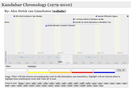
Mark Anderson and the authors undertook a great deal of work to streamline the data organization and to coax it into a format that Simile would understand. We’ll all benefit from this shortly, as it appears we’ll soon be able to make the process completely routine.
I’m increasingly interested in locative (or location-specific) hypertext narrative – things like tour guides or museum guides that are meant to be read (or used) as you visit a specific place.
Know some good examples? Some relevant research? Please Email me. Don’t be shy about sending your own work.
OK: I’ve got an Objective C++ issue. It’s easy unless you don’t know that answer. And I don’t.
I’ve got a complex C++ object:
class Hyperext {....}
And I want to have a pointer to one of these objects as an instance variable in an Objective C controller:
HypertextView.h
@interface HypertextView :UIView {
  Hypertext *	hypertext;
...
}
How do I do this without making HypertextView and everything that touches HypertextView. an Objective C++ file?
In C++, I use a Hypertext* as an instance variable and forward-declare that Hypertext is a class. The means HypertextView doesn't depend on Hypertext.h, which is a very good thing. How do I manage the same sort of dependency firewall in ObjectiveC++?
That is, how do I build an interface between the C++ model and the Objective C view without making the entire view and controller hierarchies requires Objective C++?
Or am I being excessively scrupulous?
Two conferences in two weeks might perhaps be too much.
If last week’s ELO_AI was a fallen lemon soufflé – aspiring to be high and frothy but turning out mostly burnt and bitter – Hypertext 2010 was one of those little meat pies they sell on the Sidney quay. There was rich and tasty food here, though it was not showy and seldom neat. These were papers meant to sustain you through the hard work that hypertext folk share, contributed by people who were interested in their own work but also deeply interested to learn what their colleagues had found out this year.
One highlight new spatial hypertext system, iMapping by Heiko Haller (Forschungszentrum Informatik). It’s built on top of Piccolo, a Pad++ successor, and gets lovely panning and zooming performance. I was talking to Haowei Hsieh (Iowa) after the talk – we’ve both spent lots of time building spatial hypertext views — and we agreed that the performance was really compelling. Also interesting here was a new approach to link elision: links are shown on hover and otherwise hidden. This is certainly interesting, and I believe it’s completely novel (though Jan Walker’s Document Examiner highlighted links on hover). The paper doesn’t really call attention to the most interesting aspects of the work.
Hsieh’s paper on VITE was another highlight. VITE is a long-running project to combine spatial hypertext with formal AI-style knowledge representation. It’s one of the inspirations for Tinderbox and it’s great to have a fresh flagship publication for it.
A spontaneous (and excellent) session on hypertext narrative, chaired by J.Nathan Matias, was a novel and exciting development. Hypertext 2011 (Eindhoven, June) has a strong call for hypertext fiction and storytelling.
One mild vexation was that my own paper on Criticism (pdf) was scheduled directly opposite one of the strongest sessions on adaptive hypertext systems, and so I couldn’t see several terrific papers. I suspect that this was a two-cultures issue; people assumed that systems builders would be less interested in critical theory. Oh well. It was a good session, with three capable and engaging discussants on hand, ably to critique my review of hypertext criticism.
Criticism
View more presentations from eastgate.
Writing the the New York Times, Ben Zimmer discusses the surprising emergence of “iterative” as the business buzzword of the moment.
Scott Rettberg has posted his ELO plenary tribute to the swell parties of elit’s past.
ROB: It sounds like this was a spectacular period for the ELO.
SCOTT: It was.
ROB: I mean that you were really concerned with spectacle.
by Robert Harris
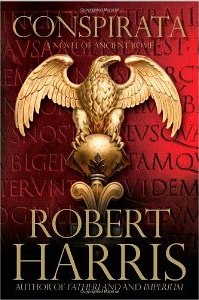
Robert Harris continues his fictional life of Cicero, as told by his former slave and secretary Tiro, with this account of the Cataline conspiracy and its aftermath. How long, Catalina, will you abuse our patience? I’ve always thought Catalina a minor episode that modestly played to Cicero’s advantage, and though Harris does what he can, Cicero’s allies at this time are less interesting (and less well documented) than his rivals and, oddly, only Clodius emerges as truly frightening. I’m growing to like Harris’ reconstruction of Terentia, Cicero’s wife, as a level-headed and sensible woman who steps in and takes charge only when the boys are in a truly hopeless muddle, sets things right, and returns to her work.
Les Orchard writes a fine tutorial about writing for the Web with Tinderbox.
Em Short discusses interactive fiction and the limitations of the parser.
Fundamentally, however, we’ve got a bigger problem, which is that the command prompt is a lie. It tells the player “type something, and I’ll understand you.” Which it won’t.
Mark Bernstein: #eloai before we embrace the wisdom of crowd-sourced tagging, let's reflect on the tags that crowds would have sourced in 1934 Germany.
Dennis Jerz: @eastgate If Jews, Nazis and bystanders had all been tagging in public, on the global stage, for decades, might 1934 have been different?
Scott Rettberg: Deep thoughts with Mark Bernstein: folksonomical metadata developed by participatory community = nazism?
Diane Greco: @scottrettberg Um, yellow star? Tags simplify, so not value-neutral. Btw issue is antisemitism not "nazism." Labels again. #eloai
Links aren’t distracting.
Blue, underlined text is distracting. We’ve known this was a mistake since Mosaic started it. You can fix it on your site; just get rid of the underlines and choose a more subtle and natural link color.
Historical note: Linda and I coined the term “breadcrumb” in a 1986 paper on technical hypertext for the Society for Technical Communication. What we had in mind, in essence, was what we now call visited link colors.
I just read a new George Landow paper, not yet published, that makes an important point: writing with links is writing in the presence of other writers. Experienced writers do this anyway; they know they’re part of a conversation.
I still think it bears repeating: if you reading a hypertext or a Web page and you can’t concentrate, you find yourself constantly wanting to read something else or to do something else — well, maybe you don’t want to be reading this right now. And if reading the Web for a decade has made it harder for you to concentrate on books, maybe you should be reading better books.
Or, perhaps you don’t need to read. If you don’t have work to do, and you don’t want to influence anyone, and you don’t care much about ideas, then you don’t need to read.
Otherwise, sit up, pay attention, and get back to work.