Sparkline Plots: a Tinderbox Experiment
Ed Tufte urges people to use sparklines — small, memorable data displays embedded in text. How might we add something like sparklines to Tinderbox?
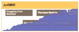
One interesting idea is to let containers and agents show a simple chart of some property of their contents. For example, this note happens to be inside a container called "Jul0801", which contains all my weblog posts for July 2008. With the new feature, we set the Pattern of the container to be plot($WordCount), and now the container looks like this:
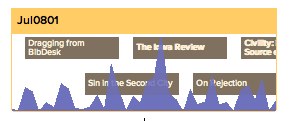
This gives me a sense of the rhythm of long and short posts. Or, I might plot the note's Modification date; since the notes are sorted by publication date, downturns in the plot follow posts that were revised after publication.
I can readily imagine applications to personal productivity (plotting the dates when things are added to Done) or personal dashboards (like Alwin Hawkins’ diabetes management Tinderbox). I expect we’ll find unexpected uses, too. For example, I grabbed the statistics for major league baseball rookies from Baseball Prospectus, dragged them into Tinderbox, and made an agent to collect all rookies with at least 100 at bats and sort them by their value above the value of a replacement player (VORP). Then, I plotted the player's slugging percentage:
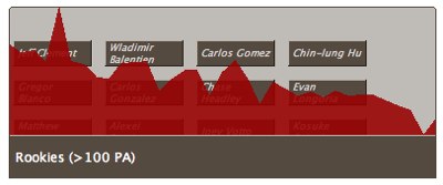
The graph generally declines from left to right; the most valuable rookies often hit for power. But there's an interesting spike near the left edge — what’s that? It turns out to be Detroit’s Matthew Joyce, who has only 123 plate appearances but who has hit ten homers for a gaudy .661 slugging percentage. That’s the sort of anomaly we want to notice, and it's easier to see in a graph then in a big table of statistics.