Tinderbox: Maps and the Client
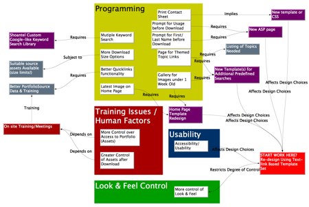
Mark Anderson was meeting with a client, planning a new database interface for the new season’s launch. Together, they threw together a light and fast Tinderbox map to capture ideas and, just as important, to elucidate dependencies among the ideas they were considering.

This is not a presentation graphic prepared for a meeting; these are meeting notes that emerge naturally from discussions. When technical issues raise training problems, that can be captured right away. When the Experience Design team wants a programming solution to a nagging problem, that, too, can be captured.
It’s easy to adjust the frame. Issues aren’t required to fit the agenda, and you don’t need to shoehorn everything into fixed categories. Categories have power; they may easily determine who is responsible for a task, who pays for it, who evaluates it. If you’re not ready to answer those questions, the map lets you capture what you know without making commitments you don’t want to honor.
Everybody can play. Throw the emerging map up on a screen. Everyone can see what’s being captured, and what isn’t. Anyone can point to things that seem to be out of place, or missing.