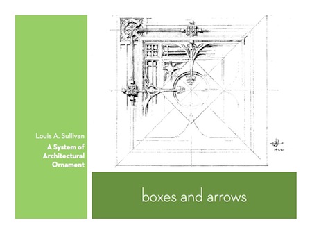
IVICA: Boxes and Arrows
A strength of spatial hypertext tools like the Tinderbox map is that they carry lots of meaning without much formal overhead; you can express that relationships exist without knowing every detail of the relationship.
But a drawback of our current tools for everything from “mind maps” to “information architecture” is that we’ve become tightly focused on boxes and arrows. Boxes are fundamental: you can draw a box around everything. And boxes, used juduciously, avoid chartjunk, the temptation to load up your visualization with lots of symbolic, sentimental clipart.
One weakness of boxes and arrows is their seeming precision: those straight lines tempt us to read meaning into every pixel, and so we wind up tweaking our layouts to get pixel-level alignment and spacing just right. This is literally unnatural: the natural world isn’t like that. An organization is nothing like an org chart, and all those identical neat boxes in the site map tempt us to make each page equivalent when each page could also be precisely what it needs to be in its specific role.

We have few tools that work with this sort of textured, layered, organic vocabulary of forms. I think that’s going to be a fruitful direction for research, especially now that we understand spatial parsers and are getting accustomed (as in OpenType fonts) to working with forms that depend on context.