IVICA: visual dimensions in Tinderbox
One key to the Tinderbox map is simplicity and regularity. It’s a working tool for getting things done, not a presentation system for making fancy slides.
Ironically, as Robert Brook pointed out at Tinderbox Weekend London, this can make Tinderbox especially effective in presentations. Not only can you get lots of information in front of management this way, but when a manager say, ‘That’s in the wrong place!’ you can just drag it into a new place and astonish everyone.
But it’s important for Tinderbox maps to be able to express all sorts of relationships and conjectures. That’s why maps are (sometimes) better than lists or database tables: sometimes, you need to express tentative connections or speculative relationships, things to which that you can’t yet commit.
In addition, Tinderbox agents constantly work to find things, and often they express their results through visual characteristics. For example, an agent that searches for overdue tasks might color them red. Tinderbox provides lots of visual dimensions:
- Color
- Accent color
- Shape
- Height and Width
- Border style, thickness, and color
- Shadow size, blur, and color
- Label font, boldness, size, and color
- Badge icon
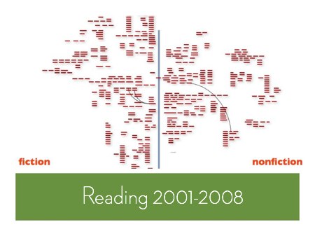
This gives you lots of ways to call attention to particular notes, especially when you have lots of notes in your map. Here’s a study I did one afternoon, while stuck on a crowded airplane, looking at all the books I’ve read in the last few years.

Here, I just threw all the books into a map, zoomed out, and started a rough sort into whatever clusters made sense at the moment. (Information Architects do a lot of card sorting; it can be a terrific way to discover new ways to structure confusing information.)
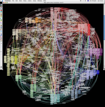
And here’s Julie Tolmie’s famous Tinderbox map of patterns in game design:

Note especially the subtle, systematic use of color not merely as an alarm code but as a continuous contextual cue.
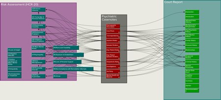
Adornments also help structure the space of each Tinderbox map.

In short, we can say lots of things with Tinderbox maps. But there’s a lot that’s tricky to express, especially when we’re using the maps to jot down information that we don’t yet fully understand. For example:
- Conference liveblogging
- Library research notes
- Collaborative brainstorming
- Workgroup prioritization, project triage, and scheduling
Today, while we can distinguish exceptional elements in lots of ways, it's harder to express connections between things. We can
- link them
- place them next to each other
- pile them on the same adornment.
That’s better than nothing — and better than squeezing everything into an outline or a list. But I think we can do more.
