Dashboard Colors
Sometimes, you might want to use color cues to reflect part of your project status.
Color cues are probably most useful when you want to present lots of individual indicators, all pretty much alike. You want to make every indicator accessible — otherwise you’d just summarize them — but you want especially to call attention to a small number of indicators that have exceptional values.
For example, in an airplane cockpit you might have a bunch of normally-green lights, so you can confirm that systems are turned on. And if one of those lights turns red, you notice that urgent red light in the middle of a panel of green lights.
In our Tinderbox dashboard, let's suppose we’ve got a group of notes which represent the progress of a bunch of projects. Or maybe it’s the time since we sent cookies to our favorite clients. To make things a little easier, we’ll assume it’s a number from 0 to 100.
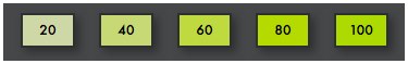
Using a Rule (which all these notes can inherit from a single prototype), we might say
$Color=saturation(green,$MyNumber);
and we’ll have a nice display like this:
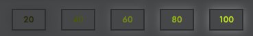
Or, perhaps we might leave the color of the note unchanged and simple change the brightness of the label.
$NameColor=brightness(green,$MyNumber);
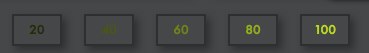
For something subtler, we could give high-scoring notes a gentle glow:
$ShadowColor=brightness(white,$MyNumber);