Dashboards
Tinderbox adds speed and a bunch of features for advanced users. But a number of the changes will matter to lots of people, because they make it easier to build special map views that provide a live overview of your work.
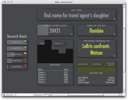
Here’s a mockup of a dashboard for a large writing project. It’s a real Tinderbox screenshot, but it’s not an actual project.
This is a window that you might see each morning as you sit down to work. It’s got a bunch of information that you might want to know:
- The total wordcount, with a bargraph to remind you of the planned length of the book.
- A histogram of the word count, by section, and a table of the same information
- A count of “research needs” – code phrases used when you need a name or a date, didn’t know the right answer offhand, and instead made a note to look it up later.
- A “word of the day”, chosen fresh each day from a list of suggestions
- The top-ranked “todo” from your task list
- The name of the note you were working on last night
- A list of books and other resources for which you’re waiting
It’s a quick overview of your work, a way to get back into the flow or to orient yourself. The dashboard can also be a pleasant motivator, showing you how far you’ve come and how far you have to go.
Inspiration: the color scheme and layout for this dashboard were taken from this year’s Feltron report. The font is Futura Condensed, suggested by Gordon Meyer; Arial Narrow (thanks Jon Tan) works almost as well. For more fontish goodness, see the Periodic Table of Typefaces, thanks Sebastian Stephenson.
