MarkBernstein.org
Feb 12 9 2012

Blue

Ziff Davis writer Violet Blue wrote a paragraph about a someone she saw at MacWorld:

I was, in fact, looking at The Saddest Booth Babe In The World. […]

She sat on a stool in between two large monitors across the aisle from us. The pretty brunette was in one of those big corner booths that paid a few bucks for that sorta-prime real estate you know is a gamble for whoever forked over the money to sell wignuts or widgets or iPhone cases or other sundry USB landfill.

Her shoulders were hunched and her hands sat limply in her lap beneath breasts that were packaged air-tight in a tight, branded t-shirt.

She stared at the floor. Unlike her counterparts, she never smiled. Sad booth babe was sad.

Some discussion ensued. Was the woman a booth babe? Some thought she was developer Piroska Szurmai-Palotai. It turned out the woman was the developer’s colleague in the PR department, Zsófia Rutkai. She was not, in any case, a booth babe – a model or actor hired specifically to work the trade show.

Blue was widely criticized for her error, and launched a ferocious (and ill-advised) defense of an indefensible position. Chuck Jordan reviews the damage.

And to someone who actually cares, the easiest and laziest way to get him to back down from an argument is to claim that he’s complicit in behavior that he’d never want to be associated with. And it’s bullshit. It sucks when it’s used as an attack, and it sucks when it’s used as a condescending ‘teachable moment.’

More on the pro journalism front: Hillary Rosner, What I Saw At The Women’s Mags.

Dec 11 26 2011

Nostalgia

John Gruber is already nostalgic for the present:

A decade or so from now, when, say, I’m waiting for my son to come home from college for his winter break, and, when he does, he wants to spend his time going out with his friends — how much will I be willing to pay then to be able to go back in time, for one day, to now, when he’s eight years old, he wants to go to movies and play games and build Lego kits with me, and he believes in magic?

How much then, for one day with what my family has right now? How much? Everything.

But, you know, John: when he does come home from college, he’ll probably be willing to take some time away from his friends to tell you about the cool new stuff he has on his Android, and you’ll show him the cooler stuff you have on your iPhone 15.

Popcorn.


Via Michael Druzinsky: wonderful street art.

Via Rose Fox: what happens when an octopus borrows an iPhone and drunk texts his friends the squid and the crab.

So can yuo go on gamefaqs and look up how to open a jar with crab in it?

I got the last one but I'm kinda stuck on this on.

Brent Simmons argues that people who believe in gamification really think consumers are child-like.

Everyone saw the focus, the insistence, and the scorn for bozos – for people who were happy enough to get by. What people always missed about Jobs at Apple was the agile mind, able and eager to shift from the inside to the outside and back again.

Apple was not saved by design or innovation. What saved Apple is the constantly iterated shift from design to execution, from surface to depth, from style to science and back again.

Jobs learned from bad times but did not let bad times shape him. When he was kicked out as a dreamy incompetent, he went elsewhere, made a couple of new fortunes, came back, and kept dreaming. When the press assumed that Microsoft would simply discontinue Office for Mac and let someone buy the wreckage at the fire sale, Apple stood on a hill before the setting sun and shook its fist at the heavens and vowed that it would never be hungry (and powerless) again. But Apple did not become a defensive shell or an outlaw.

The original iMac, Steve’s machine, was Bondi Blue. Everything else was business beige. A couple of months later, you could tell which galleries on Santa Fe’s Canyon Road were doing well because the prosperous galleries all had those Bondi Blue iMacs. Some were sitting on 17th century Spanish oak, some on polished steel, and some on two planks of raw pine thrown across a couple of old trestles – depends on the gallery – but if they were selling art, they were buying that iMac.

Apple built the iMac into a nice little business, and then wrecked its own business with laptops. Same thing with MP3 players: people ridiculed the new iPod as underpowered and overpriced, then watched in amazement as it consumed the entire sector. And watched again as it fought off every challenge until, once again, Apple demolished that market with a new kind of phone.

Mac OS was clearly a better UI package than its competitors. Rather than refine it, Jobs replaced it with Mac OS X. This required tons of work and a vast leap of faith, since a company that had always rolled its own foundations now learned to depend on Unix and Postscript.

The dramatic shifts – abandoning floppies, abandoning Pascal and OpenDoc and Java, embracing virtual memory, abandoning the PowerPC, abandoning CDs – masked a steady reengineering of everything. Compare today’s MacBook Air to the original. They look pretty much the same, but the new one isn’t just faster. It feels better: more solid, more durable. Remember hinge kits? Hinges don’t wobble anymore. (A visible side effect of the process is the maxim that every new Apple laptop has a new video connector.)

After Apple had brought color to computers and everyone else was trying to slap juicy colors on their cases, Apple seized white. Dell and HP kept black for themselves. This was pure style, but Apple has exploited that blunder for a decade.

Look at the Apple stores. The analysts thought they were the desperate indulgence of a washed-up hippie who didn’t understand business, and they turned out to make heaps of money. But they’re not just distribution and maintenance centers. Everything is geared to say, you can do stuff with Apple stuff. You. MicroCenter and Fry’s were exciting with their racks of components and motherboards, but Apple put Grandma right in the center of the store and – look at that! – you were standing there learning stuff about video production, along with Grandma.

Everyone knew that companies should build on their core competency. What does a boutique computer company know about retail? Apple went about it like building a new system, with a fresh package and style and innovative systems in the background. (Everyone thinks Lion is about the scroll bars, but blocks and Grand Central Dispatch are going to change everything in ways that matter a lot more than scrolling.)

Have you ever seen an Apple Store employee standing around, looking bored, waiting? That’s execution. It can’t have been easy to see why this is important, to convince people it matters, even to make it possible. It’s not something you can instill by walking around and asking programmer A whether programmer B is really a bozo, which was Steve’s original management skill. This sort of polish goes all the way down. You never see a pile of Apple products in the stores: the piles are in the back, out of sight. You never see money. Do they even take cash? There’s no cashier and no cash register.

It’s still going on, and the analysts still can’t follow the shift from outside to inside. The iPhone 4 was outside: new design, new display, new camera. Now, we do the inside, with a new fast processor. “Who needs a fast processor?” they wonder. You need it to do stuff, because phone software has only a few seconds to do what you have in mind. (Desktop programs like Photoshop can take minutes to load, but if an iOS app doesn’t get itself loaded in five seconds, the system assumes it’s run amok and throws it in the drunk tank.) And what do you want your phone to do? Well, Knowledge Navigator is a nice start, isn’t it? If you want to do speech recognition, you need a separate thread and a separate core – and look what we have here? GCD to manage the cores, and mobile processors with multiple cores and decent battery life. The action this year is inside.

And down the road, when everyone is finally looking at the inside again, you’ve got to think that Tim will remind us again that there’s one more thing...
I’ve been up to my ears in iPhone and iPad programming lately. It’s been a few years since I’ve jumped to a new platform, a new language, and a new framework all at once. Of course, scads of developers and coders and students have been doing the same thing in the last two years.

  • Cocoa Touch, the framework, is remarkably nice and surprisingly easy to learn.
  • There are lots of books to help you get started. Most aspire to be more accessible to beginners than the Apple documentation.
  • Apple’s documentation remains the best resource for people who know what they’re doing – people with an adequate computer science background. If you’re old enough to remember Petzold, this will come as a surprise.
  • Apple’s documentation is too elementary. It tends to avoid useful terms that everyone learns in elementary CS courses. Not everyone, admittedly – I never managed to take any courses. But there aren’t that many old autodidacts like me around the business anymore, and even I can manage to read “call by reference” without bursting into tears.
  • iOS does a remarkable job of hiding its constraints. It’s not easy to know, for example, how much memory you have, or how much you can ask for. You’re encouraged to allocate objects with abandon. It feels like it’s running on a big machine, and the processor does not feel slow.
  • I expected to want FORTH (or something like it), the language best suited to doing difficult tasks in constrained environments. I don’t.
  • Between the pattern-aware framework and tricky memory management, iOS programming has got to be really hard for untrained programmers. I suspect a lot of programs out there simply leak memory left and right and hope for the best. I have no idea how non-technical folk go about hiring iOS programmers; it must be ugly.
  • Many aspects of Objective-C seem awkward, and they are rendered more unpleasant for want of a defense. Why is there no overloading of methods? Why don’t braces create a new variable scope? Are @private methods useful now that we have @interface foo(), or are they just a leftover? It would be nice to read a rationale, and to know what the authors were (and are) thinking.
  • I'm often tempted to bridge to something from STL or BOOST . Are the Core Foundation containers adequate substitutes? When is the unsighliness of the bridge class worth undertaking?
  • What, really, are the drawbacks of Objective C++, anyway?

The iTunes App Store makes lots of money and it's a big success. But an awful lot of those apps we see are tiny fripperies with fancy graphics glued on. Long term, that’s a danger to the platform.

Horror and steampunk writer Carrie Cuinn enjoyed Readercon. So did I. But she found some of her fellow attendees were not quite up to the mark, and wrote them a vehement Dear Jackass letter. It concludes:

So, Dear Jackass, I can only hope you didn’t realize your behavior was rude, selfish, insensitive, racist, or sexist. I’ll be at Readercon 23, and I think it’s best for everyone if we don’t see you there.

It wasn’t immediately clear to me whether her complaints all related to the same person – the singular “jackass” seems to suggest it does, but I’m fairly sure that several different people were involved here. Moreover, the transgressions she describes are quite different, and I think it’s worth taking a moment to reflect on them, if only to remind ourselves what not to do.

Note: Cuinn uses the term “jackass” in its casual sense. In the technology community, a jackass is a specific character – someone who makes a controversial prediction in order to get attention or to attract coverage in the press. For example, “World Of Warcraft leads to political violence,” or “The iPhone 5 will be a catastrophic failure.”

Touching briefly on each of the social crimes Cuinn observed, we have:

  • Asking silly questions. In one case, someone asked an e-book panel “Which indie publisher, specifically, will publish my illlustrated novel?” This is a silly question because no panelist can possibly answer it. In the questioner’s defense, it was a followup to a question, also ill-conceived, about illustration in ebooks, to which the panelists ought to have given a good answer, but (in my opinion) did not. Rating: a gaffe if you do it once or twice a year; a serious misdemeanor if you do it often.
  • Ringing cell phones. Always a social crime, and this audience should know better. In defense, the guilty parties I noticed were women who lacked pockets and so could not have used “silent” mode. In a weekend conference, some allowance might be made for family emergencies. Rating: a misdemeanor in a conference. Worse in a concert hall or theater.
  • Wrongheaded opinions. In the cases Cuinn mentions, I believe the opinions were sincerely held and concisely expressed, though wrong. One reason to attend conferences is to hear from people who are wrong; sometimes, they have a point and sometimes you learn to refute them. Asserting facts know to be wrong is a felony, but that’s not alleged here. Rating: no harm, no foul.
  • Requesting an annotated bibliography. Not a crime, provided the request is polite and anticipates that the favor that might be inconvenient or impractical to grant. Rating: nothing to see here.
  • Attacking and silencing your own panelists. I missed this session, which attracted notice elsewhere. Reading between the lines, I suspect that the moderator was arguing with the program chair who, I presume, had added some unwelcome additional voices to her panel proposal. This is not the way to do it: if you have a quarrel with the program chair, settle it privately or simply decline to moderate the panel and withdraw. Rating: felony, bordering on a high crime.
  • Berating a writer at his own signing. Bizarre. A signing, it seems to me, is like a dinner party: if you go, you must be civil to your host; if you cannot in conscience be civil, you have no business accepting the invitation. Readercon signings are mostly tucked into a little corner far from everything. You would usually have to go out of your way to bump into one, so this is unlikely to be a chance encounter. Rating: temporary insanity under the stress of passionate feeling is the most likely explanation.

So, we have six indictments, but perhaps only two real crimes, and I don’t think banishment (the punishment for high crimes) is absolutely necessary. The major violations seem to involve a dispute with the program chair, who in any case has the authority to enforce the appropriate sanction should that be desirable.

I observe in passing that people are seldom taught how to attend conferences. Conference-going is a skill, requiring thought and judgment.

Having spent the last few weeks immersed in iOS – high time! – I offer a few observations.

  • XCode 4 is an impressive IDE. Running on my new i7 MacBook Air, it’s delightfully fast. Integrating the Clang/LLVM compiler with the editor is a big win, even though it spends a lot of time telling me things I already know. Yes, this function doesn’t return anything. I haven’t finished writing it yet. As you can tell. Just wait half a minute while I finish typing. There.
  • It’s fun to be working with fresh code again, even for small projects.
  • Cocoa Touch, also known as UIKit, is an interesting framework. To avoid lots of subclassing, it embraces delegates (which other frameworks call protocols or policy objects) all over the place. This is a nice use of what Objective C does well.
  • I miss overloading in C++. I really miss protected inheritance.
  • Getting XCode 4 to talk to Subversion was a bear. It’s working now. I think. I’ve scant idea exactly what used to be wrong, or what’s right now; I think it might relate to an SSL certificate authority and Beanstalk.
  • The Objective C idiom for private methods is to declare them in the implementation (.m) file, not the header (.h). I have a shelf full of introductory texts for Objective C and Cocoa. None of them highlight this. Offhand, this is one of the most important and obscure language issues confronting the immigrant from C++, or indeed from any good object-oriented language.
  • Cocoa memory management is tricky, especially after an injudicious bit of documentation convinced iPhone coders that autorelease was a Bad Thing. You can’t avoid autorelease, so it can’t be a bad thing. None of my iPhone books (and I have a bunch) do a very good job with memory management idioms.
  • Apparently, iOS 5 will make all this memory management headache vanish into thin air.
  • On the whole, the Apple documentation is more accessible to the educated reader than are the numerous volumes from technical presses. This is a change from the way things used to work. Apple is its own Osborne, its own Petzold.
  • A number of books about “getting started” with iPhone or iPad or Cocoa programming are badly conceived, being aimed at people who don’t have sufficient background to do the job properly. They try to explain object-oriented programming, memory management, and a complicated framework from ground zero. It’s one thing to explain syntax, but another thing to try to cram syntax and three years of computer science into 600 pages. Trying to learn to program UIKit is not a lot like trying to learn to program Commodore PET BASIC, but the books look remarkably alike.
  • Stack Overflow isn’t half bad, half of the time.
Aug 11 3 2011

Lab Report

Lab Report

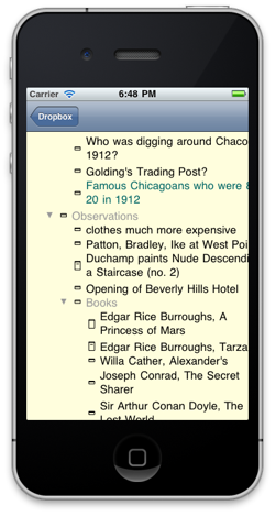
Here’s the latest update from the lab at Eastgate. That’s a Tinderbox outline, viewed on the iPhone or iPad.

The immediate goal is a viewer – a tool for browsing Tinderbox documents you’ve created on a Macintosh. To keep things light, we’ll probably have separate apps for Tinderbox and Twig maps and for outlines.

Touch interfaces are new, so we expect lots of tinkering with exactly what gestures we’ll use and what they’ll mean. The small size of the iPhone screen is obviously a constraint, but I think this may well turn out to a useful tool for lots of people.

There’s still lots to do. If you’ve got a critical application for something like this that can’t wait, though, you might get in touch with us at Eastgate.

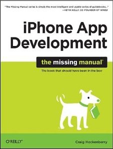
On page 45 of Craig Hockenberry’s iPhone App Development: the missing manual , we’re shown the idiom:

 if (exclamationCount != nil) {
     [exclamationCount release];
     exclamationCount = [nil retain];
     }

I'm missing something, obviously. Since [nil retain] does nothing and returns nil, so why not write

     exclamationCount=nil; ?

Thanks to boring bits of confusion and a friend who took his iPhone for a nice swim, last night’s dinner came together at the last moment.

  • homemade new pickles
  • crudites with Linda’s wild dip
  • gougères
  • one lacquered rib
    • vinho verde
  • absinthed salmon rillettes, buttermilk rye bread
  • duck (Super 88) braised in fresh orange juice with surprising amounts of garlic, ginger, spring onions, and fresh lemongrass.
    • writer’s block grenache
  • cheese with balsamic cherries
  • cornmeal shortcakes, blueberries cooked with honey and thyme, lemon marscapone

The big winner was the bread. I started with Ruhlman’s buttermilk dinner rolls, scaling back to 25 oz. flour. I used about 5 oz. rye flour and 20 oz. of bread flour. I also swapped in two eggs for the corresponding weight of buttermilk, and baked ot in a buttered loaf pan instead of making small rolls.

At Super 88, the fellow ahead of me in line was buying about 500 scallions. Super 88 has ducks for sale. They might not be quite as good as the ducks at Whole Foods and Savenors, but they cost $7 rather than $21. Hmmm.

by Craig Hockenberry

This readable introduction to iPhone application development pays attention to the details. Hockenberry discusses in considerable depth the mechanics of provisioning and submitting applications and of shepherding them through the approval process, matters that might quickly go out of date but that are, for now, tricky and not widely discussed.

It is difficult to imagine who this book envisions as its ideal reader. The opening chapters – about a third of the volume – introduce Objective C and the Cocoa Touch framework. Little prior knowledge is expected, not even rudimentary object-oriented programming, about which readers are urged to visit Wikipedia. Hockenberry’s breezy, casual style is not notably concise, and so these 100 pages strike me as far too elementary for an experienced programmer, too incomplete for a novice, and too cursory for an advanced student or a Java coder to grasp. One of Cocoa’s most distinctive features, delegation, gets two or three pages, and these pages don’t make any attempt to place delegates in the context of related Smalltalk, Java, or PowerPlant concepts. Questions any CS major would ask immediately – call by reference or value? ordered or labelled arguments? – go unanswered. Some valuable hints about the debugger are a promising start, but that topic is then abandoned and nothing much is said about profiling, leak detection, or exception management. The treatment of collections is equally sketchy, and while a few Cocoa objects are described a bit, whole catalogs of capability go unmentioned.

The treatment of design as a separate and superior activity to programming is, I think, misguided. The author is a designer and is writing, I think, for people who are not; he urges them to hire themselves a designer and then do what the designer says. Since the book clearly envisions individual developers or very small teams, this model may be unrealistic. Design and code are not separate things, and attempts to separate them are misguided. At times, the author’s contempt for the audience is palpable:

As a developer, you tend to look at problems from the implementation outward. A designer thinks about the final product and works inward toward how it’s constructed. When the logical left side of your brain encounters the designer’s artistic right side, great things can happen.

This is completely misguided – the flip side of the hard-nosed managerial outlook that always wants to control the creatives, suspecting that they only want a budget in order to buy cool clothes and then persuade each other to take them off. Everyone knows you’ve got to design the final product, just as everyone knows you’ve got to design a product that can be built. This preaching is wasted space, but since nobody is really going to be deceived by it, it’s harmless.

In any case, we hear a good deal of a designer’s thoughts on good coding practice and on the importance of employing designers, where I’d have preferred to hear more about graphic design.

The sample application developed here is an elaborate flashlight app. This might seem a placeholder, but it seems to me the choice is well considered: this is a book for people who want to write iOS applications which do almost no computation.

Ben Brooks explains why free software (free as in beer) is not always a good thing. First, revenue gives creators a good reason to maintain, improve, and nurture their software. Second, customers are hard to ignore – especially when they’re paying you.

When Twitter introduced the Quickbar — more affectionately known as #dickbar — users revolted at the forced interjection of promoted trends and an object that ‘messed’ with the view in the user’s content stream. Had Twitter for iPhone still been Tweetie and cost the users money I can assure you that Brichter would have removed the Quickbar immediately and would have been very communicative with users about that.

Feb 11 10 2011

Polish

Everyone is learning the wrong lesson from the smartphone wars.

The most recent entertainment in the ongoing competition to put a computer in every pocket is a controversial memo from Nokia CEO Stephen Elop that details Nokia’s shortcomings. John Gruber has the overview.

The first iPhone shipped in 2007, and we still don’t have a product that is close to their experience. Android came on the scene just over 2 years ago, and this week they took our leadership position in smartphone volumes. Unbelievable.

Gruber correctly observes that Nokia’s problem – everyone’s problem playing catch-up with the iPhone and iPad, is incoherence. People see the iPad selling. They copy the most obvious things – the touchscreen, the rounded corners, the black frame with silver trim. They add some software and stuff.

That doesn’t work. "Touchscreen, check. App store, check." Gruber writes. " Gaming, check. The trend Nokia missed out on? Kick-ass production values, quality, and experience." In an age where most of the “technical press” thinks that Apple’s advantage is some special design sauce that Steve Jobs personally sprinkles on new products, Gruber’s got his eye on the right ball.

But he’s wrong.

The iPad isn’t a success because the build quality is good, or because the animations are polished until they shine. The iPad succeeds because it lets people do stuff they need to do, and lets them make stuff they want to make.

All the polishing and shining helps get you to stop and look; what makes the deal is utility. Usability gets you in the door, but utility is what makes the sale, and what gets people to come back. The build quality is nice, but look around and you see lots of people with beat-up iPods and laptops and iPhones. They don’t have build quality, not any more. I know a university professor who travels around the world lecturing, and in his pocket he’s got an iPhone with a cracked screen. Not a great experience, not since he dropped it on the Paris pavement, but it still works and he’s got work to do.

It’s nice to make pretty things, but what really matters are the things that let us get stuff done.

John Gruber nails an important dynamic in the business of commercial blog networks. He responds to a strangely-argued post at Newsweek by Dan Lyons about how the Verizon iPhone is doomed with the conclusion"

I can’t decide whether Lyons is really this wrong, or if The Daily Beast makes its writers post eye-rollingly contrarian stuff like this just to get links.

This dynamic explains why so much business writing in the US is so incredibly bad, why pundits consistently make wrong (and self-interested) predictions, the predictions turn out to be nonsense, and the same people are then trotted out with the same ideas in the next round of articles. It doesn’t matter if you’re wrong, as long as you get lots of attention and inspire lots of comments and start a good flame war. That gets lots of page views and sells lots of ads.

I suspect, though, that those page views and those ads are actually defrauding the advertisers, that flame war participants are not really prospects. Eventually, advertisers may catch on.

On the other hand, Google has been tricked into showing ads recently on some splog farms-- the sort of page you stumble onto when you mistype a URL and that shows you nothing but Google ads. We'd never buy ads on a site like that! But, astonishingly, those ads are working; somehow, they are reaching people who actually want to buy a sophisticated tool for analyzing and sharing notes.

It's a confusing world.

Jun 10 26 2010

Price

We've been getting some pushback on price on the forum of another Macintosh product from people who’d like our software to cost less. (We’d like our software to cost less, too.)

37 Signals recently introduced a new iPad tool for rapidly sketching user interfaces. It costs $10, and they’re being eaten alive in their forum.

LOL @ $9.99 (Fred)

$9.99? Seems a bit steep — would have made more sense if there was an iPhone version tacked with it. (Moeed Mohammad )

+1 on the 9.99, not enough value for 9.99 compared to other apps that are that much like Pages. I like the simplicity of the app, but would be more attractive at 4.99. Then I would buy it more on impulse just to check it out, 9.99 is a but steep. (Nick Ricketts)

$9.99? Are you guys nuts? (Zee)

Did this cost more than $9.99 to code? (hop)

By the way, I agree with John. How did you guys come up with that ‘ridiculous’ price? Sorry to be harsh but I can buy several interesting apps for $10 or even a cool game. (A guy from South America)

Keep in mind that the tool is meant to help two or more user interface designers exchange ideas while they work in different offices. Let’s suppose only two designers and one manager are involved. Set their billing rate at $200/hr. To repay the investment, the application needs to make their meeting 3 minutes shorter.

Or work it out another way. Those designers are working on a project for a business — people don’t usually design user interfaces to amuse their aunt Agatha on a rainy afternoon. Suppose it’s a tiny, little project with a budget of $100K, a little skunkworks sideshow. We’re expecting this thing, when it ships, to generate maybe $35K/year gross margin. Someone has Bright Idea that might make the product just 10% more profitable.

But it probably won’t work. Really — it was just an idea. Might not be a good idea, might not be possible to implement. The users might hate it, the sales department might hate it, management will probably veto it, Steve might not like it. The economy might collapse. The project might be cancelled anyway. The whole company might go out of business. There are lots of reasons it might not be worth doing. What’s the probability that justifies buying a copy of the software?

350-1

The way I work it out, if the odds that the idea is worth a 10% bump in gross margin are better than 350-1, you should buy the software.

The app store is worse.

This is robbery(by alexcharlie) The app does nothing. It is worse than the worst sketch app on iPad. It is criminal to charge this much. It is no more intuitive because of it's simplicity. Any other drawing app is easy to use and more expressive. Avoid this app.

great $2 app (by awkpod) This app must be a joke, or maybe a clever piece of 37signals performance art. Either way I don't get $10 of value out of it.

It goes on and on. Takeaways:

  • Comments kill blogs. I’ve been saying this for years. Take a crowd of skilled professionals, give them comments and a forum, and soon you’ll have a pile of writing that is indistinguishable from pre-adolescent petulance.
  • That’s a lot of ink spilled on the price of an application that costs less than a martini at, say, Craigie on Main
  • People don’t bother to crunch the numbers.
  • An enormous amount of what passes for business discussion on the Web is literally silly. It lacks common sense and judgment, and this has obvious bad effects. A less obvious problem, though, is that the idiocy makes it hard to distinguish novel insights (which 37 Signals claims to have — and may well possess) from chance success.
Apr 10 22 2010

Unreasonable

Unreasonable

Something is badly wrong with software. Artisanal software and NeoVictorian programming can help. But, first, we’ve got to do something about the users.

In school, people learn a myth that, in the past, programmers didn’t care about users. This is historically false but makes a useful fable. When UI/UX consultants repeat this myth to clients, it’s a lie. Sure, user experience design has improved since 1967. But the old folks weren’t fools – they were working with stone knives and bearskins.

We teach people that software developers are techies: idiots who don’t know how to dress and who require adult supervision and who happen to have a useful talent. We teach them that software users are simple people with simple needs. We tell users that they shouldn’t have to think. We treat them like kids, and we talk about our own colleagues and forebears as if they were idiots.

Thanks to the myth, a lot of people treat software (and its makers) badly. With software, plenty of people check their common sense at the door. They forget that things take a few days to travel from Boston to Bangladesh – especially when a small volcano shuts down a vast chunk of the world’s freight system. They send angry emails when their late-afternoon order isn’t filled until 8am the following morning. And they are outraged – livid with anger – when they discover that the $4.99 database system they just purchased for the iPad can’t manage their company’s books.

I’m not making this up. Here’s a typical sampling of customer reviews for Filemaker’s Bento for iPad. (Disclaimer: You could argue that Bento is a Tinderbox competitor.)

fixwhatsbroke: “Absolutely can’t believe it isn’t able to sync with the iPhone metadata I’ve created in the desktop version.”
Filemaker pro lover: “I bought this to keep simple business books. Not possible. This so called database has less functionality than a spreadsheet. All it does is let you create simple records....but with a pretty picture arround it. One record per page. Nothing can be done with the information. Not even a sum.”
ejrod: “Looks cute and simple and sadly it is too simple. Also has bugs. Cannot enter data in certain fields. I would like a refund.”
Doc Mason: “Based on the numerous comments and reviews, it looks like the developers of Bento are asleep at the helm.”

This is a database program, written for a machine that shipped 14 days ago. The machine and its operating system are both new. The whole sector is new. The developers had at most a couple of months lead time and worked with simulators and, possibly, a sample unit chained to the wall. And we’re demanding a refund of $4.99!

The pork chops I served last night with sauce Robert, an asparagus salad, home-made dinner rolls, and orzo in brown butter – those pork chops were 30% off and they cost $4.95. The wine – a tremendous bargain from Portugal – was $5.98.

This idiocy wrecked sites like VersionTracker and MacUpdate, which long ago were overrun by petulant children. Now, those kids are running the App Store, which is the iPad.

There seems to be no place to turn for intelligent discussion of programs. I asked here about legal blogs, and received so many excellent suggestions that we’ve had to build a Tinderbox to keep track of them. (We’ll share the results soon.) But what about software? Sure, there are interesting blogs from developers and few blogs about verticals. But who writes about software you want to use with the passion people spend on gadgets?

When people do write, it seems to me, they write about stuff everyone has. Alice is getting lots of attention for iPad because it’s cute and threatens no one. And sure, it is cute. It’s a toy. It’s supposed to be cute. (And it takes a book that people think is a kid’s book and make it more childlike, emphasizing the Victorian play and hiding away those hints of sexuality and mortality that make Alice matter.)

At OOPSLA, I proposed a fundamental guide to decent treatment of developers, the difference between a workshop and a factory. In a nutshell, you should know who made the software, in the same way you know who wrote the book. Who made Numbers for iPad? It’s gotten almost no press, because numbers are scary, but at first glance it strikes me as a brilliant creation. Steve Jobs gets the credit for the iPad, but did Steve design Numbers too? Really? Who was responsible for this intricate, polished work of art? How did she get it out the door? Where are the interviews, the profiles, the anecdotes?

The software trade press is largely corrupt and mostly extinct. Blogs, oddly, seem not to be picking up the slack. (Gruber writes well, but he’s chiefly interested in Apple Corporate. TidBits – happy 20th – does good work but is always about new products and broad appeal.) Where’s the intelligent guide to iPhone games? To presentation design for iPad? Who is critically examining obscure and specialized software that I might need to know about – software that isn’t ever going to be in the top 25?

If we treated books and music like we treat software, we’d never talk about anything except the Best Seller List and Billboard. It wouldn’t exist.

Got a lead? Email me.

Cory Doctorow thinks the iPad is a computer, and laments that you can’t program it with quite the freedom we once enjoyed. He’s right, and he’s completely wrong. The iPad isn’t a computer: it’s an information appliance. We trained a generation to enjoy polished interfaces and to deplore the slightest deviation from UI convention. We accepted that “Don’t Make Me Think! ” was a reasonable goal. The iPad is giving the lady what she wanted. In any case, the software we write now isn’t something that kids can write; the APIs are just too big, the frameworks are just too complex.

Don’t like the world we’ve made? Get behind Smalltalk and Squeak and Tinderbox and artisanal software.

Dave Winer thinks the iPad is a wonderful toy. He’s right, too. And he’s completely wrong, because he’s imagining the iPad is a replacement for his mother’s old laptop. His mother doesn’t need an iPad to replace her laptop; she needs an iPad to replace the TV in the kitchen, or that silly digital picture frame. It’s an appliance: you use it in addition to your real computer and in addition to your phone.

Marc Benioff thinks the iPad is all about video. I agree with Tim Bray: this is (almost certainly) entirely wrong. The iPad isn't just about consuming media: that’s what your phone is for. The iPad is a for making stuff when you’re doing stuff. It’s not a heavy-duty creator’s tool: that’s your laptop back on your desk. The iPad is the tool you have handy.

Lots of people are saying they’ll get an iPad in a generation or two, when they’re better and less expensive. Good luck with that: while you wait, people are going to be using them to get stuff done. They’ll actually write a few chapters of their novel while sitting in coffee shops. They’ll come up with a clever presentation while riding the bus.
You won’t. See you around.

Kottke gets the spirit of the press today.

Lorem iPad dolor sit amet, consectetur Apple adipisicing elit, sed do eiusmod incididunt ut labore et dolore magna aliqua Shenzhen. Ut enim ad minim veniam, quis nostrud no multi-tasking ullamco laboris nisi ut aliquip iPad ex ea commodo consequat. Duis aute irure dolor iPad in reprehenderit in voluptate velit esse CEO Steve Jobs dolore eu fugiat nulla pariatur.

The iPad is a new thing. It doesn’t replace your computer. You use it when you don’t want the whole computer, and when your phone isn’t enough. It’s a new tool. You don’t have to get one – you can use other tools and get stuff done. But it makes stuff easier, and faster, and readier to hand.

Remember how PCs got adopted in the first place? You had a few enthusiastic users who bought business PCs with their own money or robbed Peter to pay for them, and everyone thought they were silly toys until they were in a turf war and their secretaries were sending hand-typed memos and their rivals had PageMaker and PowerPoint. It’ll be like that again. 90% of success is showing up, and part of that is showing up with enough computing power to get the job done.

It’s an impressive little machine. And it’s got lots of dimensions for growth. It’s fast, but we can use more speed. The screen is gorgeous, but we can use even more pixels. It’s got great typography, but we need more. It’s got a terrific battery — a whole day of video! — but people can always use more. (This is good news: room for growth means this is the start of something big, not just a splash.)

So, sure, it’ll be better next year. But I’ve got things to do. Right now.

Has anyone noticed that it’s black? And that iPhones are black, too?

When Apple returned from the slough of despair, Apple’s branding seized white. Macs were white, iPods were white, Apple stores werre white. Black meant Windows; for years, Apple’s machines were white, high-end PC's were black, and low-end machines were beige.

Now, Apple branding has taken back black – for accessories. These guys are smart.

As you walk approach Teotihuacan, you run a gauntlet of booths that sell silly “Mexican” souvenirs. As you walk through the ruins, you are continually approached by people selling toys and trinkets. No one sells, or gives away, a guidebook or a map, not even the little (but often fairly good) “self-guided tours” that the U. S. Park Service hands out. The outdoor signage is trilingual but mediocre. The new museum signage is good but sparse, the old museum signage is even sparser and, since I was able to read it, is likely written in rather elementary Spanish. There are said to be tour guides, but where? And how good? There seems to be a bookstore, but it was small, oddly situated, and closed for inventory.

Teotihuacan and Information

I don’t know much about Teotihuacan, beyond visits to the Field Museum and what one picks up here and there. I was limited to a very short visit. I had lots of questions.

  • What’s restored? How do you tell? How solid is the restoration?
  • Where are the potsherds? The metates? The hearths? We see lots of lovely figurines, jewels, and spectacular burial goods, but there’s surprisingly little bread and butter archaeology. And, simply walking around, I’m not seeing the scatter of potsherds that you see, for example, at Chaco.
  • The peak population hit 100,000, so this was, for a time, the largest city on earth. How do we know the population? How solid is the estimate?
  • What signage there is seems pretty confident about construction dates. How do we know? (Does dendrochonology work here? )
  • Are there ballparks?
  • A lot of this architecture seems to be designed for display paintings. Is that right?
  • A number of buildings are said to be elite political-residential structures. How do we know that? How are they distinguished from religious structures?
  • Teotihuacan is much larger than Pompeii or Ostia. The public spaces are vastly more impressive. But where are the bars and brothels and workshops? Where are the macaw pens and turkey corrals? How did people get water for cooking and drinking? Is that big open plaza really a market? Are there other markets? (Was there money?)
  • The last phase of Teotihuacan is termed “Metapec”. Does this refer to the Tolucan town where, the previous night, we’d had such a nice dinner of beer and queso fundido with chorizo and some micheladas and some quesadillas and more beer and dominoes and some more beer? Why Metapec?
  • There are stairs everywhere, and their risers seem to me to be uncomfortably high. Is there a “standard” riser? Is it in fact too tall, given the stature of the inhabitants? If so, why?
  • What are the current controversies and recent developments?

True, you don't want to bury a site in signage. When you first encounter a site so clearly intended to evoke an emotional response, it would be a shame to have your nose in a book. But, still, there is so much to be explained (and so much to be gained from better understanding) that more needs to be done. An iPhone/iPad solution seems natural here – not so much for showing reconstructions (though this would reduce the temptation to deface the site with reconstructions to impress casual visitors) but rather to provide lots of additional information to the curious.

Feb 10 20 2010

Pancake Mix

CIA Instructor Bob Del Grosso is not happy with cooking frauds, nor with Marc Bittman’s minimalist cooking in the NY Times, whom he calls a minimalist of skill. The problem, he says, starts from a media environment that appoints arbitrary, untrained people as arbiters of cooking; since many of their readers are even less competent, who knows or care that their technique is wrong?

I’ve always been skeptical of technique for getting started. When I was learning metal machining – a skill I had to pick up in graduate school in order to build some instrumentation we couldn’t find money to buy – I was the despair of Heine, Harvard’s infinitely patient machine shop instructor. Heine wanted me to learn to hand file a perfect cube; I wanted to get down to using the Bridgeport and the lathe and to crank out the mounts I needed. Same thing in the kitchen: the Culinary School master wants you to saute correctly, and maybe you just want dinner.

But your interests can align. Take pancakes.

Pancake Mix
This morning’s buttermilk pancakes, right out of Ruhlman’s Ratio for iPhone.

A few years ago, I was buying pancake mixes at Whole Foods, because my experience of making pancakes from Joy Of Cooking had been (a) it was fussy to get all the bits and pieces, and (b) the pancakes didn't always come out. So I’d pay $5 for organic mixes and it just worked.

And that’s a lot better than toaster waffles! Nothing much wrong with good pancake mixes. It’s just one thing: you don't need them. And it’s not that fussy.

The trick: get all the ingredients. Put them on the table. All of them. Take them out of the pantry, and line them up. Flour, milk, eggs. baking powder, salt, sugar. (Want nuts? Blueberries? Honey? Vanilla? Grab them too)

Grab two bowls. Get a skillet or a griddle; it goes on the range. Get a whisk for a fork. Get a spoon or a ladle -- a 2oz ladle if you have it.

Now you’re cooking. That's the whole trick: get everything lined up, and now everything falls into place. The rest is just ratios – and for pancakes the ratio is wildly forgiving: basically 3/4c flour, 3/4c milk, 1t baking powder, and 1 egg for two people. You can use buttermilk and add some baking soda too. You can use a little more flour or a little less milk. You can replace some of the flour with cornmeal or whole wheat or rye. You can add some butter.

You can go crazy and separate the eggs and beat the egg whites fluffy. The orthodox technique says, blend the liquids in one bowl and the flour in another, then add them, and that’s fine – but if you just throw it all in one bowl, that’ll work too.

You can’t go wrong. No throwing the first one away, no blunders, no disasters, no drama. It takes five minutes. You can do it on a workday.

The key technique: put it all on the table first. In French, this is mise en place. You need to do it.

Once you’ve mastered the pancake, maybe you don’t need to do it this way. You can grab stuff on the fly. Fine. Until then: get it all out.

I dabble in Vampire Live!, a Storm8 iPhone game. It is, to be frank, a lousy game, which is to say that I’m a level 62 vampire and I’m still waiting for a game to break out. No competition, no narrative, just enough new stuff to try to keep me stopping by occasionally.

But life intrudes. In this case, Ambrosia, who is one of the 94 members of my "clan" — a low-level vampire with whom I’ve had almost nothing to do — broke her arm. Turns out she’s an actress, or maybe a stunt person; she was in a swordfight, her arm broke, she went to the hospital. All in the day’s work.

Except it turns out she broke her arm because she has bone cancer, and so very suddenly she’s a very unhappy camper. And, suddenly, a bunch of vampires from all over the world (one mentioned that they’re from the Vatican – stick that in your pipe and smoke it) are trying to think of useful things to say. Someone else in the clan had a nasty cancer scare last year a couple of months back. Someone’s a nurse. Someone else had a childhood stroke. And everyone can say, “there, there.”

There’s a terrible discord between the interface (140 character texting, names like “Bast” and “NurseVamp” and Skittles) and the events (arguments with her mother over surgery, the Mayo clinic, outcome statistics, whether it’s all worth it.) And of course in the Internet no one knows anything.

But it’s a moving, unfolding narrative. And, interestingly, it’s emergent and collaborative. These things never work in fiction; people try them all the time, they always peter out incoherently. This is incoherent but that’s what you expect. We’re playing a game, and if it’s ultra-casual and has a lot of chat, that’s probably just fine from a hospital bed.

Nov 09 9 2009

Sliders

Last night for dinner I fried up some leftover patties of homemade duck sausage and served them on small round brioche bits that were bread pudding remnants. Tasty!


Speaking of sliders, Kottke and Gruber and all the cool kids are cheering on Neven Mrgan’s protest against all the different kinds of slider to be found in Photoshop.

I love Photoshop. It’s where I spend eight hours five times a week. I just wish that one of these days, instead of piling on more furniture, they’d clean up the place.

This is why we get beautiful, shiny, polished programs that do the same stuff you could do in 1994. They attempt nothing new, but they sure have lovely detailing. Sure, the proliferation of slider styles is mildly inconvenient and it’s a code smell. I bet fixing it would only cost $100K. Maybe $250K, worst case. It might be worth doing, if Adobe has the money and the talent.

But is this what we want most?

Notice how the iPhone has a ton of tower defense games with lovely graphics, and hardly one game that’s new? Notice how we’re still waiting for any real use of augmented reality? Or location-specific software art?

Why can't we have a better computer press?

(To be clear: Kottke and Gruber and Winer and ArsTechnica are miles and miles ahead of the trade press, and leave the newspaper reviewers in the dust. But, seriously: if you want a clean, well-lighted place, buy a café. Or a bookstore.)

I am lying in bed early this morning, Linda is in the shower, and I am reading Daring Fireball on my iPhone and looking at this extraordinary graph of the collapse of newspaper circulation and I am thinking that this very unusual situation will lead to lots of the usual talk.

The Reactionary guys say that nobody wants to read these days, and they blame television and the public schools and the internet. The Cluetrain medics blame the decline of advertising, especially in a bad economy, and prescribe conversations. The Web fellows tell you that nobody wants to pay any more, and blame the internet. Rupert Murdoch proposes to make everybody pay for news on the Web by forming a big cartel and building a big fence, and while Mr. Murdoch has a great many dollars and I do not, I am not convinced that this fence can be built, and I suspect that the price-fixing laws might express an opinion on the subject of that cartel.

All these guys are missing the real story. Why have newspaper circulations — not just revenues, but circulation — collapsed so far, so fast?

The reason is that newspapers are a bundle, tied together with string. The link and the Web have been yanking on that string for twenty years now. When you do that at first, nothing much happens, especially if the bundle is big and heavy. But, if the knot comes undone, very suddenly papers are flying all about and you no longer have a bundle at all.

The newspaper we know in the US is a bundle, created (roughly speaking) by Pulitzer and by Hearst. At one time, everyone is buying a paper — some paper — because every one wants to know something. If you want to know what the President is going to do next, you buy the paper. If you want to know who wins the third at Aqueduct (where wallets go to die), that is in the paper too. If you want to know when the movie about Guys And Dolls is going to start, you get the paper and look it up. If you want to know the closing price of hog bellies, T-Bills, or Pan Am, it is in the paper too, along with which ships are arriving at the pier and which fashions are departing in Paris.

Now, these papers are not interchangeable; and that is why we have Mr. Pulitzer, who invents what we call the good paper, and Mr. Hearst, who invents the other kind. My mother is at one time a newspaper woman, and though she is a nice Jewish girl from a nice socialist family, she works for Mr. Hearst, who is not socialist, or Jewish, or nice except that he pays my mother very well and invites her to swell parties. I mention this just to explain my biases, as the FCC wants me to do. But all the newspapers are big bundles. This guy is a mensch and wants to read the Forward, and that putz, who is hardly more educated than a neanderthal, likes the Sun. But if the Herald-Tribune or the Sun or Forvertz want you to buy their paper, they need to have theater reviews and stock prices and pretty girls and the latest on pork bellies and of course the eighth at Saratoga. Besides, the Sun has Archy and Mehitabel.

But all these papers are bundles. This happens naturally, because these papers all need huge printing presses, and they keep stables of horses and teamsters (and now fleets of trucks) to make and deliver the paper. This is why newspapers organizations are so large.

And,now, very suddenly, the Web yanks on that string and the bundle is not a bundle but instead is paper flying all about. If you want to know when a movie starts, you use your cell phone. If you want the winner at Aqueduct, it has a Web site. Josh Marshall will tell you what the president is thinking, and Matt Drudge will tell you where he ought to go, and Craig will tell you who is wishing to sell you their sofa or their car. If you are the kind of guy who buys the paper for the stock prices or the funnies, you go online and read them and you do not get whole sections of book reviews and fashion advice and gossip about people you do not know.

For some years, the Web is inconvenient and expensive and slow, and many things the newspapers do are still better in the newspaper than elsewhere. But the Web is always improving, and with ubiquitous iPhones and Kindles you can find out about the Cubs without unfolding a paper, or buying one, and if you are really interested in the Cubs you can read seven columns about the Cubs from seven different angles and you are not reading about fashions or Fassbinder while your train is stuck again at Downtown Crossing and you have nothing else to do. Even if Mr. Murdoch got you to pay him to read his writer’s take on the Cubs, it would not help him much because you will buy only the part about the Cubs, there being no reason for you to take the part about Fassbinder because it does not come tied up with the real story about the bottom of the eighth with two out and runners at the corners.

So that is why the collapse is so sudden and so complete. The knot has come loose. Those astonishing iPhone numbers, and the success of the Kindle, are for newspapers the four horsemen of the apocalypse.

I am also reading this morning in Jimmy Breslin’s wonderful biography of Damon Runyon that Runyon stole his style from Coleridge, and that it is nothing more than writing in the first person present, combined with avoidance of contractions at all times. I am thinking this is not quite the whole story, but Breslin is a smart fellow and I thought I might take it out for a spin.

Apparently, when Microsoft wanted to update the storage servers for their Sidekick mobile phones, they forgot to make backups. And, when something went wrong in the switchover, every user’s data was lost.

Hundreds of thousands of users. Contacts, email, the works. Gone.

Or, to put it a different way: there goes a business for which Microsoft recently paid a half a billion dollars when they bought DANGER last year.

Keep good backups. Things go wrong. You need them.

Keep your own backups. Even professional hosting companies make stupid blunders.

It ought to be a crime. A hundred thousand people lose their contact lists. It’s probably not a disaster for anyone, though there’s always the possibility that some kid somewhere is going to call have to call Uncle Eddy for help next week but Uncle Eddy’s number isn’t Mom’s the cell phone anymore. But forget that: it’s also a few hundred thousand hours of rekeying contacts,. And time standing in line to get new cell phones. And time trying to find out why your phone lost all its contacts. So, whoever forgot to make those backups didn’t simply destroy a business that Microsoft bought for half a billion dollars, they also took about a couple of million dollars of labor and wasted it. Talk about public nuisance.

iPhone has the right architecture. Tethered to your computer. You have backups. You might also have backups in the cloud, which is nice. But if the cloud goes up in smoke, you still have your data. Your data is yours — or it should be.

Oct 09 6 2009

Urban Sketches

Urban Sketchers: an interesting community of sketchers in many media, from watercolors to pencils to iPhones.

Seth Goden predicts the end of dumb desktop software. For example, take his iCal calendar:

If I try to schedule an appointment for 2 pm, it requires me to not only hit the 2, but also select pm. I have never once had a meeting at 2 am. Shouldn't it know that?

He proceeds from this to say that "The people who make desktop software are making themselves obsolete. When you start developing on the web, your default is to be smart, to interact and to be open (with other software and with your users)."

This is wrong.

First, the feature he wants is actually not so great — not when you schedule the 2am wakeup call for your 6am flight to Mumbai (where you have never been in your life) and find that your calendar changed the wakeup call to 2pm because it thought you wouldn't want to be disturbed. Besides, you never go to Mumbai; you must be catching the 6pm to Memphis.

Every day offers all sorts of unique circumstances. You know which matter because you know a lot. Your children don’t understand you, your rabbi doesn’t understand you, your dog doesn’t understand you. You want your calendar to understand you?

Second, machine learning is hard. The “smart” features Goden wants are based on inductive learning, but induction is full of tricks. Sure, your address book is full of phone numbers of people you haven’t called in ten years. Some of those people are dead. Some are people you’ll never need to call. But there’s also the phone number of the fellow who owes you one big favor, and someday (though that day may never come) you may need to call him and ask him for that favor. But if your address book considerately deleted it for you, you’re out of luck. (That Obama kid you knew in school? Well, you don’t need his cell phone number now that you’re grown up, do you!)

Remember the problem with Mom cleaning your room? Even your mother didn’t always know what was terrifically valuable to you and what was junk. Will your calendar will be better?

Third, Web development doesn’t make it easier. In fact, server-side developers are likely to be short on CPU, so lots of clever inductive strategies that are viable on the desktop won’t work in Web apps. Well, they’ll work in beta, and for the press briefing when the system has maybe ten users. Once things get built out? Fail whale.

Think I'm wrong? Just ask Sandy.

Of course, one advantage Web developers have had is that they’re new. It’s long been a maxim in software development that sometimes it pays to hire kids, because kids don’t always know what’s impossible, and sometimes find it easier to solve unsolvable problems than to learn why it can’t be done. But that has nothing to do with the Web.

Fourth, these features are expensive. That can work for core systems like the built-in calendar, and it’s fine for appliances like the iPhone, since development costs are amortized over zillions of users. But for software that everyone doesn’t use (or that everyone doesn’t use yet) the cost of getting the software to anticipate what you want can exceed the cost of asking you to show it what you want — often by orders of magnitude. This is the 37 Signals lesson: you don’t always need to be smart if you’re simple and fast and people understand what you do.

Note to marketers: software is not always the same as soap and cereal. Sometimes you can sell sizzle in software, but it’s got to work well at a good price. That’s engineering. Imaginary mystical Web goodness isn’t engineering, it’s wishing for magic.

If you read the current business press — especially in print, but also on the Web — you can’t help but notice that CEO’s of winning firms are brilliant (and handsome), while the leaders of losing firms are incredible dolts — pursuing obviously-doomed strategies, saying dumb things, and lacking the personal qualities that distinguish winners.

John Gruber often breaks the mold by actually showing a tactical mistake and identifying what was wrong. Today, Gruber calls out Sprint’s Dan Hesse for a poorly-thought-out interview. Charlie Rose asked Hesse whether the Palm Pre was "making a dent into the iPhone market", and Hesse answered that the Pre is doing well but that “the Apple brand and that device have done so well, it’s almost not… it’s like comparing someone to Michael Jordan.”

In other words, what Hesse tried to do was lower expectations, because for the business press it often matters as much whether you beat expectations as whether you actually, like, succeed. Gruber argues that this was a blunder:

This is one of the worst answers he could have given. Even just plain “No” would have been better than comparing the iPhone to Jordan, which suggests that Hesse doesn’t believe they can compete. He could have simply said that the iPhone has a two-year head start, and Sprint is happy with how the Pre is doing three months in.

Gruber’s right, though it might have been even more useful to acknowledge what Hesse was trying to do. (The same thing applies to sports. It’s pretty easy to see that the quarterback just threw another easy interception, but it’s much more interesting to explain what he thought he was doing than to harp on what a lousy throw he made.)

This is also the sort of mistake that seems consequential in the business press, but probably is not. If you read the naval history of World War II, you’ll be struck by a curious anomaly. Before August 1942, the allied navies kept making lots of silly blunders. Flammable paint is left on deck, people have the wrong equipment, watchstanders fall asleep at critical moments, the new model of torpedo doesn’t actually work. By late 1942, the allied navy is getting better and suddenly it’s Japanese seamen who fall asleep, foul up signals, run out of supplies, or steer the wrong way.

It’s almost as if the Allies started out with a virus, and suddenly they got better and the Japanese caught it.

People tend to think this was training: the US Navy got better, the Japanese got worse. In reality, though, it’s selective focus: mistakes matter (and are noticed) when they are costly. In 1941 and 1942, the Allies lost a lot, and naturally wanted to know why. By 1943, the Allies were winning. Everyone has a hand in a victory, and the mistakes — the missed signals, the cans of paint left of deck — are soon forgotten.

Update: This article has been massively retweeted. Thanks, all! Please do follow me on Twitter.

Instapaper’s Marco Arment recites a litany of iPhone app developer woes, and sums them up with an important observation: “Apple thinks this is good enough.”

It’s not just a business model problem; it’s a potential disaster for mobile software innovation. To sell software for the iPhone, you have to get Apple’s approval. The approval process turns out to be a mess, and this – much more than the 30% overhead – threatens to wreck the marketplace. If you can’t predict whether Apple will let you sell your software, you can’t invest in making good software.

My overview:

  • The dominant platform offers thousands of choices, but only when authorized through a single source.
  • The dominant price point is so low that the penalty for selling garbage is slight.
  • Authorization is always slow and often capricious.
  • The age-rating system is obviously doomed, since noisy groups assert that almost every aspect of existence is unsuitable for children.
  • The result is that most applications are barely-functional junk, and star applications are often little more than slight papering-over of the built-in APIs or of familiar genres.

The last two featured games I bought — the only games I purchased by browsing, as opposed to personal recommendations from Web celebs — were crap. I’ll probably stop buying stuff from the app store unless someone like Gruber or PeterMe extolls it.

That’s a disaster for software innovation. And the last, best hope for an alternate mobile platform.

But I’ve still got an iPhone in my pocket.

Jul 09 14 2009

Pundit Penalty

PeterMe observes (Do People Ever Tire of Being Wrong?)that pundits can get attention by making wildly inaccurate and contentious predictions — the iPhone is doomed, Up is uncommercial, etc — and that there seem to be no consequences for having been wrong.

Jul 09 6 2009

Pisa

Pisa

Breezed through Pisa en route back to Piedmonte. Tried to score terrific pizza, compromised on adequate. The trip went 0-2 on pizza; it was that kind of movie.

Pisa's tower and Duomo and baptistery all far more impressive than you'd expect. Will require much additional inspection on subsequent journey.

Camping in Piedmont turns out far from onerous, as camper is equipped with everything necessary to civilization. Wine cellar, a glass rack, dual iPhone chargers, and a tent that erects itself as soon as you take it from the bag. (Packing the tent, on the other hand, required seven attempts, much poring over the documentation, and the assistance of a team of French bicyclists.)

In the New Yorker, Kelefa Sanneh offers a terrific and thoughtful overview of recent enthusiasms for care, craftsmanship, and artisanal work: Out Of The Office. A sensible response to Matthew B. Crawford’s much-twittered New York Times Magazine defense of The Case for Working With Your Hands.

Sanneh observes that parallels have been drawn to open source development, but I think that’s probably the wrong end of NeoVictorian Computing from which to launch this argument. I predict that we’ll learn more by looking at artisans and applications than at Linux, and in the end what we learn will inform the vast platform projects as well. In this connection, it’s worth looking at John Gruber’s WWDC wrapup which observes that a lot of people are moving into the development space – many of them iPhone developers migrating to Macintosh, rather than vice versa. (Note how the iPhone Apps store is probably the first real success for micropayments – something we’ve been trying forever.)

Jun 09 10 2009

Born To Kvetch

by Michael Wex

We were visiting my aunt and uncle, who were renting a house on the Cape. It was breakfast; my aunt was making matzoh brei, as a special treat. My dad loved matzoh brei, which my mom wouldn’t make (because it's traditionally fried in schmaltz and Mom was a low-fat girl with a vengeance). So we were all sitting around, talking politics and eating just a little more matzoh brei, and a close friend of my cousin’s fiancée comes over because he wants some matzoh brei too. He’s a nice guy, a curator for an art museum, full of good stories. And he mentions this book, Born To Kvetch, whch naturally I note down in my iPhone so it can get into my Tinderbox projects file, and onto my reading stack. And now I’m reading it.

The first essays are absolutely terrific, especially the fascinating study of kvetching, “Kvetch Que C’est,” that opens the book. I’d always assumed that kvetching – that familiar style of complaining so familiar to Jews whose ancestors spoke Yiddish – was a 19th century style, but Wex makes a great case that it’s old, perhaps very old. I’d missed, for example, Exodus 14.11, which has a certain familiar ring:

Is it from lack of graves in Egypt that you took us to die in the desert?

Wex argues that kvetching is very close to the center of Jewishness. It’s fascinating. The later chapters of the book tend to bog down in odd facts and curious sayings, but even there we encounter treasures. For example, you probably know schmuck, and putz, and maybe schlong. But what are them feminine equivalents? You never hear them. Wex explains why.

Then there’s lign in dr’erd un bakn beygl — a phrase that explains that things are going so well that you’re dead, you’ve got to spend eternity in a hot kitchen, you’re baking bagels that (being dead) you can’t eat, and since down there everyone is dead it’s really hard to sell them, but thanks for asking. (I’ve never understood why, when people ask “How are you?” I never feel right saying “Great!” This became a regular shtick with Dorie Friend, who was president of Swarthmore when I was a student, because I’d always have some complaint, and then when it became a shtick I’d get myself tangled up to his endless amusement. Now I know that my ancestors thought it was impolite, and possibly dangerous, to say how wonderfully things are going...)

Nov 08 9 2008

iPhone Games

I have an iPhone. Despite my occasional jibes at game studies, I like computer games. John Gruber mentioned Wurdz; it's fun. Curt Schilling mentioned Fieldrunners; it’s fun, too.

I’ve noticed, though, that people don’t talk much about what they’re playing. Sorting through the entire store to find an interesting game is too much work, especially since the store is filled with lots of half-finished stubware. So, I asked Twitter for suggestions.

I can't say that any of these inspired me, or even seemed to be intended for players like me.

Five days more.

Put it in your appointment calendar. Add it to your iPhone. Make a note. Write it down. Next Tuesday: make history. You’ll want to remember this.

The long Civil War ends Tuesday night. As Andrew Sullivan pointed out, there should be a terrific party at the offices of that abolitionist blog of 1857, The Atlantic.

James Russell Lowell, we finally made it.

Where else should we celebrate? Grant Park, of course: I missed the great battle in 1968, but we all remember and the whole world was watching. Selma, of course. Pullman, and Homestead, and Lawrence (Bread and Roses). And, perhaps, Gettysburg.

Hope.

Oct 08 23 2008

Born To Kvetch

by Michael Wex

We were visiting my aunt and uncle, who were renting a house on the Cape. It was breakfast; my aunt was making matzoh brei, as a special treat. My dad loved matzoh brei, which my mom wouldn’t make (because it's traditionally fried in schmaltz and Mom was a low-fat girl with a vengeance). So we were all sitting around, talking politics and eating just a little more matzoh brei, and a close friend of my cousin’s fiancée comes over because he wants some matzoh brei too. He’s a nice guy, a curator for an art museum, full of good stories. And he mentions this book, Born To Kvetch, whch naturally I note down in my iPhone so it can get into my Tinderbox projects file, and onto my reading stack. And now I’m reading it.

So far, it’s a terrific, fascinating book.

Jon Leavitt explores the iPhone outliner CarbonFin as an adjunct to Tinderbox.

Jul 08 11 2008

January '03

Somehow, I misplaced this weblog's pages from January 2003. I finally got around to grabbing them from an old backup — going way back to the TiBook era — and pasting them back here.

Notable, perhaps, is the Apple strategy note on the introduction of Keynote and Safari, two projects that were initially regarded as absurd. It's five years later, and boy was I right: not only did Apple get Microsoft's knife away from Apple's throat, the consensus seems to be that they kicked the knife pretty much out the window. Jobs gets the credit, the the Keynote and Safari teams deserve statues at One Infinite Loop.

Apple is telling everyone that, if they have to, they'll build a word processor that will replace Word and a spreadsheet that will replace Excel. They don't want to do this; if they did, they'd just launch the products. Keynote and Safari don't gore Microsoft's ox; they attack dead markets where there's no money to be made. They demonstrate capability without starting a war.

Apple is also making sure they can pull it off. If they can't -- if this is Cyberdog all over again -- it's just a footnote like the Cube. Management wants to be sure that, if total war breaks out, their weapons go boom. If they do, fine: Apple has deterrence. If they don't -- if Keynote and Safari turn out badly -- then management knows to avoid war at any cost.

So, today they launch the iPhone 2. They have everybody running huge ad campaigns to catch them; Verizon is buying space in the Boston Globe from wall to wall, Microsoft just announced a huge campaign on the theme that Vista is not really that bad. They roll out a new synchronization service at the same time. People get glitches; they complain on Twitter that if another company had these glitches, everyone would be complaining.

Remember when everyone left Apple for dead on the side of the road?

Feb 08 25 2008

Game Criticism

Greg Costikiyan believes we need better criticiism of computer games, and delivers an instructive sermon on the difference between reviews and criticism.

Earlier, John Gruber pointed to this useful refutation of a critique of the MacBook Air because it has too many internal screws. You see this all the time in tech reviews in newspapers and business magazines: the reviewer will pontificate that the product in question is bound to be hurt because some particular feature they want was omitted. The iPhone will fail because it doesn't have Exchange integration. The Air will fail because it doesn't have a swappable battery. The iMac will be the ruin of Apple because it doesn't have a floppy disk. You know the drill.

It's easy to convince yourself that you could do it better, especially if you don't understand the technical and business constraints that underpin the design.

Oct 07 15 2007

Tinderbox 4.0.2

A new update to Tinderbox is available. If you bought or updated Tinderbox is the past year, it's free.

Tinderbox 4.0.2 is a fit and finish release, adding a few features that streamline some repetitive tasks and fixing a few annoyances.

  • There's a new option to Paste And Match Style, that's nice for clipping from the Web or from pdf's; it's smart enough to preserve bold and italic passages and to match your current font, color, and size.
  • Dragging a URL onto an existing note sets that note's URL, instead of making a new note.
  • Dragging a vCard or Address Book entry onto a note sets that note's attributes, instead of making a new note.
  • Mail to Tinderbox works better. (I use it a lot from my iPhone)

One of the key things about the iPhone design is that you have to get the Internet package, and there's only one Internet package: unlimited. So, you don't worry about connect time, you don't worry about using up your quota. It's just there.

Tim Bray offers a fascinatingly contrarian perspective, suggesting that in the long run we'll all be better off with some kind of metered service.

Once the telco has your money they really want you on the network as little as possible; there’s no incentive to make it run faster or have better apps or lure you into using it more.

One thing seems very clear from the iPhone launch: telephone companies make awkward partners to customer-centered vendors. Every time there's news about the iPhone, Apple is out there to reassure people and invite them into the store, and ATT is out there urging the customers to go away and leave them alone.

Aug 07 17 2007

iPhone Abroad

If you're taking your iPhone on a trip, be sure to turn off automatic email checking. Jon Henshaw writes:

Stasia Holdren, our VP of Business Development and our Google AdWords guru, recently taught a one-day AdWords seminar in Vancouver, Canada. Although the city is relatively close to Seattle and is a larger metropolitan city, she was technically on an International roaming connection. She was mindful of that and only made calls from her phone when she had to. Unfortunately, her iPhone had other ideas. Since her phone was set to check email every few minutes, she was charged giant roaming fees for every new connection made, along with the time and data of each connection. She racked up a $600 bill from AT&T in just two days, and that was in Canada!

Ouch.

We've been talking about one of the new Tinderbox 4 tutorials that shows how to send email from Tinderbox. This was originally conceived as chiefly an example — everyone understands what sending email entails — where "email" was a placeholder for "updating out special proprietary database application from Tinderbox."

But, actually, email is interesting. Here are some notes from Dr. Jonathan Leavitt:

Subject: I suppose this is pretty good!

At least when I'm at BZ's (and presumably at home) I can type lots of notes in Tinderbox and email them just by dragging them to the green box. But why do this from Tbox rather than doing it from Mac Mail?

  1. More versatility in note processing before I send the message out.
  2. Sent messages are already kept in Tinderbox and can be reorganized, whereas email has to be manually imported into Tinderbox note by note, titles written, etc.
  3. Using prototypes, I can set up key attributes, keywords, collections, and all that.
  4. Which makes me want to learn more about the Tinderbox 4.0 collections feature.
  5. I can email key tbox notes for reading when Tinderbox is closed, even on the iPhone.
  6. I can excerpt text from Tinderbox notes to other notes (dragging or exploding) and email the excerpts..
  7. I can specifically prepare Tinderbox-to-iPhone notes for reading when the laptop is put away.
  8. I can further edit notes like this one in Mail and then re-import it by dragging into tbox.

Another good reason: lots of Web services have email interfaces. This will only get bigger, because email is ideal for pushing information to read-mostly termini. That includes mobile devices, where reading is easier and also more common than composition, and also includes many kinds of low-intensity recipients, who need to see your message but probably won't need to respond.

Jul 07 26 2007

iPhone: 1 Month

I've had my iPhone for about a month. Following Dave Winer and others, it's time to take stock.

It's a beautiful appliance. Everyone seems to agree. It feels good in the hand. It's the right size. Its screen is superb — so good, in fact, that I think it's likely to push people toward higher-resolution laptop displays.

My guess for the future: a subminiature Mac laptop with a high resolution display and Flash memory instead of a hard disk, which means it could have a battery that can handle any flight on the new ultra-long-range Boeing without a recharge.

The software package is polished, elegant, and simple. The only thing that's worse on the iPhone than on the Treo is the To Do list. But these days, I just email tasks to my Tinderbox projects file; that's even better than the Treo.

The marketing lead-up and rollout was a thing of beauty, superbly executed.

The problem: it's an information appliance. It's a superb information appliance, it's the realization of a long dream in the tech community, but the flaw in that dream is that appliances are limited tools, not the limitless dream machines we call computers.

And it's a phone, too!

Addressing A Problem

In Mail.app, you can easily add a correspondent to your address book. That's nice, because it's a fast way to whitelist someone, to say, “I know them, so their stuff isn’t spam.”

But, Mail.app doesn't seem to know when someone is already in my address book. If I use this freely, I wind up with lots of extra address carda for the same person: George's phone numbers, George's email address, George's cell phone, George's other email address, George's iPhone email.

There's got to be a simple way to say, "these two cards are the same person: please consolidate them.” Or something like that. This must happen to people all the time. What’s the trick I'm missing? Email me.

It's easy! Card menu: Merge Selected Cards. Thanks Mark Paul!

Jul 07 15 2007

Spanning Sync

One thing I've wanted for ages is a good way to have online calendars that could be open to viewing and editing by other people at Eastgate. We don't have terribly demanding calendar needs, so this should be easy.

It's not.

Spanning Sync

I'm trying Spanning Sync to sync my iCal calendars with Google calendars. This would be great, because then my iPhone would sync to one of my laptops, my Macs all already sync their calendars through .Mac, and now some of those calendars would also sync with Google. Selected Google calendars could be open to viewing and editing by staff members.

So far, I'm pretty sure there's a bug somewhere that fouls up repeating events. So, I'm not syncing that calendar. Everything else seems to work OK.

When syncing doesn't work, today's software gives you no real hint of what's going wrong, which end of the pipe is to blame, or just what it’s doing. And if I can’t figure it out, how are pointy-haired managers and their secretaries supposed to cope?

A useful (and nicely-designed) article from Apple discusses a variety of issues in Web design for the iPhone. What's notable here are the things you aren't urged to do:

  • no separate sites for mobile devices
  • few or no extensions or special tags

But small-screen devices are different: their screen is smaller. You've got to be prepared.

One thing I misinterpreted is the meaning of double-tap, which zooms into a big page. I assumed it was literally a magnifier, but it's not: it looks for a block that encloses what you tapped, zooms in so that block's width matches the screen, and then adjusts the type scaling to make the type look good. This is (fairly) simple to implement and works remarkable well; I assumed, for example, that I'd need to redesign this page or to create a variant that matches the 320 pixel size of the iPhone screen. I don't; the scaling just works.

What you need to avoid, it turns out, is bad typography: excessively-long lines of text can't scale. They look too small on the screen, and you need to squint and pan and scan. An ironic culprit: Pogue's Awsome iPhone Period-Typing Shortcut in the Missing Manual site, which lets body text span nearly the entire width of the page. Guideline: you don't want more than 50 or so characters on a line, and this page (in a default Safari window) is about twice as long as it should be.

The iPhone screen is gorgeous, but it only has 320x480 gorgeous pixels. Now, that used to be plenty for everyone, and now it's in your pocket. And panning works very well. SO does turning the iPhone sideways to get a landscape-mode screen.

But it's bound to be nice when you zoom and things Just Fit. So, look for Web designers to rediscover column modules in the neighborhood of 480 and 320 pixels. And look out for the html viewport <meta tag.

A lot of short-term reaction to iPhone is just emotion. People who want it to succeed find reasons to think it's working. People who don't, find other reasons. Ho hum.

If you actually watch what is happening on the ground and in the device, though, you'll see lots of interesting things. Notice, in the side-by-side comparision of Apple and AT&T retail experience, how Apple's curious decision to build retail stores has changed the company. Apple handles customers quickly, efficiently, and has attractive young people cheering the customers and high-fiving them out the door. AT&T lines move slowly, and their retail people are sour, short-sighted, off-message. It might have been worth building the stores for image and culture after all, even if they hadn't turned out to make tons of money.

Lots of snazzy Web applications — 37 Signals’ Backpack and Basecamp come to mind — do a lot with hover effects. You point to an item, and hidden controls appear that let you expand it, or delete it, or edit it.

I don't think that works well (or maybe at all) with iPhone, because in a touch interface it's hard (impossible?) to hover without clicking. Prediction: this will, in short order, transform a bunch of Web 2.0 interfaces.

On the other hand, Jon Gruber was probably the first to observe that, since iPhone decided to avoid copy and paste entirely, email is the iPhone’s clipboard. That’s very good news for Web 2.0 services, since it’s easy to write interfaces that receive email (many already do) and so sensible things with them.

It's been a long time since the tech world has been quite so excited about a new product launch. Well, maybe the game consoles were like this in some corners of the world, but they're toys, amusement devices. There's a sense — a hope, really — that this is new. Michael Mulvey comes closes to nailing it:

The iPhone is the floating car we imagined we'd be driving in the future.

The Jetsons, Star Wars, Blade Runner, Minority Report ...the iPhone is that touchscreen gadget they all used (metaphorically speaking) to communicate with...... and like any good science fiction movie - it's about the theatrics. The experience. The motion. The transitions. The atmosphere. What the iPhone does is as important as how it does it.

That, of course, is the takeaway from Brenda Laurel's important Computers as Theater ; the screen is a proscenium,

But we're a future-hungry generation and the future is late in arriving. Damn it, I want my jet pack.

Jun 07 26 2007

Attribution

Yesterday, Reuters ran a story by Franklin Paul about the imminent flop of the iPhone, featuring a prominent critique by David Platt, described as a computer science professor at Harvard University.

Here's the list of Computer Science faculty in Computer Science in Harvard's School of Engineering and Applied Science -- the place people expect "a computer science professor at Harvard" to be employed. And there's no David Platt in the Harvard Faculty of Arts and Science phone directory. (I believe he's taught some courses at the Extension school. And perhaps he's a new appointment. But his own site doesn't mention a Ph.D., and most Harvard professors have doctorates.)

Yes, there's a lot of iPhone hype. But this pseudo-reporting is absurd. Nobody knows how people will like the iPhone. Nobody. When Steve Jobs came back to Apple and announced the iMac, we laughed: who would want a bright blue VT-100? Who indeed! Two months later, you could tell which art galleries in Santa Fe were doing well because all the thriving galleries had bright blue iMacs sitting on their 18th century Spanish-American tables. And I thought the iPod was a silly little peripheral that would cleverly lead a few people to buy Macs because they owned an Apple product and nothing terrible had happened.

The popular tech press is corrupt. All this week's iPhone coverage is merely a battle of people trying to spin their past job performance or grab some extra attention. You can't study a device this complex quickly; we'll all need days or weeks to figure out what it can and can't do.