MarkBernstein.org

This page is automatically generated by a Tinderbox agent that scans posts in this weblog and selects those that might be useful to instructors who use Tinderbox for:

  • planning courses
  • preparing presentations
  • recording and guiding class discussions
  • organizing course reading
  • preparing student assignments
  • critiquing and interlinking student work product

and other pedagogical practice.

Presenting With Tinderbox

In most of my presentations for Tinderbox Weekend, I nested “slides” inside a container in the previous slide. Here, you’ll notice that the “title” block is actually a container, so I can simply select it and zoom into its interior map.

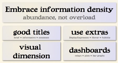
In this slide, I’m making lots of use of a feature from the upcoming Tinderbox release 5.X – subtitles. Notes can now display a title, a subtitle, and text as well, giving you a lot of new flexibility for presentations and dashboards.

The point here applies to (and implicitly criticizes) this presentation: your notes ought to be rich in dense information. Here, I’m suppressing lots of information we might have – examples, implementation details, insights into what’s coming next – in the interest of visual simplicity.

It’s not the way I usually want to work, but it’s a common technique. In the high-stakes world of volunteer Web conferences, it seems, getting this wrong can result in turmoil and tears.

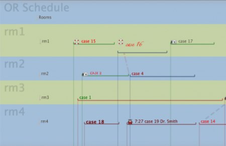
Brian Gregory studies ways to utilize operating rooms (and their personnel) more efficiently. In a recent weblog post, he shows how the new timeline view in Tinderbox can represent a wealth of information about facility usage.

Each font represents a distinct OR room setup.  The color of the horizontal line for each case represents a category of procedure, the vertical line represents the ASA of the patient and the potential difficulty and slowness of anesthesia in starting the case.  However, the representation of every attribute can be changed.  Make the bottom colors maroon and gold if those were your school colors, or make them represent who was in charge of the OR that day.  The vertical lines also give you a good idea of ‘crunch time’  –lots of cases starting at once– and the difficulty in starting them (the color of line).

When we designed the timeline view, we were thinking chiefly of retrospective tasks: teaching history, disentangling evidence in court, explaining political crises. But the same view lends itself in interesting ways to planning.

Operating Room Schedules
Jun 10 18 2010

Hypertext 2010

Two conferences in two weeks might perhaps be too much.

If last week’s ELO_AI was a fallen lemon soufflé – aspiring to be high and frothy but turning out mostly burnt and bitter – Hypertext 2010 was one of those little meat pies they sell on the Sidney quay. There was rich and tasty food here, though it was not showy and seldom neat. These were papers meant to sustain you through the hard work that hypertext folk share, contributed by people who were interested in their own work but also deeply interested to learn what their colleagues had found out this year.

One highlight new spatial hypertext system, iMapping by Heiko Haller (Forschungszentrum Informatik). It’s built on top of Piccolo, a Pad++ successor, and gets lovely panning and zooming performance. I was talking to Haowei Hsieh (Iowa) after the talk – we’ve both spent lots of time building spatial hypertext views — and we agreed that the performance was really compelling. Also interesting here was a new approach to link elision: links are shown on hover and otherwise hidden. This is certainly interesting, and I believe it’s completely novel (though Jan Walker’s Document Examiner highlighted links on hover). The paper doesn’t really call attention to the most interesting aspects of the work.

Hsieh’s paper on VITE was another highlight. VITE is a long-running project to combine spatial hypertext with formal AI-style knowledge representation. It’s one of the inspirations for Tinderbox and it’s great to have a fresh flagship publication for it.

A spontaneous (and excellent) session on hypertext narrative, chaired by J.Nathan Matias, was a novel and exciting development. Hypertext 2011 (Eindhoven, June) has a strong call for hypertext fiction and storytelling.

One mild vexation was that my own paper on Criticism (pdf) was scheduled directly opposite one of the strongest sessions on adaptive hypertext systems, and so I couldn’t see several terrific papers. I suspect that this was a two-cultures issue; people assumed that systems builders would be less interested in critical theory. Oh well. It was a good session, with three capable and engaging discussants on hand, ably to critique my review of hypertext criticism.

Apr 10 22 2010

Unreasonable

Unreasonable

Something is badly wrong with software. Artisanal software and NeoVictorian programming can help. But, first, we’ve got to do something about the users.

In school, people learn a myth that, in the past, programmers didn’t care about users. This is historically false but makes a useful fable. When UI/UX consultants repeat this myth to clients, it’s a lie. Sure, user experience design has improved since 1967. But the old folks weren’t fools – they were working with stone knives and bearskins.

We teach people that software developers are techies: idiots who don’t know how to dress and who require adult supervision and who happen to have a useful talent. We teach them that software users are simple people with simple needs. We tell users that they shouldn’t have to think. We treat them like kids, and we talk about our own colleagues and forebears as if they were idiots.

Thanks to the myth, a lot of people treat software (and its makers) badly. With software, plenty of people check their common sense at the door. They forget that things take a few days to travel from Boston to Bangladesh – especially when a small volcano shuts down a vast chunk of the world’s freight system. They send angry emails when their late-afternoon order isn’t filled until 8am the following morning. And they are outraged – livid with anger – when they discover that the $4.99 database system they just purchased for the iPad can’t manage their company’s books.

I’m not making this up. Here’s a typical sampling of customer reviews for Filemaker’s Bento for iPad. (Disclaimer: You could argue that Bento is a Tinderbox competitor.)

fixwhatsbroke: “Absolutely can’t believe it isn’t able to sync with the iPhone metadata I’ve created in the desktop version.”
Filemaker pro lover: “I bought this to keep simple business books. Not possible. This so called database has less functionality than a spreadsheet. All it does is let you create simple records....but with a pretty picture arround it. One record per page. Nothing can be done with the information. Not even a sum.”
ejrod: “Looks cute and simple and sadly it is too simple. Also has bugs. Cannot enter data in certain fields. I would like a refund.”
Doc Mason: “Based on the numerous comments and reviews, it looks like the developers of Bento are asleep at the helm.”

This is a database program, written for a machine that shipped 14 days ago. The machine and its operating system are both new. The whole sector is new. The developers had at most a couple of months lead time and worked with simulators and, possibly, a sample unit chained to the wall. And we’re demanding a refund of $4.99!

The pork chops I served last night with sauce Robert, an asparagus salad, home-made dinner rolls, and orzo in brown butter – those pork chops were 30% off and they cost $4.95. The wine – a tremendous bargain from Portugal – was $5.98.

This idiocy wrecked sites like VersionTracker and MacUpdate, which long ago were overrun by petulant children. Now, those kids are running the App Store, which is the iPad.

There seems to be no place to turn for intelligent discussion of programs. I asked here about legal blogs, and received so many excellent suggestions that we’ve had to build a Tinderbox to keep track of them. (We’ll share the results soon.) But what about software? Sure, there are interesting blogs from developers and few blogs about verticals. But who writes about software you want to use with the passion people spend on gadgets?

When people do write, it seems to me, they write about stuff everyone has. Alice is getting lots of attention for iPad because it’s cute and threatens no one. And sure, it is cute. It’s a toy. It’s supposed to be cute. (And it takes a book that people think is a kid’s book and make it more childlike, emphasizing the Victorian play and hiding away those hints of sexuality and mortality that make Alice matter.)

At OOPSLA, I proposed a fundamental guide to decent treatment of developers, the difference between a workshop and a factory. In a nutshell, you should know who made the software, in the same way you know who wrote the book. Who made Numbers for iPad? It’s gotten almost no press, because numbers are scary, but at first glance it strikes me as a brilliant creation. Steve Jobs gets the credit for the iPad, but did Steve design Numbers too? Really? Who was responsible for this intricate, polished work of art? How did she get it out the door? Where are the interviews, the profiles, the anecdotes?

The software trade press is largely corrupt and mostly extinct. Blogs, oddly, seem not to be picking up the slack. (Gruber writes well, but he’s chiefly interested in Apple Corporate. TidBits – happy 20th – does good work but is always about new products and broad appeal.) Where’s the intelligent guide to iPhone games? To presentation design for iPad? Who is critically examining obscure and specialized software that I might need to know about – software that isn’t ever going to be in the top 25?

If we treated books and music like we treat software, we’d never talk about anything except the Best Seller List and Billboard. It wouldn’t exist.

Got a lead? Email me.
In new installment in Tinderbox Chronicles, publisher Steve Zeoli uses Tinderbox to explore his company’s offerings.

I work for a small, nonprofit publisher of books about sexual abuse. For a recent meeting, I wanted to create a visual representation of our catalog of titles, showing how old our books are by the type of book. The first step was grabbing title, ISBN, price, author and other information on each of our publications which I already had in a spreadsheet on my work PC...

At the start of a new research project, you often need to dig in and gather lots of readily-available information, not to accumulate facts but to map out the structure of the domain you want to master.

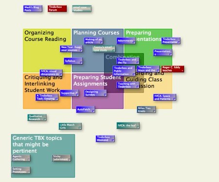
A recent Tinderbox Forum discussion on Tinderbox & Teaching led new Eastgater Stacey Mason to cast around for resources in Tinderbox and its role in education. She gathered information from Google, from Eastgate’s office library, from a new agent in this weblog.

The query is Text(tbx)&Text(teaching|presentation|assignment|syllab|classroom). The agent took a minute to write, and it's miles better than toying with a whole sequence of searches. And now that I’ve made the agent, it’s right there, updating itself with new notes (like this one). And I can share it with you.

Naturally, Stacey kept notes in Tinderbox.

Notice the interesting way she uses adornments (including overlapping adornments) to organize the map. It’s easy to add notes, and easy to move them as our understanding changes. Adding a new category takes seconds; redefining an old category and redistributing its notes is just as fast. Unlike outliners and mind-maps and tag buckets, the tool doesn’t tempt you to retain your original organization by making big changes tedious and difficult. It’s easy to split categories, or to have notes that bridge areas, or to remind yourself that some categories might be provisional, flawed, or unrelated.

At Brand Savant, Tom Webster explores how Tinderbox can be valuable for designing questionnaires and surveys. It’s surprisingly complicated:

Survey questionnaires are not like other writing projects, however, in that they are, in a sense, 'programs.; Questions often depend upon the answers to previous questions, and some questions may or may not be skipped depending on prior responses. If you move a question towards the beginning of a survey that depends upon a response to another question, you need to be able to see what that dependency is so that you don’t 'break' the survey and can move the related questions correspondingly. You also need to check the logic of a survey instrument to be sure that you aren’t skipping persons on a given question that should actually get the question, and that you aren’t assuming ‘facts not in evidence’ by asking a question before establishing a critical bit of information.

Webster singles out Tinderbox for its versatility in moving between spatial hypertext maps and hierarchical charts and outlines.

With survey research tools increasingly becoming platform independent, there are lots of possibilities for Mac users in the field, and I highly recommend Tinderbox for a variety of research purposes. It can be complex, but doesn’t need to be, really–I just open it up and dump text in with the default settings and then worry about order and presentation later. With an outliner I am constricted to a hierarchical view, but with a mind-mapper, I lose the logical order that a survey instrument eventually needs to have. With Tinderbox I can shift from chaos to order, depending on the thinking mode I need to utilize, and the tool shifts with me.

I’ve been working long hours lately, moving Tinderbox to a new development platform with new compiler and new libraries. This pays down some accumulated technical debt, and the need to examine every object and every file helps build a cleaner system. But the main benefit you’ll see immediately is speed.

Part of the speed boost will come from having a universal binary. Lots more comes from careful revisions, such as finding ways to do less work when loading and saving files. Lots of this is expensive; it's easy to spend several thousand dollars to save a few seconds.

Is it worthwhile?

The stock answer is, “Of course! Nothing is too good for customers, user experience is crucial, and speed makes the experience better.” But that’s wrong. User experience is not what matters: getting your work done is what counts. Getting the book written, getting the plan approved, getting the right answer – all of these matter a lot more than a few seconds here or there.

But seconds do count. If we can make Tinderbox load faster, that saves only a few seconds — but it saves those seconds many times a day, for many people. Perhaps none of those people really care about saving those few seconds. Perhaps none of them would pay to save them. But, in aggregate, it can make sense for them to pool together and invest a few thousand dollars because, in aggregate, it’s worth it.

But it’s not an easy call. Lots of businesses get this wrong, investing in over-engineered products when the customer would prefer to save the money. Business presentations are a conspicuous example: people spend a fortune on fancy PowerPoint decks that nobody needs to see. Books, too, have long been over-engineered: the history of the late 20th century demonstrates how readers, given the chance, prefer to keep the money at the cost of less perfectly-produced books and newspapers. (Magazines, on the other hand, seem to thrive on production value; as the paperback and DocuTech have flourished in the book world, the pulp magazine has pretty much vanished.)

Update: a sensible response from Loryn Jenkins, who is more concerned with “flow” state and less worried about the economics of temps perdu. Another developer wrote a convincing email to argue that most software managers actually undervalue both user experience and freedom from technical debt.

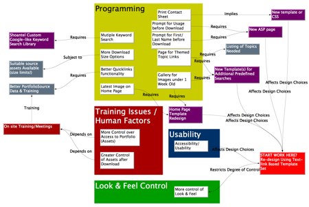
Mark Anderson was meeting with a client, planning a new database interface for the new season’s launch. Together, they threw together a light and fast Tinderbox map to capture ideas and, just as important, to elucidate dependencies among the ideas they were considering.

Tinderbox: Maps and the Client
Click here for full scale

This is not a presentation graphic prepared for a meeting; these are meeting notes that emerge naturally from discussions. When technical issues raise training problems, that can be captured right away. When the Experience Design team wants a programming solution to a nagging problem, that, too, can be captured.

It’s easy to adjust the frame. Issues aren’t required to fit the agenda, and you don’t need to shoehorn everything into fixed categories. Categories have power; they may easily determine who is responsible for a task, who pays for it, who evaluates it. If you’re not ready to answer those questions, the map lets you capture what you know without making commitments you don’t want to honor.

Everybody can play. Throw the emerging map up on a screen. Everyone can see what’s being captured, and what isn’t. Anyone can point to things that seem to be out of place, or missing.

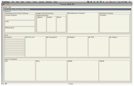
Meagan Timney is writing a dissertation "Of Factory Girls and Serving Maids: The Literary Labours of Victorian Working-Class Women in Victorian Britain," at Dalhousie, where she oversees the Working Class Women Poets archive. She recently sent some interesting notes about her work with Tinderbox for planning the archive.

Here’s the treemap view that she sketched for the archive.

Go ahead and click the image; so you can see the full-size window.

There’s nothing very fancy going on here — just a straightforward sketch of the structure of a scholarly site. But it occurs to me that this kind of visualization can be terrifically useful for thinking about all sorts of aspects of site development and planning. And, while you know how things work, this diagram might work well for explaining the site (and not just the front page!) to managers (and funders) who don’t spend much of their time reading this sort of Web site.

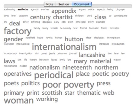
Same things with the Common Words view. It’s not a sophisticated analytical tool, but it’s right at your fingertips — and it’s easy to compare the word cloud for a single note or section to the word frequencies of the entire document.

Little Match Girls

Describing the site, Timney writes that "Materials to be mounted on the site include an annotated index of working-class women authors and their works, an extensive critical introduction, a database of more than 600 full-text poems written by working-class women in the nineteenth century (including Fanny Forrester, Marie Joussaye Fotheringham, Mary Hutton, Millicent Langton, Lucy Larcom, and Ruth Wills), a full bibliography of scholarship, reviews, and textual materials that will provide both historical and literary contexts (e.g. reviews from editors in nineteenth-century periodicals, brief biographies of authors, such as Ben Brierley’s biography of Fanny Forrester in Ben Brierley’s Journal), and serve as a portal to contemporary critical contexts. This fully-searchable database will include headnotes and annotations for each poet. Other materials will include a Wiki, which will document the design and editorial practices of the site, to augment the construction of a prototype model for other sites, and a web forum, which will allow for critical discussions of the texts themselves, humanities computing and the digital representation of non- canonical texts, as well as open discussions of hypertext editions and their function as systems of “information engineering” (Flanders)."

Little Match Girls

Have an interesting Tinderbox project? I'd like to hear about it. So would lots of people who read this blog. You might find helpers, advisors, collaborators, and fans. Email me.

We make Tinderbox maps because spatial relationships can be richer and more flexible than lists.

This argument is distinct from one that is sometimes advanced to support ‘mind mapping’ – that people are more adept at working with spatial relationships than with other symbolic forms. I'm not convinced that people are particularly good at working with spatial relations. But spatial language is inherently richer at expressing some relationships, and the continuity of space is often convenient for describing approximate relationships that are difficult or inconvenient to specify more exactly,

IVICA: Space and Patterns
Tinderbox map by J. Nathan Matias

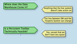
Here’s a piece actual Tinderbox map, produced for a corporate presentation and discussion. The dialectic pattern here — question and answer, call and response — is something we often encounter in meetings, in negotiation, and in planning. We’re doing this not to validate or verify a logical inference — this isn’t a poor man’s Toulmin diagram — but rather to record the making of a design decision.

It’s easy to see what”s going on here, even if you don’t read every note. Notice, though, that there’s no good HTML markup for this description. You could use <dt> and <dd>, I suppose, but that”s a hack. You could use a bunch of special purpose <div>'s. You could format it as a dialogue, like a screenplay.

Question: what would a green, right-facing tag in the right column mean?

Question: what would a blue, left-facing tag in the right column mean?

I bet you can propose sensible answers to both questions. But you’ve never seen this diagram before, there’s no legend, and I don’t think any of us studied this visual language in school. This is interesting.

One key to the Tinderbox map is simplicity and regularity. It’s a working tool for getting things done, not a presentation system for making fancy slides.

Ironically, as Robert Brook pointed out at Tinderbox Weekend London, this can make Tinderbox especially effective in presentations. Not only can you get lots of information in front of management this way, but when a manager say, ‘That’s in the wrong place!’ you can just drag it into a new place and astonish everyone.

But it’s important for Tinderbox maps to be able to express all sorts of relationships and conjectures. That’s why maps are (sometimes) better than lists or database tables: sometimes, you need to express tentative connections or speculative relationships, things to which that you can’t yet commit.

In addition, Tinderbox agents constantly work to find things, and often they express their results through visual characteristics. For example, an agent that searches for overdue tasks might color them red. Tinderbox provides lots of visual dimensions:

  • Color
  • Accent color
  • Shape
  • Height and Width
  • Border style, thickness, and color
  • Shadow size, blur, and color
  • Label font, boldness, size, and color
  • Badge icon

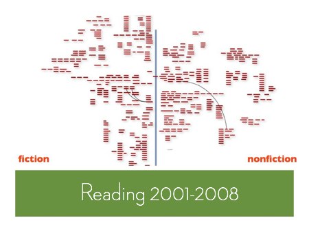
This gives you lots of ways to call attention to particular notes, especially when you have lots of notes in your map. Here’s a study I did one afternoon, while stuck on a crowded airplane, looking at all the books I’ve read in the last few years.

IVICA: visual dimensions in Tinderbox

Here, I just threw all the books into a map, zoomed out, and started a rough sort into whatever clusters made sense at the moment. (Information Architects do a lot of card sorting; it can be a terrific way to discover new ways to structure confusing information.)

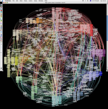
And here’s Julie Tolmie’s famous Tinderbox map of patterns in game design:

IVICA: visual dimensions in Tinderbox
Tinderbox map by Julie Tolmie

Note especially the subtle, systematic use of color not merely as an alarm code but as a continuous contextual cue.

Adornments also help structure the space of each Tinderbox map.

IVICA: visual dimensions in Tinderbox
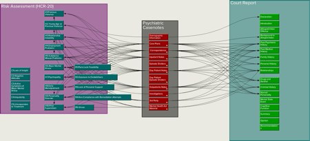
Tinderbox map of psychiatric forensic workflow by Dr. Fionnbar Lenihan

In short, we can say lots of things with Tinderbox maps. But there’s a lot that’s tricky to express, especially when we’re using the maps to jot down information that we don’t yet fully understand. For example:

  • Conference liveblogging
  • Library research notes
  • Collaborative brainstorming
  • Workgroup prioritization, project triage, and scheduling

Today, while we can distinguish exceptional elements in lots of ways, it's harder to express connections between things. We can

  • link them
  • place them next to each other
  • pile them on the same adornment.

That’s better than nothing — and better than squeezing everything into an outline or a list. But I think we can do more.

IVICA: visual dimensions in Tinderbox
Concept proposal. These notes aren’t linked, but their visual connection is stronger than simple adjacency.
Jun 09 7 2009

IVICA: the leaf

On June 19, the researchers who study spatial hypertext and related areas will hold their grand, irregular festival, IVICA. (I sha’n’t be gone long. — You come too. It’s one day, and not very expensive. It’s colocated with Digital Libraries, but you needn’t sign up for the whole conference.)

I didn’t have a paper to send this year, and so the organizers invited me open the shebang. I’m going to say a few words about the day when “A Narrative, a Picture, and a Link Walk Into a Bar”.

I’d like to take a piece of that argument and explore it here. First, because it has interesting implications for Tinderbox and for the way we use Tinderbox maps — especially for information gardening. Second, because it raises interesting questions for all kinds of interface design, from operating systems to preference dialogs.

IVICA: the leaf
Tinderbox map by Prof. Margaret Syveron, University of Texas at Austin

Our information maps are, chiefly, boxes and arrows. When screens were very small, we had no choice. With only 512x384 monochrome pixels , every bit of screen real estate mattered terribly. Every pixel still matters, and we certainly cannot waste them, but perhaps we now have enough cushion to consider a broader views.

IVICA: the leaf

Why use a box, for example, and not (say) a leaf? Boxes use space efficiently, and they’re easy to draw, and at some level of abstraction everything is a box. But then, at some level of abstraction, everything is a curve. How might information farming and information gardening benefit if we moved beyond boxes and lines?

The peril, of course, is chart junk — decorating our maps to make them look good or to impress (or baffle) managers. That’s always a mistake, though it sometimes seems an effective short-term strategy.

Can we make our maps more meaningful? More expressive? Can we perhaps make it more likely that an unconscious or accidental juxtaposition of ideas on the map will trigger reflection and understanding — what Nakakoji and Yamamoto call “representational talkback?”


Twitter: #ivica, #infoFarming

One highlight of Tinderbox Weekend London was Robert Brook’s discussion of using Tinderbox for planning public information programs for the British Parliament.

A key theme of his talk was the importance of sketches — small, quickly-prepared documents that hold the information you need yet remain malleable enough to adapt quickly as changes are required. “People often make oil paintings when they want sketches,” Brook observed.

For example, consider the meeting agenda prepared for a series of meetings with the varied stakeholders of a project. Instead of printing numerous agendas tailored for each different audience and constituency, a single Tinderbox agenda can let each meeting focus on its chief concerns through natural actions in hiding, showing, and arranging elements. Map views let participants see what they’re discussing and what is being passed over; people suddenly notice that this thing over here actually connects to the other group’s thing over there.

This flexibility extends from Web projects like Hansard, a new Web repository of Parliamentary debates from 1803 that was partially prototyped with Tinderbox, to performance reviews and management negotiations. In budget discussions, for example, it can be helpful to make note sizes proportional to cost, focusing attention on the most pertinent items.

My own notes for this fascinating session are something of a mess, highlighting Brook’s own observations of the importance of informal and even fuzzy tools. Keeping control and responsibility in one place, he insists, is key: being able to change the map within a presentation gives speakers a way to visibly incorporate changes and address objections that is indispensable where many interests must be satisfied and where changes will need to be accommodate and embraced throughout the entire development cycle.

My question about legal applications of Tinderbox garnered all sorts of interesting mail, from Vancouver the north woods of British Columbia to Kathmandu. Everything from teaching police officers to be better witnesses to mapping lines of influence in the Afghan resistance to the Soviet Union.

Forensic psychiatrist Dr. Fionnbar Lenihan writes from Edinburgh that he found Tinderbox "good for doing some quick pandemic flu planning." He’s the pandemic czar at his facility; closed communities like prisons are particularly worrisome for managing disease outbreaks.

Once I had sketched out some ideas on a map, I was able to print off a view and use that for discussions with other people.

This is an example of a “disposable Tinderbox” – a Tinderbox project that’s intended as a sketch or study rather than a long, ongoing project. Tinderbox serves its role in the early stages, where its flexibility and responsiveness help capture ideas without premature commitment to an organization or framework or conclusion. It’s easy, for example, to accommodate information in Tinderbox that “doesn’t seem to fit”, or ideas that might not fit with the expected result. Later, you can pick up and move to Keynote or InDesign or whatever you want to use for production; Tinderbox now serves as a storehouse of information from which you can draw.

Small Tinderbox files load quickly, but streaming thousands of notes and links from your disk is bound to take a few seconds. In the big picture, it’s an acceptable cost: first, because it’s only a minute or two a day, and second, because there isn’t a free lunch – picking up and handling thousands of objects is a lot of work.

But making things faster is nice. And, because you’re probably sitting there waiting for Tinderbox to load so you can write stuff down, the delay has more emotional weight than, say, the minute you lost getting coffee, or waiting at a traffic light, or reading the invitation to a client’s product launch.

Most of the time, I resist optimizing Tinderbox. First, my reflexes already lean too far on the side of performance. Habits, formed at a time when computers were much slower and much smaller, lead me to make lots of little optimizations in the code and the architecture that probably are unwarranted but that, collectively, help make the code fast. A lot of this adds complexity, things are already pretty complex under the hood, and the we don’t want to make the trade-off worse.

But, after a user twittered in praise of a very slight speedup in load times in Tinderbox 4.5.3, I took out the profiler and studied Tinderbox 4.6 . Things looked reasonable: parsing XML takes time but XML has proved its worth for Tinderbox many times over.

And then, there it was: one routine of the XML loader was doing tens of thousands of memory allocations. OK: we’re building complicated objects from their flattened disk representations, we expect allocations. But there did seem to be a lot of them.

Short answer: small changes in memory strategy in Unicoder, XMLReader, and CeresReader save about 100,000 allocations every time I open my weblog. And now, with Tinderbox, they save time whenever you open your big documents. It won't matter unless you've got thousands of notes, but it’s nice to have.

Over in the Tinderbox Forum, we’re having an interesting discussion on planning a new project, centered on keeping your notes attached to their sources.

The discussion promises interesting sidelights on teaching anatomy and on medical applications of Tinderbox.

Another thread that came up recently involved Alex Strick van Linschoten’s AfghanWire.com project.

Tinderbox users are interesting!

by Robert D. Richardson, Jr.

I'm reading Richardson’s Emerson: the mind on fire . He’s an interesting fellow, and he formed an even more interesting circle. In fact, you could argue that Emerson’s fireside was the place where the real definition of “the American” was fixed.

Besides, my wife is working on a Masters in this period, so I’m bound to find it interesting.

Problem is, it’s not my period. Sometimes I need for a scorecard. Sarah Ripley: is she connected to George Ripley? Is Mary Emerson the sister, or the aunt? Just a hint of who and what people were would help a lot; sometimes, all you need is a poke to get on the right track.

Lydia Child? Oh, she's the woman who always brought lunch to her husband who was in debtor’s prison.

An encyclopedia, or wikipedia, is nice to have, but it's really too much and too slow. I’m used to having the Oxford Classical Dictionary ready to hand for Antiquity; I don’t think there’s anything like this for 1830 Boston.

But, you know, it should be easy enough to make in Tinderbox. Tinderbox could take care of lots of clerical minutiae — searching, sorting, organizing. And Tinderbox can remind you what you’re missing: who needs to have birthdates checked, who needs more narrative filled in. You don’t need a database: I fancy a few hundred people would cover the crying needs, and that’s a small Tinderbox document.

You could share the work among a bunch of hands — either a class (in which case it could be the seed of something like Landow’s Victorian Web ) or just as a study-group enterprise. I bet a grad student with a flair for witty commentary could publish this. (Another example: What Jane Austen Ate and Charles Dickens Knew ). If you’re managing an enterprise product, I imagine the same sort of information on your customers would be great to have — and building the system would be a great assignment for an intern or an newcomer.

It's not just academic. Think about all the family you know — or can remember, or about whom you remember stories. Will your niece’s children meet these people, or hear these stories? Write stuff down. And I don’t know of a better way to write this stuff down so it can be used, so it doesn’t turn into a big bunch of cards in the back of a drawer.

Want to work on ways and means? What to hear how to do it? Want to lend a hand? Email me.

Fascinating notes and screencast on using Tinderbox to create classroom presentations and syllabuses, by J. A. Wilcox.

What's more, the fundamental unit of an assignment on my daily syllabus originates from a bibliographic entry produced by EndNote. First, I select references in EndNote for export. I run a PERL transformation on those exported items which produces a Tinderbox document. I then import these Tinderbox objects into my course Tinderbox document, rearranging and tagging the objects until I have a workable syllabus.

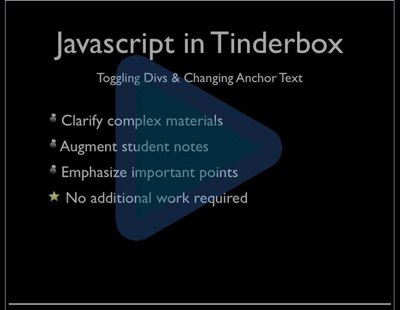
The screencast, Javascript in Tinderbox, explores ways to clarify complex materials, augment student notes, and emphasize key points — without giving the instructor any additional work. Highly recommended.

Teaching With Tinderbox

Jolyon Patten, a London solicitor who specializes in complex commercial issues, writes today about a fascinating kind of Tinderbox analysis. Here's his problem:

I’ve had a thorny problem to deal with today, involving a case in the Philippines, where I had two strands of information: the first was what a party had said (over time) had happened; the second was what had actually happened, as ex post facto discerned from various sources.

As you can imagine, this sort of analysis can quickly turn hair-raising; you need to keep track of what happened, what people thought had happened, what people pretended had happened, and what people could reasonable have believed at different times. This is hard — contrast the wonderful concept demo from Adaptive Path that posits a “business problem” of reacting to a competitor who has called to taunt you about the impact that the weather may have on your profits — and it’s absolutely the sort of problem that people need to solve.

Patten explains that he

…turned to Tinderbox and quickly scratched together a document that allowed me, in map view, to use long, thin adornments to set out the relevant years, with different coloured notes for Real Facts and for Alleged Facts above and below the adornment ‘timeline’. Facts and Representations had different prototypes, with subtle colour differences, and it was easy to add fields as and when needed.

We've got a bunch of new visualization features coming in Tinderbox 4.5, which isn’t quite ready yet. They’re shiny, they look nice, but that’s not the point. The point is that visualization can help you see things you’d otherwise miss, and to discover patterns in data that would otherwise give you a headache.

The first day of Tinderbox Weekend here in San Francisco was mostly about theory. I started off with the "director's commentary" for NeoVictorian Computing, looking at how my thinking on programming and software design has been shaped by the ways people use Tinderbox. Big surprises:

  • Writing for small audiences — including writing for yourself — is much harder and much more interesting than anyone thought.
  • Tinderbox users take to inheritance with surprising aplomb. Composition is hard, agents can be hard, but inheritance — which I thought would be a big headache — is not.
  • Even though Tinderbox doesn't insist that you make class objects, people tend to like them.
  • Representational salience is difficult. You can't tag a note to describe its meaning; there's too much meaning in even small notes or isolated images, and more meaning pours in as soon as you place one idea next to another.
  • Still, while you can't add metadata to describe the note's meaning as a whole, you can sometimes describe what the note means to you. And that, sometimes, is enough.

Michael Fitzhugh did a star turn on Tinderbox and the reporter's notebook. Keeping track of experts in all sorts of field is just part of the Business beat. Keeping track of story ideas is essential, too. So you've got to have a completely inhomogenous data store with all sorts of objects — sources, budgets, stories, pitches, beats — all of which may need to be connected, and all of which need to be findable. The Tinderbox framework Fitzhugh has evolved for himself is fairly simple, I think, but it evolves gracefully as he needs it: I think this is a much more pleasant solution than unpacking a complex solution someone else wrote, where you pretty much need to adapt your practice to the toolkit.

Bill Humphries has a nifty look at Second Life. "What would it mean to blog from Second Life?", he asked. And then he showed how simple it could be: a little tool your character carries around says, "I'm blogging this", and when you tell it to, it emails Tinderbox with your character's world coordinates, a screenshot, and a short blog post. Again, off the shelf tools in Second Life and Tinderbox let you glue the tools together to do unexpected things.

Finally, Cathy Marshall did a wonderful retrospective on spatial hypertext, and probes the fascinating question of how we are going to keep track of all our digital artifacts. We have a lot of stuff on our disks. We don't need to throw anything out. You take maybe ten photos a day, get an album or two a week, read a book and a couple of magazines every month, you're just getting started. Do this for a decade, you've got maybe 100,000 things. How do you find stuff? How do you know what you've got? How do you know what you don't have — the dog that isn't barking? Perhaps spatial hypertext tools like Tinderbox can work on this scale, too.


And now, back to work. Sunday is all about practice, technique, and details. How to pick things up and do them in Tinderbox, starting with a tour of the latest (and next) batch of new features. Show time!

We're setting the table for Tinderbox Weekend Boston this weekend. It's going to be great: everything from Tinderbox for plotting to using Tinderbox on location when the film you're shooting is not exactly what you had in mind.

Tinderbox Weekend Boston

We always make a few extra copies of the handouts as a Remote Membership package. It's not designed (unlike most everything else we do at Eastgate) to be a great deal. It's a way to support Tinderbox Weekend if you can't come. You get a copy of The Tinderbox Way, a CD filled with sample files and presentations, and your very own nametag lanyard.

For this batch, there's a little bonus: I spent an afternoon behind the microphone and worked up a screencast of the slides and audio from my recent OOPSLA Lecture on NeoVictorian Computing. So, if you'd much rather watch and listen to the talk on your iPod than read about NeoVictorian Computing here, now you can.

Support Tinderbox Weekend
Tinderbox Weekend Remote Membership: $75

You can always remove it later.

We've only got a few extras; get 'em while they're hot. All gone! But we'll have some extras for Tinderbox Weekend San Francisco, December 1-2.

Adrian Miles is writing a paper for the Video Vortex Symposium in Brussels next week, and writes an intriguing report on the process of drafting the work in Tinderbox for presentation variously as a hypertext, a Keynote presentation, an interactive video vog, and a research paper.

But I’m now at the pointy end. It’s time to really start to nut out what I mean by crystalline structures and faceted video. I have it sort of sketched in my head, but right now it looms before me as a whole other essay on top off, or along side, of the current 5000 words. Which is why I’m writing about this particular knot here, rather than there.

These are good knots. This is where my writing moves from reporting or just joining the dots of my thinking out loud to be a thinking in the writing.

Sep 07 27 2007

Noting The News

More excitement for Tinderbox Weekend San Francisco (Dec 1-2): Michael Fitzhugh is going to talk about Noting The News.

From pitching editors to proofing pages, Tinderbox is an indispensable tool for journalists. It brings order and ease to reporting by tracking story assignments, ideas, sources and interview notes.

Michael Fitzhugh, a reporter covering technology and biotech for the weekly East Bay Business Times, will show how he puts his notes to work, helping him meet deadlines and keep up with the news.

Tinderbox 4: progress bar2

In Tinderbox 4, you can set the pattern of a note to be bar(50). That gives you a note that's 50% Color and 50% Color2. This can make a handy indicator, perhaps to reflect the status of a project. (Another pattern, vbar(50), makes the bar advance from the bottom toward the top of the note)

The pattern can refer to one of the note's attributes:

bar($PercentComplete)

Indeed, the pattern can refer to an entire expression:

bar(100*$WordCount/$RequiredLength(/assignments/GothamTimes))

The Tinderbox site has a page about new features in the Tinderbox 4 map view.

Feb 07 18 2007

Topic: Iraq

I've avoided making Iraq a weblog topic page here, thiinking of The Forsyte Saga's timid old Uncle Timothy, the retired publisher living in Belgravia with his aged sisters and his money safely invested in 3% consols who, after things blew up in the Crimea, put up maps in the drawing room. With lots of colored pins.

But there's been a lot of Iraq lately, and if you glance at the Books Bought list right now you’ll see it's likely that more is coming.

  • State of Denial (Woodward)
  • The Assasins’ Gate (Packer)
  • Prince of the Marshes (Stewart)
  • Chain of Command (Hersh)
  • The Situation and the Story (Gornick)
  • Fiasco (Ricks)
  • Imperial Life in the Emerald City (Chandrasekaran)

Of course, this is going to be remembered as the great issue of the time.

Closer to home, I’m writing a chapter on the way the limitations of print culture has led our leadership to depend on executive summaries and PowerPoint presentations, and to a bastard postmodernism faith that, since text is contingent, you can reshape the world just by really believing in what you're doing.

Of course, since it's all in Tinderbox I can easily go back and tag relevant posts. An agent could search for Iraq and Baghdad and Bush, gather and sort and tag. It took a couple of minutes to do that. Then i used the agent to tag things by hand, omitting some minor notes and adding some — especially What Ended — that the agent missed.

Tom Webster has an interesting note on using Tinderbox for keeping track of market research focus groups . The challenge is not simply crunching the data; in practice, life can come between the researcher and the information. "Three months, 13 cities, three continents....": not only do you need to analyze and organize a lot of information, you need to get things done in the time and workspace you have — in airports and hotels and in moments between meetings. Webster describes the problem as having to "take five hundred cocktail napkins and turn them into a ten-page article."

One of the projects I did over the past few months was a coast-to-coast qualitative research project for a large public broadcasting concern, which spanned over two months in more cities than you can count on one hand. In this project, we did focus groups in several representative cities, then packaged all the data up to draw some conclusions about media usage, lifestyles and consumer behavior.

The day this project ended I had to drive to Georgia for another client, then fly off to London to give a presentation. As a result, I had very little time to go back over the data (or watch the films of the groups over and over) to distill my thoughts and draw conclusions to deliver my analysis within a reasonable time frame. Tinderbox was immensely helpful here, serving as both my "institutional memory" for both client and project, and as a remarkably efficient way to create, group and identify clusters of notes--and people--to get to the insights that the groups had to offer.

This year, we tried a completely new scheme for Tinderbox weekend. I think it went very well indeed!

We leapt directly into hottest part of the Tinderbox fire with Penny Chase's discussion of Tinderbox for meetings. I'd imagined that this might be a gentle way to get started, perhaps discussing ways to use the Tinderbox map in presentations. But within minutes we found ourselves deep in Tinderbox automation: notes that automatically deduce their own type, containers that help compose agents you're going to want, and Minutes that automatically format themselves for distribution. Very challenging -- and lovely!

Then, zoom, Jon Stephan led us through Tinderbox for managing litigation. The complexities of corporate litigation (think Jarnduce v. Jarndyce) make a fascinating match for Tinderbox. For example, related suits might need to be defended in different jurisdictions with different rules, and in these suits different courts might decide the same questions of in different ways. It's fascinating to see how one might go about tracking these complexities in a way that lets you keep track of what's happening and what needs to be done.

Stephan mentioned as well that he used to keep track of things in paper notebooks, and switched to Tinderbox in part from concern that information on paper would be too easily lost. People worry about preservation of electronic media, but paper media are in some ways more fragile and more likely to become effectively inaccessible. If you can't find your notes, it didn't happen.

Al Hawkins once more did a wonderful and engaging talk, this time centering on using agents to organize course notes. Al also walked us through Tinderbox's much-overlooked Explode dialog, demonstrating how quickly he could move from an inconveniently-formatted pdf reading list for his medical informatics course to an flexible set of Tinderbox notes, neatly organized and sorted.

Finally, Kathryn Cramer wound up with a tour de force exploration of investigative journalism, showing how she built graphic overviews and Tinderbox prototype trees to explore complex cases involving money laundering, retired military personnel, fictitious secret societies with offshore bank accounts, and a complex taxonomy of threats and McGuffins that reads like Edward Gorey.

Thanks to everyone, presenters and particpants alike, for lively discussions and exciting examples!

Jul 06 28 2006

AutoFetch

Many Tinderbox features turn out to be useful in unexpected ways. Autofetch is perhaps the outstanding example.

Originally, Autofetch was intended to make it easier to do two jobs:

  • Provide a nice way to integrate RSS feeds into your Web pages. This is the syndication mission in really simple syndication. The catch is, almost nobody uses RSS for syndication! They use RSS as a personal information dashboard, a menu of Web news. So, this role is nice to have but not, I think, very much used.
  • Provide a clean way for teachers to include assignments in student work -- and to make sure that changes in the assignment get passed to students. It's a great idea! I'm not sure that many people actually use it.

So is Autofetch a spare wheel? No! Autofetch turns out to be a terrific way to spread information between Tinderbox documents.

For example, from type to time we release a new version of Tinderbox. This information gets used in lots of places. In the old days, we had to change the version number each time we mentioned it -- and that led to mistakes. Now, whenever we want to mention the current version, we just say

^include(/config/version)

(Or, more likely, we put that in a macro and say ^do(TinderboxVersion). You get the idea.)

But different sites use different Tinderbox files! How do we make sure that all the different sites get the news about a new version? We can use AutoFetch. The Tinderbox site exports its configuration notes in simple text format; for example, the current Tinderbox version is always at

http://www.eastgate.com/Tinderbox/config/version.

Other Tinderbox documents can simply AutoFetch from this URL and get the current price.

What happens if I'm offline? When I'm working on a plane or in the forest, Autofetch can't check the version, so it uses the old version. All is well.

Some people worry that they don't fully understand Tinderbox agents.

You don't need to understand them completely. Nobody understands them completely: this is research. You need to understand them well enough to use them, well enough to let them help you with your work. That's all.

One of the key roles for agents is simply to gather some notes that are especially important or urgent or need attention. For example:

Current: Done=false & DueDate<"today+1 week"

Overdue: Done=false & DueDate<"yesterday"

Agents like this let you keep your notes organized naturally -- by project, or location, or team assignment. The agent gathers copies of notes that fit its criteria. Open an outline window focused on that agent, and you've got a sorted, up-to-the-minute list of the items that demand attention.

Agents: Gathering The Important Stuff
Of course, this isn't just useful for project management or getting things done. If you're using Tinderbox for your research notes, you can track the hot topics or memes in your own reading. If you're using Tinderbox as a journal or diary, you can keep track of writing about the arts, or about your grandchildren or your cooking. If you're using Tinderbox to plan a book, your agents can track loose ends and unfinished chapters.

How do you use agents?

Apr 06 27 2006

Adornments

A big topic at Tinderbox Weekend Chicago turned out to be adornments.

I remember when spatial hypertext and hypertext maps were pretty much lab curiosities, but now we need to talk about how to use them effectively to get work done, and to do it right now.

Kathryn Cramer will be talking about information and serious blogging at Tinderbox Weekend Boston, sent along this screen shot from a new Tinderbox project.

She's studying some apparently-interlocking organizations and connections. It's a classical journalism problem: who is connected, and how are they involved? The key point is that this is not a presentation or a visual explanation -- it's a working document that emerged naturally in the course of an afternoon. Cramer isn't (yet) explaining this to you with charts and diagrams, she's just organizing her notes, but this sort of malleable map lets her express tenative and imprecise relationships as they seem to emerge from the evidence.

Tinderbox Day Chicago went very well -- lots of interesting talk, tons of energy. Gordon Meyer did a nice little talk on the many ways he's used Tinderbox over the years for technical documentation. I survived a new Introduction To Tinderbox segment designed to emphasize research. This was a special challenge: I try to avoid teaching the introduction because I'm so familiar with Tinderbox. But things seem to have gone well.

Lots of new additions to The Tinderbox Way. There will be even more additions for Tinderbox Weekend Boston, May 13-14.

As we were leaving the Drake with our carry-on bags, a couple of white-gloved bellmen were standing by the grand staircase. One offered to help us with our bags.

"We're fine!", I said cheerfully. It's a carry-on, after all; we're going to be carrying the thing to Boston, we can carry it to the door. I'm thinking, "I don't want to make extra work, I don't want to negotiate a tip, I'm not so old and feeble that I can't safely manage this little suitcase."

"I have to go down there anyway," he says, taking my bag and Linda's and leading the way.

This was nicely done. Don't Make Me Think is not, I think, a very good motto for design, but it's a very good motto for offering gratuitous service. And gratuitous service (which includes cheerfulness) is one of the ways a hotel can distinguish itself from all the other hotels in the neighborhood.

In general, people at really good hotels seem really happy, and people at really bad hotels seem miserable, sullen, harried, or terrified. You can understand the dynamics of the general rule: good hotels probably pay better, have more reasonable managers and better workloads. Some of the boutique hotels like Cathy's Paramount and the Rex in San Francisco, I think, get extra good cheer from esprit de corps and from attitude -- and maybe also from a sense that individual contributions matter.

I stumbled across a nice post about Tinderbox (and flattering comments on this blog) from Nathan Baron. (Nice WordPress template, too)

I've been playing around with a piece of software called Tinderbox.  Tinderbox is simply amazing.  It allows you to mind map, outline, rearrange ideas and present information visually.  It is software that I have been waiting for my entire life.  It thinks like I do.

As I'm sure you already know, the clearest sign that someone is really, really intelligent is that they agree with you. (Vera Ganley is really bright, too!) And so, having found Mr. Baron's weblog to be very intelligent indeed, I wanted to know more about the fellow.

But his weblog has no "About" page. I only know the author's name because it's in his URL.

This isn't uncommon. I've written about this before. Lots of people skip the "about" page, or leave it empty, not wanting to boast or call attention to themselves.

It's not boasting to introduce yourself. Your readers need some context. Are you running a company, or teaching in a university, or raising children, or breeding camels? Are you a student in Omaha or Osaka or Östersund?

I've met Mike Bonifer a couple of times at Digital Storytelling, and so while I was in LA I thought I'd call and say hello and find out what his new venture, Network LIVE, is really doing. Bonifer blogs the delightful meeting he set up with him and some of the Network LIVE crew.

You get the feeling Bernstein could get just as engaged in a discussion of crayon choices with a kindergartner as he is discussing form factors for hypertext publishing.

As you can see, it was a wide-ranging meeting. Owning context, ad hoc media networks, knowledge representation for entertainment industry creatives, tagging and inheritance, the impact of spam farms, and Tinderbox. For starters.

Jan 06 2 2006

Presentations

Guy Kawasaki, who invented software evangelism and played a crucial role in Apple's renaissance and who is now a VC, has a new weblog.

Recently, Kawasaki complained that most of the PowerPoint presentations he sees are bad. And since he's hearing polished and important presentations on which millions of dollars of investment depend, these are probably a lot better than the presentations at your average trade show or faculty meeting. His prescription:

  • 10 slides
  • 20 minutes
  • 30 point type, and larger
Presentations

The ten slide rule is wrong. No, you don't want to cram too much into a talk. No, you don't want to overwhelm the audience with detail. But two-minute slides are far from ideal.

  • In two minutes, the audience has time to be bored by your slide. They can critique it. They can critique you. They can reflect on what you're not telling them. They can poke holes in your metaphors. They can look around the room to see who else is doing this.
  • If you have only ten slides, each slide needs to cover a lot of ground. One slide for the problem your business addresses, one slide for the technology, one slide for sales and marketing.
  • It's hard to design a visually compelling slide for broad, abstract topics like "our planned sales and marketing strategy".
Presentations

All things being equal, take your 2-minute blue-gradient slide and break it up into five or six small slides -- none of which will be on screen for more than 20 seconds. Most slides need only a headline. A few can have a headline and two or three bullet points.

And that gives you space as well for visual information -- for emotionally rich but hard-to-discuss information about your company, your products, and your ideas. You don't have to talk about the visuals; they'll explain themselves.

The 30pt text? Too small: 30pt is the fine print. Avoid small type on the screen; it's ugly and hard to read, and it tempts you to read your slides. 64pt headlines are fine, 96pt is better.

Better yet, when presenting to small groups who speak your language, consider dropping PowerPoint entirely and work from your Tinderbox map and notes. Crank up the magnification and the font sizes, dial back the colors, and you have an effective presentation tool that lets you adapt your presentation easily, right up to the last moment. PowerPoint and Keynotes are for keynotes -- fixed and formal presentations to a big audience.

In the Sunday New York Times, James Fallows looks at Mac Programs That Come With Thinking Caps On.

Next is Tinderbox, which is easily, if incompletely, described as a way to show visual or graphic connections among facts or ideas. You enter basic bits of information - quotes, themes for a presentation, items mentioned at a meeting, characters for a story or screenplay - and create the desired links or hierarchies among them. The programs' powerful "agents" can automatically create such links as well. You can include pictures, diagrams, and other data. Then you can easily switch among varied views of the material: straight text, outline, flow chart and so on.

The program's underlying concept is that even when you are dealing only with words, different spatial arrangements can lead to different thoughts and emphases. . . . Tinderbox seems to offer an even wider range of variations beneath a deceptively simple exterior.

How do you make sure a Tinderbox note uses the right prototype? Tinderbox gives you lots of ways.

  1. Just set the prototype: You can always set the prototype from the popup prototype menu when you create a note.
  2. The same prototype: Often, you'll create a series of notes of the same type -- a series of references, perhaps, or a set of tasks, or a bunch of weblog posts. When you create a new note, Tinderbox guesses that you want the same prototype you used last time. So, often, you'll just get the right prototype.
  3. Let the container set the prototype. Often, a note's context determines what kind of note it is. A project contains tasks: if you add a note to a project, the project can go ahead and say, "This note is a task!" A weblog page contains posts; if you add a new item to a weblog page like this one, the page can say, "This note is a post!"
  4. Let an agent set the prototype. We might be able to write an agent that scans for patterns and adjusts the prototype appropriately. One agent, for example, might look for any Tasks that are due in less than a week, and make them into UrgentTasks.
  5. Let a stamp set the prototype. The stamp menu is very easy to customize, so it's easy to add frequently-needed declarations that say, "this note is an ImportantChore". Quickstamp can be handy, too -- especially if you need to reassign lots of notes to use a prototype you've just invented.
  6. Adornment actions are like stamps. You can add an adornment to a map that automatically sets prototypes (or applies time stamps -- or does any other action for that matter).

In many of my Tinderbox documents, I seldom set a prototype. Instead, the note figures out its prototype from its context, or its content.

This is important, because it's really important not to clutter note creation with difficult and time-consuming distractions. Early hypertext tools sometimes asked too many questions before you could add a note, and the result was that users evaded and avoided the questions by always replying, 'It's just a generic note.' If we can usually get the prototype right without intervention, and it's easy to change the prototype later, then the system doesn't get in the way. Prototypes save typing, and they also improve representation.

Late in the second day of WebZine, I ended up doing an impromptu demo of Tinderbox as a tool for crafting a quick, interactive presentation.

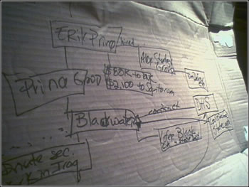
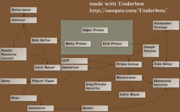
It's an interesting task. Irina Slutsky wanted to present an exploration of the patterns of connection in New Orleans between the Blackwater mercenaries, various front organizations, and the GOP power structure. The point she wanted to make was that organizers need to track the facts and connections and present the data -- that too much rhetoric and too few facts had too often weakened the left. But, in a moving story like this, new connections are emerging all the time -- which made the chart she was drawing on scrap cardboard a bit of a mess. And, because the didn't know in advance where all the links would go, PowerPoint turned out to be intractable.

Tinderbox Presentation Demo

Tinderbox Presentation Demo

Why do this in Tinderbox instead of a graphics or presentation program?

  1. Tinderbox makes it very easy to move things around, and to add new notes and new links
  2. Tinderbox also lets you store support information -- sources, annotation, original data, contact information -- inside the notes. After all, it a tool for notes.

The downside is that you don't have a huge repertory of shapes and arrows and assorted chartjunk. But that might not be a downside at all, since we're discovering structure and writing things down, not making glossy slides.

Aug 05 23 2005

Syllabus

We've been asking lots of students (some of them also happen to be distinguished teachers) about taking notes with Tinderbox.

While we're thinking (in the Northern Hemisphere) of going back to school, Tinderbox can be a nice tool for sketching out and sharing course plans. One particularly nice factor is that you can concentrate on writing now, confident that you can export your work to a Web site that will look the way you want -- when The Way You Want It To Look will be decided sometime later.

Marisa Antonaya sent along her prototype syllabus/course site, remarking that

Each [section of the Tinderbox file] is linked to a different template in order to give each of my courses (history and literature) a unique look. As usual, a few hour's design work is worth not having to worry about the look once it's done, giving me all the time I need to focus on content.
Jun 05 20 2005

Sticky

Experienced Tinderbox can benefit from an occasional dip into new Tinderbox features. Jon Buscall writes:

I'm leading a workshop for a client tomorrow. Whilst putting my notes and presentation together in Tinderbox I got into working with sticky adornments for the first time in Map View. What a sensible idea sticky adornments are.

Adornments are simply neighborhoods in the Tinderbox map -- they're usually colored and labeled, and they help organize the map. Adornments usually reside behind everything else, and you can move and resize them freely. When you move a sticky adornment, the notes and agents above the adornments stick to it; making it easier to expand a growing map.

May 05 7 2005

Supportive 2

Hugh Nicoll found a link to "Supportive" and adds his own story.

Because I am devoted to a qualitative, narrative approach to research and interaction with my students I need to keep accurate but free-form records of classroom activities, project logs, student work, etc.

The nub of the problem involved the obscurities of the Tinderbox Explode command, but the whole post is well worth reading as a use case for spatial hypertext tools in research.

I took the schedule notes (on paper) back to my office, and created Tinderbox notes for each group including the leader’s contact info, topic, and presentation date. Then in another one of those trivial but terrific Tinderbox moments, I created agents for each of the presentation dates (9 June through 14 July), and had the 33 groups sorted by weeks. Sending reminder emails to the group leaders, and keeping my notes on the student presentations will be wonderfully simple.

Saturday, I gave a short talk at the National Art Education Association conference. I wanted to explore some of the implications of Pam Taylor's research in using Tinderbox and Storyspace in the art classroom. In particular, we've got fairly good methods for deciding whether a feature makes software a few percent better or worse, but no good method for knowing whether the software sometimes makes a huge, life-changing difference to its users.

The scary part? Putting together the visuals, knowing that they're going to be shown to a room full of art professionals -- professionals on holiday who (I imagine) must see plenty of earnest, clumsy student stuff every day. I dialed the visuals way back; better to be clumsy and simple.

An Intimidating Audience

But M. L. Deruaz has some nice things to say about the talk.

Best parts of trip? hearing Mark Bernstein present about using Tinderbox (He created the software). He's bright, entertaining and possibly the only person I have ever seen who knows how to create interesting powerpoint visuals to accompany a talk.

Freelance writer Jon Buscall describes an improvised Tinderbox document he assembled for notes on a single article. He began by dragging the email for the assignment into Tinderbox moved on to interview notes, and then wrote everything up in his word processor.

By creating a single box for a single assignment I’ve now got all my notes, contact details and early drafts stored in one place. I can see that in future I might try this more often. That way I’ll have a relatively complex document relating to a paid assignment in one hypertextual space that won’t take too long to open and close.
Dec 04 20 2004

Project Page

Jill Walker has opened a project page onto her new research project on distributed narrative. It's a Tinderbox-driven portal onto her blog posts, papers, lectures, and teaching on the subject.

This interesting Tinderbox application will, I expect, be an influential genre-shaper. Researchers often have diverse interests; the project page is an interesting application of ad hoc faceted classification to the personal home page.